Manual
RealObjects GmbH
Version 8.2.8867.9
Copyright © 2006-2017 RealObjects
PDFreactor is a registered trademark of RealObjects GmbH.
- Installation
- Integration
- Input Formats
- Output Formats
- Layout Documents
- Basic Page Layout
- Breaking Text
- Generated Content
- Page Header & Footer
- Generated Content for Pages
- Transforms
- Multi-column Layout
- Line Grids and Snapping
- Region Layout
- Breaking Boxes
- Advanced Page Layout
- Leaders
- Table of Contents
- Shrink-to-Fit
- Page Order
- Pages Per Sheet
- Booklet
- Pixels per Inch
- Media Queries
- Document-Specific Preferences
- PDFreactor Cookbook
- How Do I Create Running Table Headers?
- How Do I Set CSS & XSLT Stylesheets?
- How Do I Set Styles for Print or Screen Only?
- Automatic Resizing of Form Controls
- How Do I Set Colors in CSS?
- How Do I Resize Background Images?
- How Do I Create Rounded Corners?
- How Do I Place an Image in the Header?
- How Do I Use HTML in Headers and Footers?
- How Do I Create a Document With a Text Direction of Right-to-Left?
- How Do I Save Memory if a Document Refers to Many or Very Large Image Files?
- How can I determine programmatically that content fits into its pages
- How Can I Retrieve the Number of Pages of a Converted Document Programmatically?
- How Do I Access Resources That Are Secured Via Basic or Digest Authentication?
- How Can I Set Request Headers And Cookies For The Outgoing Connections of PDFreactor?
- How Can I Add a Smooth Color Transition to the Background of an Element?
- How Can I Rotate Text by 90 Degrees?
- How Can I Style The First N Pages?
- How Can I Remove the First Page From the Generated PDF?
- How Can the Log Output Be Matched to a Specific Application or Document?
- How Can I Use the REST API With cURL or Wget?
- How Can I Set a Time Limit For Conversions?
- How Can I Add a Watermark to the PDF?
- Fonts
- CSS Support
- 1. RESTful Resources
- 2. API Comparison
- 3. The following JavaScript libraries and frameworks were tested:
- 4. ClientRect and DOMRect
- 5. PageDescription
- 6. BoxDescription
- 7. LineDescription
- 8. Range
- 9. The effects of the values of
-ro-link-areaon block and split inline elements - 10. List of methods to disable restrictions
- 11. List of Viewer Preferences
- 12. Options
- 13. Values of the option object
- 14. Supported media features
- 15. @-ro-preferences properties
- 16. The first one specifies what to analyze:
- 17. The second one specifies how to analyze:
- 18. The packaged core fonts are:
- 19. Default Font Mapping
- 20. Supported Pseudo-Elements
- 21. Supported Pseudo-Classes
- 22. Supported Page Pseudo-Classes
- 23. Supported attribute selectors
- 24. Supported at-rules
- 25. Key words for the supported A series formats, based on DIN 476/ISO 216, and their corresponding oversize formats
- 26. CSS Key words for the supported B series formats
- 27. Key words for the supported C series formats
- 28. Key words for supported international page formats
- 29. Supported hyphenation dictionaries
- 30. Supported length units
- 31. Supported Color Keywords
- 32. Supported counter and ordered list style types
- 1. Calling a REST resource
- 2. Simple XML and JSON Payloads
- 3. Retrieving a converted PDF
- 4. Batch Processing
- 5. JavaScript/Node.js
- 6. PHP
- 7. Python
- 8. Ruby
- 9. Perl
- 10. Java
- 11. .NET
- 12. Using PHP
- 13. Using .NET
- 14. Using Python
- 15. Using Perl
- 16. Using Ruby
- 17. Using Java
- 18. Using JavaScript/Node.js
- 19. Using the Python Command Line wrapper
- 20. Using PHP
- 21. Using .NET
- 22. Using Python
- 23. Using Perl
- 24. Using Ruby
- 25. Using Java
- 26. Using JavaScript/Node.js
- 27. Using the Python Command Line wrapper
- 28. Setting the stroke color to black
- 29. Creating a comment from an empty element
- 30. Creating a comment from a non-empty element
- 31. Styling a comment
- 32. Creating a customized comment
- 33. A comment with different start and end tags
- 34. Set
titlefrom first heading - 35. A one inch wide page margin on all pages.
- 36. Definition of inside and outside margins on left and right pages.
- 37. All pages in format 'letter' and portrait orientation.
- 38. All pages in format 'letter' and landscape orientation.
- 39. A page size of 4.25 inches by 6.75 inches for all pages.
- 40. All HTML
<table>elements have to appear on pages with the namepageName. - 41. A Named Page with 'letter' format and landscape orientation.
- 42. An entire HTML document in English language.
- 43. Hyphenation enabled for an entire document except for
paragraphs of the
noHyphenationclass. - 44. Widows & Orphans set to an amount of two lines.
- 45. Generated Text on an HTML
<div>element. - 46. An explicit line break inside Generated Text.
- 47. A Generated Image with an SVG image as source.
- 48. A chapter heading for HTML
<h1>elements using Counters and Generated Text. - 49. Subchapter headings with Counters reset every chapter.
- 50. Page Header with Generated Text on the left and right side.
- 51. An HTML
<footer>element at the start of the document used as page footer in all pages. - 52. Two Running Elements at the start of the document with the same name. The first appears on page one, the second on every page thereafter because it is the latest Running Element of the name.
- 53. An HTML
<footer>element at the end of the document is as Running Element. The page footer displays it in the last page only, as it is not available earlier. - 54. Variants of
xhtml()function declarations: - 55. A Page Counter used at the bottom right of the page to display the page number.
- 56. Using the
pageandpagescounters. - 57. A NamedString "
headingString" created from the heading's text with the functioncontent()and read with thestring()function from the page header. - 58. Variations of Named String declarations.
- 59. Cross-references created from an HTML hyperlink to
a chapter heading with a numbering. The Cross-reference is
declared with generated text and
target-counter()functions to retrieve the page and chapter numbers. - 60. A Cross-reference that references a heading and shows the heading's before Generated Content and text:
- 61. Defining a footnote for an element and styling the footnote area.
- 62. Styling the footnote-call and footnote-marker:
- 63. A chain of two regions defined for two HTML
divelements with IDs "region1" and "region2". - 64. Creation of a named flow for two HTML
<article>elements while an HTML<section>element from one of the articles is moved to a different named flow. - 65. A manual page break before an HTML
<h1>element, used to make a chapter start on top of a new page. - 66. A manual page break before an HTML
<h1>element, that makes the chapter start on a right page. - 67. Avoiding breaks after HTML heading elements.
- 68. Avoid breaks inside an HTML
<div>element. - 69. The value of the
sizeproperty also automatically specifies the TrimBox. - 70. The document should be printed in DIN-SRA4 and the MediaBox is set to this size.
- 71. A bleed width of 3mm around the print result. The Bleed Box determines it's size from the TrimBox and this width.
- 72. The CropBox is set to match the MediaBox.
- 73. Setting printer marks
- 74. Setting color bars at the bottom left and right.
- 75. Adding leaders to the entries in a table of contents.
- 76. Simple table of contents created with Awesomizr based on
HTML
<h2>elements - 77. List of figures with custom text content for the entries
- 78. Shrink-to-fit using the setPixelsPerInchShrinkToFit API method
- 79. Shrink-to-fit using the -ro-scale-content CSS property
- 80. Setting the page order
- 81. Inserting existing PDFs into converted document
- 82. Arranging 4 pages per sheet
- 83. An image as content of a Page Margin Box.
- 84. An element with the
labelclass is rotated by -90 degrees and moved to the left side. - 85. Select the first four pages and remove their page margin.
- 86. Removing the first page
- 87. cURL
- 88. Wget
- 89. Setting a Timeout of 15 Seconds
- 90. Defining a custom font
Installation
PDFreactor can be deployed in various ways:
Java library: Use this to integrate PDFreactor directly into your Java applications.
Web Service: The PDFreactor Web Service is used by the wrapper APIs (PHP, .NET, Python, Ruby, Perl, Java, JavaScript and Node.js). It is also a RESTful service and thus can be used by any language utilizing the REST API.
Command line: Use the PDFreactor command line web service client for direct integration into shell scripts.
When it is used as a Java library no further installation is required.
However, if the .NET, PHP, Perl, Python, Ruby, JavaScript, Node.js or Python Command Line APIs are used, the PDFreactor Web Service is required.
Note:
For details about system requirements and information about the
latest changes, please see the readme and changelog files contained within the PDFreactor
installation package.
The PDFreactor Library
The PDFreactor package comes with two PDFreactor libraries located in the PDFreactor/libs directory:
pdfreactor.jar
pdfreactorcore.jar
It is generally recommended to use the pdfreactor.jar, since it not only contains
PDFreactor itself but also all 3rd party libraries required by PDFreactor.
This JAR file is a stand-alone PDFreactor library. No other libraries are
required.
If some of the 3rd party libraries are already installed on the server or
if certain functionality is not required, the pdfreactorcore.jar can be used. It
only contains PDFreactor, optional 3rd party libraries contained in the
3rdparty directory should be added to the PDFreactor class path manually
depending on whether or not they are already installed on the server or their functionality
is desired.
Note:
Please refer to the libs.txt in the PDFreactor/libs/3rdparty directory
for more information about the 3rd party libraries.
The PDFreactor Web Service
If PDFreactor is deployed using the PDFreactor installer, the installation provides an option to automatically install the PDFreactor Web Service with PDFreactor. No further configuration is required in this case.
On Unix and Linux platforms the PDFreactor Web Service must be started manually.
To do so, after extracting the archive or installing the RPM go to the bin subdirectory
and use the following command to start the service:
./pdfreactorwebservice start
To stop the service, use:
./pdfreactorwebservice stop
To display whether the service is already running, use:
./pdfreactorwebservice status
Note
The PDFreactor Command Line is a client for the PDFreactor Web Service and such it is subject to the same limitations as the PDFreactor Web Service itself. For example, if the Web Service can't access a file from the file system of the machine it is running on, the Command Line can't access it either.
PDFreactor Web Service Configuration on Windows
On Windows systems the PDFreactor Web Service is started with the
Local
        Service
account by default.
When the Web Service is started using this account, it can only access files from the local file system that the Local
Service account is allowed to access. For example, files from the user's home directory cannot be read on most systems.
The Web Service may or may not be able to read files from other locations on the disk depending on the system configuration. If you need
the Web Service to be able to access a particular file or folder on the disk, add the Local Service user to the list of users
that can access this file or folder, and enable read permissions for this user.
In production environments, you may wish to start the PDFreactor Web Service with its own distinct user account.
PDFreactor Web Service Configuration on Linux / Unix
On Linux and Unix systems the PDFreactor Web Service has the same permissions as the user that started it.
Jetty
The PDFreactor service is run on the application server Jetty. It is a requirement for the .NET, PHP, Perl, Python, Ruby, Java, JavaScript, Node.js and Python Command Line wrappers.
By default, Jetty will listen at localhost:9423.
See:
#CustomizingTheServerConfiguration for information on how to modify this and http://www.eclipse.org/jetty/ for further details about Jetty and ways to configure it.
Note:
Java 8 or newer is required to use the packaged Jetty application server.
PHP Requirements
To use PDFreactor with the PHP API a webserver (e.g. Apache) with a PHP-installation (Version >4.3 or >5.0) is required.
The PDFreactor service must be running within Jetty on the same machine.
.NET Requirements
The PDFreactor .NET API requires the Microsoft .NET framework 4.0 including the latest patches.
The PDFreactor service must be running within Jetty on the same machine.
Additional Requirements for ASP.NET. The .NET framework 4.0 must be registered at your IIS-server.
Perl/Python/Ruby Requirements
The Perl/Python/Ruby API can be used via CGI on your webserver, or by the corresponding modules for the Apache webserver (mod-python, mod-perl, mod-ruby).
The PDFreactor service must be running within Jetty on the same machine.
For specific installation requirements please have a look at the install.txt of the related wrapper.
Integration
You can integrate PDFreactor by directly using it as a Java library, by using its .NET, PHP, Perl, Python, Ruby, JavaScript or Node.js API, or by running it on the command line.
Memory
Depending on the input documents, PDFreactor may require additional memory. Large and especially complex documents, e.g. documents containing several hundred pages or documents using a complex nested HTML structure, may require larger amounts of memory.
The exact amount of memory required depends nearly entirely on the input document. Should you run into any issues converting a document, we recommend increasing the memory to e.g. 2GB or higher before attempting another conversion.
See:
#WebserviceConfiguration for how to increase the memory available to the PDFreactor Web Service.
Note:
The memory available to the PDFreactor Preview app is set to 1024m by default.
To increase the amount of memory available to the PDFreactor Preview app, you need
to adapt the -Xmx1024m parameter in the file PDFreactor/bin/PDFreactor Preview.vmoptions.
To increase the memory to e.g. 2GB, change the parameter to
-Xmx2048m and restart the PDFreactor Preview app.
Parallel Conversions
When doing multiple parallel PDF conversions, it is important to adapt the available memory to the number of parallel conversions.
Generally, a common document requires no more than 64MB of memory. To safely convert up to 16 of these documents in parallel, PDFreactor requires at least 1GB of memory (16 * 64MB). Keep in mind that this is merely a rule of thumb and that the amount of required memory may vary depending on the documents and integration environments.
Using the Java library
With just a few lines you can create PDFs inside your applications and servlet.
The following sample program converts http://www.realobjects.com/ to PDF and saves it as output.pdf.
import java.io.FileOutputStream;
import java.io.OutputStream;

import com.realobjects.pdfreactor.PDFreactor;
import com.realobjects.pdfreactor.Configuration;
import com.realobjectd.pdfreactor.Result;

public class FirstStepsWithPDFreactor {
    public static void main(String[] args) {
        try {
            PDFreactor pdfReactor = new PDFreactor();

            // configuration settings
            Configuration config = new Configuration();
            config.setAddLinks(true);
            config.setAddBookmarks(true);

            // the input document
            config.setDocument("http://www.realobjects.com");

            // render the PDF document
            Result result = pdfReactor.convert(config);
            byte[] pdf = result.getDocument();

            OutputStream outputStream = new FileOutputStream("output.pdf");
            outputStream.write(pdf);
            outputStream.close();
        } catch (Exception e) {
            e.printStackTrace();
        }
    }
}
See:
the API documentation for details.
New API:
Since PDFreactor 8, there is a new Java API. To access the new API, use the
PDFreactor class in the com.realobjects.pdfreactor package.
This API is now recommended. One major benefit is that it is identical to the new web service client API.
The legacy API is still accessible in the
com.realobjects.pdfreactor.legacy package, however, it may be removed in future versions.
Using PDFreactor in a Servlet
When used in a Servlet to generate a PDF that is returned to
the client (e.g. a browser) PDFreactor can write directly to
the ServletOutputStream:
ServletOutputStream out = response.getOutputStream();
response.setContentType("application/pdf");
pdfReactor.convert(config, out);
out.close();
Logging
PDFreactor uses the Java Logging API to output information about it's progress. A simple console logger can be created like this:
Logger pdfReactorLogger = Logger.getAnonymousLogger();
pdfReactorLogger.setLevel(Level.INFO);
pdfReactorLogger.addHandler(new DefaultHandler());
config.setLogger(pdfReactorLogger);
See:
http://docs.oracle.com/javase/6/docs/technotes/guides/logging/
Additionally, you can append the log to the generated PDF by using the method
setAppendLog like this:
config.setAppendLog(true);
Note:
To enable logging you have to set an appropriate log level first using the method
setLogLevel, e.g. like this:
config.setLogLevel(PDFreactor.LogLevel.WARN);
OSGi Support
PDFreactor provides support for OSGi out of the box. The Manifest of the
self-contained variant of PDFreactor (pdfreactor.jar) includes all entries required to deploy it as a
bundle in your OSGi environment. Only the self-contained version of PDFreactor is OSGi compatible.
The non-self-contained variant of PDFreactor ("pdfreactorcore.jar" and associated libraries) does not
contain appropriate Manifest entries. Keep in mind that overwriting, removing or modifying the Manifest of
pdfreactor.jar may break OSGi compatibility.
Running PDFreactor Without Graphics Environment
If you are using PDFreactor on a system without a graphics environment like X11, you need to enable the headless mode of Java. This can be done by setting the appropriate Java system property. You can either set the property as a Java VM argument or you can set it inside your Java code. it is recommend to set it as early as possible, as changing it affects the entire Java VM instance. In any case it is important to set the property before PDFreactor is instantiated.
As a Java VM Argument.
java -Djava.awt.headless=true
In Java Code.
public class MyPDFreactorIntegration {
    // set the headless system property
    static {
        System.setProperty("java.awt.headless", "true");
    }

    public void createPDF() {
        PDFreactor pdfReactor = new PDFreactor()
        // ...
    }
}
Note:
Enabling the headless mode manually is not necessary when using the PDFreactor Web Service.
Important:
If the headless mode is not enabled on a system without a graphics environment, you might experience an error similar to this:
java.lang.InternalError: Can't connect to X11 window server using ''
as the value of the DISPLAY variable
Using the PDFreactor Web Service
If PDFreactor is deployed using the PDFreactor installer, the installation provides an option to automatically install the PDFreactor Web Service with PDFreactor. No further configuration is required in this case.
On Unix and Linux platforms, no installer is available. Therefore,
the PDFreactor Web Service must be started manually on these systems. To do so,
after unzipping the PDFreactor installation archive go to the
path-to-PDFreactor/bin directory and use this command to start
the service:
./pdfreactorwebservice start
To stop the service, use:
./pdfreactorwebservice stop
To display whether the service is already running, use:
./pdfreactorwebservice status
The PDFreactor Web Service can be used by one of the wrapper APIs (PHP, .NET, Python, Ruby, Java, JavaScript, Node.js and Python Command Line) or by using its REST API.
Checking if the Web Service is Operational. You can check if the PDFreactor Web Service is operational (i.e. if it can create PDFs)
by using the method getStatus in the wrappers or the REST URL /status.
If the Web Service is not working normally, an appropriate exception is thrown when using a wrapper or
the status code 503 is returned when using the REST API. In this case you should restart the
PDFreactor Web Service.
Asynchronous Conversions
The PDFreactor Web Service can convert documents asynchronously, meaning that the client is not required to keep an open HTTP connection to the server until the conversion is finished. While this is usually negligible when converting small documents, synchronous conversions may be very detrimental to the user experience when converting large or complex documents.
Temporary Document Files
When doing asynchronous conversions, temporary files are created on the server's file system (if not configured
otherwise, see #ServerParameters).
These files are deleted when the document is retrieved by the client (except when the keepDocument property
is set in the configuration). Should these documents not be retrieved, they will remain on the server until they
are automatically deleted after 5 days. It is also save to remove these files via external cleanup mechanics.
Starting an Asynchronous Conversion
Converting synchronously is very simple. You send a request for conversion to the server using the
convert method and receive the result object in the response. Asynchronous conversions on
the other hand have to be managed by the integrating application. You can start an asynchronous conversion by
using the convertAsync method. The response is a unique ID which references the conversion
you just triggered. The ID is important as it is the only way to check on or retrieve the finished document from
the server at a later time.
// sync
Result result = pdfReactor.convert(config);
// async
String id = pdfReactor.convertAsync(config);
Checking the Progress
Since after the conversion is triggered you do not have any information on whether it is finished or not,
your application needs to poll the progress of the conversion. This is done by using the getProgress
method, which takes the conversion ID as argument. The returned object gives the current estimated progress
(in percent) and also contains a partial log (if a log level was configured).
Progress progress = pdfReactor.getProgress(id);
Retrieving the Document
After the conversion is finished, you can retrieve the document by using the getDocument
method, which again takes the conversion ID as a parameter. The returned result object is the same as if you had
called the convert method in the beginning, meaning that it contains the converted document.
Result result = pdfReactor.getDocument(id);
Important
Retrieving the document causes it to be deleted from the server if not configured otherwise. See #deletingAsyncDocument for further information.
Deleting the Document
As already mentioned, asynchronously converted documents are stored on the server
to be accessible at a later point. To make managing these stored files as convenient as possible, by default the
document is deleted from the server once it is retrieved for the first time, e.g. by using the method
getDocument. Since this might be undesirable in certain cases, it can be prevented by
setting the keepDocument property of the Configuration object to
true.
config.setKeepDocument(true);
Once you want to remove the document from the server, call the deleteDocument
method with the conversion ID as argument.
pdfReactor.deleteDocument(id);
Using the REST API
The REST API provides application- and language-neutral access to the PDFreactor Web Service. To use a RESTful resource, your application has to open an HTTP connection to the appropriate URL. While the RESTful URLs are not identical to the appropriate wrapper methods, the names are recognizable (see #apiComparison for a comparison).
The RESTful PDFreactor Web Service can be reached via the URL http://localhost:9423/service/rest, unless otherwise deployed or configured. The WADL is available under http://localhost:9423/service/rest?_wadl.
RESTful resources respond with an appropriate HTTP status code. Please see the REST API documentation for detailed information. The following table gives a comprehensive overview of all available RESTful resources:
| Resource | HTTP method | Description | Headers |
|---|---|---|---|
| /convert | POST | Converts the specified document into PDF or image | |
| /convert/async | POST | Converts the specified document into PDF or image asynchronously | Location |
| /progess/{id} | GET | Checks the progress of the conversion with the given ID. | Location |
| /document/{id} | GET | Retrieves the converted PDF or image | |
| /document/{id}/{page} | GET | Retrieves the specified page of a converted multi-page image | |
| /document/{id} | DELETE | Deletes the converted PDF or image from the server | |
| /status | GET | Checks if the REST service is responsive and able to convert documents | |
| /version | GET | Retrieves the version of the PDFreactor Web Service |
To convert a document using the REST API, the following resource has to be called using the HTTP POST method:
http://localhost:9423/service/rest/convert
The PDFreactor configuration must be included in the POST data, either as JSON or XML string.
Payload
All POST resources require a payload in XML or JSON format. The payload is the PDFreactor configuration.
When doing a request, the appropriate Content-type header should be set.
XML:
<ns:configuration xml:ns="http://webservice.pdfreactor.realobjects.com/">
    <document>http://www.realobjects.com</document>
</ns:configuration>
JSON:
{
    "document": "http://www.realobjects.com"
}
Headers
The RESTful resources /convert/async and /progess/{id} both return
a Location header, which contains the URL that should be called next.
The Location header of the /convert/async response contains
the complete document URL to /progess/{id}, including the id parameter.
This makes it very convenient to get the progress after triggering an async conversion.
The Location header of the /progess/{id} response contains
the complete document URL to /document/{id}, including the id parameter. This
header is only present if the conversion is finished, so it can be used to directly access the converted document.
Data Formats
Certain resources like /convert or /progress return data
in XML format by default. However, you can control the data
format by either specifying appropriate Accept headers or more conveniently by appending a file extension
to the REST resource. Not all file extensions are supported for all resources, and some file extensions may
behave differently.
pdf, png, jpg, bmp, tiff, gif– Retrieves the binary data of the converted PDF or image directly. Also, the appropriateContent-Typeheaders are included so that you can display the PDF or image directly in the browser. These file extensions are only supported for the/convertand/documentresourcesbin– Same as above, however, the data is returned as generic binary data with content type "application/octet-stream".json, xml– The data is returned in JSON or XML format.txt– The data is returned as plain text. What exactly is returned depends on the resource:/progress/{id}.txtreturns the current estimated progress in percent/version.txtreturns the full version as a string/convert.txtor/document/{id}.txtreturn the converted PDF as a base64 encoded string
To retrieve an asynchronously converted PDF from the server, use the /document resource
with the conversion ID "1234" as a URL parameter like this:
http://localhost:9423/service/rest/document/1234
The resource will return a result object which includes (among other data) the converted PDF as a base64-encoded string. If no file extension is given, the data is returned in XML format. If you prefer the data in JSON format, just add the appropriate file extension to the resource:
http://localhost:9423/service/rest/document/1234.json
Sometimes it might be desireable to retrieve the PDF directly as binary data or display it in the browser. For this, simply use the "pdf" file extension:
http://localhost:9423/service/rest/document/1234.pdf
Note:
When using the convert or document resources to retrieve the binary data of the
converted document directly, you can specify an image
file extension like jpg even if you retrieve a PDF (and vice-versa). This is not recommended. While
the returned binary data is the same, an inappropriate "Content-Type" header is set which might confuse some
user agents. If you do not know whether you retrieve an image or a pdf, use the generic extension bin.
Using a Wrapper
PDFreactor can also be easily integrated in your web apps using one of the wrappers APIs, i.e. PHP, .NET, Python, Perl, Ruby, Java, JavaScript, Node.js or Python Command Line. This has to be used in conjunction with the PDFreactor Web Service which is run by a Jetty web application server (see chapter #Jetty).
See also The PDFreactor Web Service for information on how to start the service.
Using PHP
To use the PDFreactor PHP API simply copy the PDFreactor.class.php to a directory of
your webserver where PHP is enabled.
Then include the PDFreactor.class.php with:
include("/path/to/PDFreactor.class.php");
With just a few lines you can create and directly show PDFs inside your PHP web application:
<?php
include("../PDFreactor.class.php");
$pdfReactor = new PDFreactor();
$config = array("document" => "http://www.pdfreactor.com");

try {
    $result = $pdfReactor->convertAsBinary($config);
    header("Content-Type: application/pdf");
    echo $result;
} catch (Exception $e) {
    print "Content-type: text/html\n\n"
    puts "<h1>Error During Rendering</h1>"
    puts "<h2>.$e->getMessage().</h2>"
}
?>
See:
PDFreactor methods in the PHP API docs for all available options.
PHP API specific issues. PHP Script timeout: Generally the timeout of PHP scripts is set to 30s within the
php.ini. When rendering large documents this limit may be exceeded.
Using .NET
You can easily access the PDFreactor service from any .NET language.
The library assembly PDFreactor.dll offers you a large subset of the Java-API
and takes care of all communication with the service.
A simple usage in C# would be:
PDFreactor pdfReactor = new PDFreactor();
Configuration config = new Configuration();
config.Document = "http://www.pdfreactor.com/";

try
{
    byte[] pdf = pdfReactor.ConvertAsBinary(config);
}
catch (PDFreactorWebserviceException e)
{
    // ...
}
See:
PDFreactor methods in the .NET API docs for all available options.
Using ASP.NET. To use the .NET API from ASP.NET copy PDFreactor.dll
from wrappers\dotnet\bin in your PDFreactor installation directory
to bin in the root of your IIS-Application or to the global assembly cache.
An ASP.NET example would be:
<%@ Page Language="C#" Debug="false" %>
<%@ import namespace="RealObjects.PDFreactor.Webservice.Client" %>
<%
PDFreactor pdfReactor = new PDFreactor();
RealObjects.PDFreactor.Webservice.Client.Configuration config =
            new RealObjects.PDFreactor.Webservice.Client.Configuration();
config.Document = "http://www.pdfreactor.com/";

try
{
    byte[] result = pdfReactor.ConvertAsBinary(config);

    Response.ContentType = "application/pdf";
    Response.BinaryWrite(result);
}
catch (PDFreactorWebserviceException e)
{
    Result result = e.Result;
    Response.Write("<h1>Error During Rendering</h1>>");
    Response.Write("<h2>"+result.Error+"</h2>");
}
%>
Using Python
To use the PDFreactor Python API simply copy the PDFreactor.py to a directory of
your webserver where Python is enabled (by e.g. CGI or mod-python).
Then include the PDFreactor.py with:
import sys
sys.path.append("path/to/PDFreactor.py/")
from PDFreactor import *
With just a few lines you can create and directly show PDFs inside your Python web application:
pdfReactor = PDFreactor()
config = { "document": "http://www.pdfreactor.com" }

try:
    result = pdfReactor.convertAsBinary(config)

    # Used to prevent newlines are converted to Windows newlines (\n --> \r\n)
    # when using Python on Windows systems
    if sys.platform == "win32":
        import os, msvcrt
        msvcrt.setmode(sys.stdout.fileno(), os.O_BINARY)

    print "Content-Type: application/pdf\n"
    sys.stdout.write(result)
except Exception as e:
    print "Content-Type: text/html\n"
    print "<h1>Error During Rendering</h1>"
    print "<h2>"+str(e)+"</h2>"
Windows specific issues:
To directly output the PDF to the browser please use the following code:
if sys.platform == "win32":
    import os, msvcrt
    msvcrt.setmode(sys.stdout.fileno(), os.O_BINARY)
    print "Content-Type: application/pdf\n"
    sys.stdout.write(result.docuent)
See:
PDFreactor methods in the Python API docs for all available options.
Using Perl
To use the PDFreactor Perl API simply copy the PDFreactor.pm to a directory of
your webserver where Perl is enabled (by e.g. CGI or mod-perl).
Then include the PDFreactor.pm with:
require "PDFreactor.pm";
With just a few lines you can create and directly show PDFs inside your Perl web application:
my $pdfReactor = PDFreactor -> new();
$config = { "document" => "http://www.pdfreactor.com" };
$result = $pdfReactor -> convert($config);

eval {
    $result = $pdfReactor -> convertAsBinary($config);

    print "Content-type: application/pdf\n\n";
    binmode(STDOUT);
    print $result;
} || do {
    my $e = $@;

    print "Content-type: text/html\n\n";
    print "<h1>Error During Rendering</h1>";
    print "<h2>"+$e+"</h2>";
};
Windows specific issues:
To directly output the PDF to the browser please use the following code before printing the result:
binmode(STDOUT);
See:
PDFreactor methods in the Perl API docs for all available options.
Using Ruby
To use the PDFreactor Ruby API simply copy the PDFreactor.rb to a directory of
your webserver where Ruby is enabled (by e.g. CGI or mod-ruby).
Then include the PDFreactor.rb with:
require 'PDFreactor.rb'
With just a few lines you can create and directly show PDFs inside your Ruby web application:
pdfReactor = PDFreactor.new()
config = { document: "http://www.pdfreactor.com/" }

begin
    result = pdfReactor.convertAsBinary(config);

    print "Content-type: application/pdf\n\n"
    $stdout.binmode
    print result
rescue Exception => e
    print "Content-type: text/html\n\n"
    puts "<h1>Error During Rendering</h1>"
    puts "<h2>#{e}</h2>"
end
Windows specific issues:
To directly output the PDF to the browser please use the following code before printing the result:
$stdout.binmode
See:
PDFreactor methods in the Ruby API docs for all available options.
Using Java
To use the PDFreactor Java Wrapper API simply add the pdfreactor-wrapper.jar
to your Java application's class path.
With just a few lines you can create PDFs inside your Java application:
PDFreactor pdfReactor = new PDFreactor();
Configuration config = new Configuration();
config.setDocument("http://www.pdfreactor.com/");

try {
    byte[] result = pdfReactor.convertAsBinary(config);

    // handle the pdf
} catch (PDFreactorWebserviceException e) {
    Result result = e.getResult();
    System.out.println(e.getError());
} catch (Exception e) {
}
See:
PDFreactor methods in the Java API docs for all available options.
Using JavaScript/Node.js
Note:
This chapter refers to the JavaScript API that allows using PDFreactor from JavaScript in a browser. There are also:
To use the PDFreactor JavaScript API simply add the PDFreactor.js
as a JavaScript to your web page or as a module in your Node.js application.
JavaScript.
<script src="PDFreactor.js" />
Node.js.
const PDFreactor = require('PDFreactor.js');Callbacks
Because the JavaScript and Node.js wrappers use HTTP requests which are asynchronous by nature, the convert
and all other API methods cannot return anything. Instead, all methods take an additional two parameters: Namely
callbacks for a success and error case, respectively.
// not possible:
var result = pdfReactor.convert(config);
// correct usage:
pdfReactor.convert(config, successHandler, errorHandler);
With just a few lines you can create PDFs inside your web page or application:
pdfReactor = new PDFreactor();
config = { document: "http://www.pdfreactor.com/" };
pdfReactor.convert(config, function(result) {
    var pdf = result.document;
    // handle the PDF
}, function(e) {
    console.log(e);
});
See:
PDFreactor methods in the JavaScript or Node.js API docs for all available options.
Using the Command Line
PDFreactor features a Python based command line web service client. It requires the PDFreactor Web Service to be running.
The Command Line executable is located in the PDFreactor/bin directory and can
be used like this:
python pdfreactor.py -i input.html
For Windows systems a compiled version is provided, so no Python installation is required.
pdfreactor.exe -i input.html
Batch Processing
The Python Command Line wrapper can be used to batch convert files by either specifying a directory on your system or using wildcards in the input file name.
python pdfreactor.py -i /directory/documents
Here all files in the /directory/documents are converted.
python pdfreactor.py -i /directory/documents/test*.html
Here all files in the /directory/documents matching the file name are converted.
Note:
Contrary to other wrappers, the Python Command Line wrapper can also process file paths as input documents (in addition to URLs and content). When using file paths, the PDFreactor Web Service must be running on the same system. If not, the file paths cannot be accessed.
Note:
Asynchronous conversions are not possible using the Python Command Line wrapper.
Custom Headers and Cookies
In certain situations it may be necessary to set custom headers and cookies to the connection from the
wrapper to the PDFreactor Web Service. This can be done with the
headers and cookies properties of the PDFreactor object.
pdfReactor.headers['my-header'] = 'my-header-value';
pdfReactor.cookies['my-cookie'] = 'my-cookie-value'; // Node.js only
Note: Setting cookies manually is not possible in JavaScript. It is done automatically by the browser.
$pdfReactor->headers["my-header"] = "my-header-value";
$pdfReactor->cookies["my-cookie"] = "my-cookie-value";
pdfReactor.headers["my-header"] = "my-header-value"
pdfReactor.cookies["my-cookie"] = "my-cookie-value"
pdfReactor.headers["my-header"] = "my-header-value"
pdfReactor.cookies["my-cookie"] = "my-cookie-value"
$pdfReactor->{headers}->{'my-header'} = 'my-header-value';
$pdfReactor->{cookies}->{'my-cookie'} = 'my-cookie-value';pdfReactor.getHeaders().put('my-header', 'my-header-value');
pdfReactor.getCookies().put('my-cookie', 'my-cookie-value');pdfReactor.Headers.Add('my-header', 'my-header-value');
pdfReactor.Cookies.Add('my-cookie', 'my-cookie-value');Web Service Configuration
The PDFreactor Web Service can be configured in several ways. Most commonly, as described in the chapter #Memory, you may want to increase the amount of memory available.
Increasing Memory
To increase the amount of memory available to the PDFreactor Web Service, you need
to adapt the -Xmx1024m parameter in the
file PDFreactor/jetty/start.ini.
To increase the memory to e.g. 2GB, change the parameter to
-Xmx2048m and restart the web service.
Note:
It is recommended to adapt the memory parameter for the PDFreactor Web Service appropriately before going into production.
Increasing Maximum Threads
The number of maximum threads limits the number of parallel conversions. For machines with multiple
CPU cores, this value can be increased to allow more parallel conversions. This number is automatically
determined by the PDFreactor Web Service. It can also be configured manually
(see the parameter threadPoolSize in
#ServerParameters). The Jetty application server also has a
configured limit of 200 maximum threads which should only be increased if absolutely necessary.
Keep in mind that more parallel conversions will result in increased memory usage. Please also see the chapter #Memory for more information.
Customizing the Server Configuration
Sometimes it may be necessary to change the host or port of the PDFreactor
Web Service. The port can be changed in the start.ini file located in the
PDFreactor/jetty directory.
You can change the port in this line of the start.ini:
…
jetty.http.port=9423
…
Usually it is recommended to run the PDFreactor Web Service on the same machine as the PDFreactor integration. This is not strictly necessary and the host for the service can be changed.
You have to remove the following line from the start.ini:
…
jetty.http.host=localhost
…
This will enable the PDFreactor Web Service to be accessible from other machines. By default, the service is available under "http://localhost:9423/service".
If either the host or port were changed or if you use a completely custom server for the PDFreactor Web Service, you need to specify the new service URL in the constructor of the PDFreactor instance.
$pdfReactor = new PDFreactor("http://myServer:9423/service/rest");PDFreactor pdfReactor = new PDFreactor("http://myServer:9423/service/rest");pdfReactor = PDFreactor("http://myServer:9423/service/rest");my $pdfReactor = PDFreactor -> new("http://myServer:9423/service/rest");pdfReactor = PDFreactor.new("http://myServer:9423/service/rest");PDFreactor pdfReactor = new PDFreactor("http://myServer:9423/service/rest");pdfReactor = new PDFreactor("http://myServer:9423/service/rest");python pdfreactor.py -u http://myServer:9423/service/rest -i input.html
Logging
The logging mechanism for the APIs that use the web service is different from the
logging mechanism of the Java API. Here, the Configuration object of
PDFreactor has two additional properties
log and error which are available in the Result object
after the conversion process to retrieve the log or any errors which may have occurred
during the conversion, respectively.
Another way of retrieving the log is using the property appendLog.
This will append the log to the generated PDF you have both the generated PDF and the log
in one document.
Additionally, the entire log output of the Jetty application server is written into log files
located in the PDFreactor/jetty/logs directory.
Note:
To enable logging you have to set an appropriate log level first using the property
logLevel.
Examples
The following examples show how to enable logging by setting an appropriate log level and then appending the log to the generated PDF.
$config = array(
    logLevel => LogLevel::DEBUG,
    appendLog => true
);Configuration config = new Configuration(); config.LogLevel = LogLevel.DEBUG; config.AppendLog = true;
config = {
    'logLevel': PDFreactor.LogLevel.DEBUG,
    'appendLog': True
}$config = {
'logLevel' => PDFreactor::LogLevel -> DEBUG,
'appendLog' => true
}config = {
logLevel: PDFreactor::LogLevel::DEBUG,
appendLog: true
}Configuration config = new Configuration(); config.setLogLevel(LogLevel.DEBUG); config.setAppendLog(true);
config = {
    logLevel: PDFreactor.LogLevel.DEBUG,
    appendLog: true
}python pdfreactor.py --logLevel DEBUG --appendLog -i input.html
Load Balancing
In high availability and high performance environments it is common to run multiple PDFreactor Web Services behind a load balancer.
When doing synchronous conversions, no additional configuration or settings are required since the
request to the web service is completely stateless. When doing asynchronous conversions on the other hand,
you have to make sure that all relevant requests are routed to the same web service by the load balancer.
This can usually be achieved by setting a sticky cookie. Please refer to the manual of the load balancer
on how exactly to handle sticky sessions. When using a wrapper, cookies can be set using the cookies
property of the PDFreactor instance
(see #CustomHeadersAndCookies)
Server Parameters
Additional configuration options for the server can be specified for the PDFreactor Web Service. These are either parameters the client should not or cannot influence, and they affect all conversions.
The following parameters can be configured:
docTempDirThis parameter specifies the location of the Web Service's temporary folder which is used to store asynchronously converted documents. The pre-configured location is thepdfreactor/doctempdirectory in thePDFreactor/jettydirectory.fontCacheDirThis specifies the location of the PDFreactor font cache used by the Web Service. The pre-configured location is thepdfreactor/fontcachedirectory in thePDFreactor/jettydirectory.disableDocTempIf set totrue, the Web Service will not use a temp folder. This also means that asynchronous conversions are not available. Synchronous conversions will be done in-memory, so make sure that the Web Service has sufficient amounts of memory available.disableFontCacheIf set totrue, the Web Service will not use a file-based font cache. Generally, this is not recommended since the font cache will then have to be created for every conversion which is likely to have a significant performance impact. The default value isfalse.disableFontRegistrationIf set totrue, font registration is disabled and any existing font cache will be ignored and the font directories will be scanned for font information. The default value isfalse.disableSystemFontsIf the totrue, PDFreactor will neither scan for nor use fonts system fonts that are installed on the server. Only fonts specified via CSS and via the server parameterfontDirsas well as PDFreactor internal fonts will be used.fontCacheDirThis specifies the directory of the font cache which will be created by PDFreactor. If no path is specified, the font cache will be created inPDFreactor/jetty/pdfreactor/fontcache.fontDirsThis parameter takes a colon or semicolon separated list of directories that PDFreactor should scan for fonts.threadPoolSizeThis parameter determines the number of parallel conversions that can be performed by the PDFreactor Web Service. Please note that while there is no maximum value for this, only a thread pool size that is lower as or equal to the system's maximum amount of threads will increase performance when converting documents in parallel. The default value is calculated from the system's number of processors.docTempRetentionPeriodAsynchronous conversions create temporary files on the server, which are automatically deleted when they are read once. If results of asynchronous conversions are not accessed, these files remain on the server and are deleted after a certain amount of days equal to this parameter. The default value is5(days).serverLogModeThis parameter configures the log mode of the server. If set tobulk(the default value), the entire log output of a PDF conversion is dumped after the conversion is finished. This can also be set tolivewhich outputs log entries directly. However if there are multiple conversions in parallel, log entries from other conversions may be written out at the same time, so there is no guarantee that you will receive a coherent log of a single conversion (contrary tobulk). The modeoffdisables the server-side logging of all conversions.conversionTimeoutSpecifies a timeout in seconds after which conversions automatically terminate. Specifying the value "0" means that there is no timeout. By default, no timeout is configured.
These server parameters can be configured in various ways:
Java System Properties
As system properties, server parameters have the following form:
com.realobjects.pdfreactor.webservice.parameterName=parameterValue
To specify system properties for the PDFreactor Web Service, add them
to the section "VM Arguments" in the PDFreactor/jetty/start.ini file, below the
"--exec" line like this:
-Dcom.realobjects.pdfreactor.webservice.parameterName=parameterValue
Important:
The parameter name must be prefixed with
com.realobjects.pdfreactor.webservice.
Servlet Init Parameters
Init parameters are specified in the
PDFreactor/jetty/contexts/service.xml file. They appear similar to this:
<Call name="setInitParameter">
    <Arg>com.realobjects.pdfreactor.webservice.parameterName</Arg>
    <Arg>parameterValue</Arg>
</Call>
Important:
The parameter name should be prefixed with
com.realobjects.pdfreactor.webservice.
Environment Variables
Another way to set server parameters is in form of environment variables. How exactly enviroment variables are set is dependent on your system, however it should be similar to this:
export PDFREACTOR_PARAMETERNAME=parameterValue
Important:
The parameter name is upper cased and must be prefixed with
PDFREACTOR_
Configuration File
Server parameters can also be configured in a special configuration file. For this,
create a new file pdfreactorwebservice.config at the same location where
the pdfreactor-webservice.jar is located, which is usually in the
PDFreactor/jetty/lib/ext directory. The content of this configuration file is
one or more lines, each consisting of the following:
parameterName=parameterValue
This format is similar to Java's properties file format.
Parameter Priority
Should the same server parameter be specified in multiple ways (e.g. as system property and environment variable), the parameter with the highest priority is chosen. The priority is as follows, with the first item having highest priority:
Configuration file
System property
Enviroment variable
Servlet init parameter
API Comparison
The following table shows a comparison between the API methods available in the Java library, in wrappers and as RESTful resources. Please note that depending on the wrapper language, the method signature might be slightly different.
Java library | Wrapper | REST resource (HTTP method) | Description |
|---|---|---|---|
convert(Configuration) | convert(Configuration) | /convert (POST) | Converts the input document to PDF or image synchronously |
convert(Configuration, OutputStream) | Not available | Not available | Converts the input document to PDF or image synchronously and writes it directly in the OutputStream |
Not available | convertAsBinary(Configuration) | /convert.pdf (POST) | Converts the input document to PDF or image synchronously and returns directly the binary data |
Not available | convertAsync(Configuration) | /convert/async (POST) | Converts the input document to PDF or image asynchronously |
Not available | getProgress(ID) | /progress/{ID} (GET) | Checks the progress of an asynchronous conversion |
Not available | getDocument(ID) | /document/{ID} (GET) | Retrieves the converted PDF or image |
Not available | getDocumentAsBinary(ID) | /document/{ID}.bin (GET) | Retrieves the converted PDF or image directly as binary data |
Not available | Not available | /document/{id}/{page} (GET) | Retrieves the specified page of a converted multi-page image directly as binary data |
Not available | deleteDocument(ID) | /document/{ID} (DELETE) | Deletes the converted PDF or image from the server |
Not available | getStatus() | /status (GET) | Checks if the PDFreactor Web Service is responsive and able to convert |
VERSION | getVersion() | /version (GET) | Gets the version of PDFreactor |
The API /document/{id}/{page} is only available in REST. In the Java library and the wrappers,
you can simply access the appropriate entry of the array property documentArray of
the Result object.
Some methods do not directly return anything (e.g. deleteDocument and getStatus),
however, all methods throw appropriate exceptions. RESTful resources respond with appropriate status codes.
The method getVersion does not exist in the API of the Java library, here the version is
available as the constant VERSION.
What API Method Should I Use?
When using PDFreactor Web Service clients, you have several convert API methods (or RESTful resources) at your disposal. Depending on the use case, some API methods are more efficient than others.
Small Documents
Simple Case. Small and simple documents are best converted using the convertAsBinary API method. This method is
the most efficient since the document is directly returned as binary data without any additional overhead.
Complex Case. For more complex documents you should use the convert API method. This returns a result object
containing the document as a base64-encoded string, as well as a log, number of pages and exceeding content information.
When using this method, the PDF document is converted and stored in-memory. It also has slightly more overhead but the
result object contains helpful information about the conversion.
Large Documents
When converting large documents, you should convert asynchronously using the convertAsync
API method. This has several advantages: Firstly, the connections to the server are closed directly after receiving
the conversion request, thus avoiding keeping connections open for extended periods of time which is
timeout and error prone. Secondly the client's integration does not block during the conversion and you have more
control over when to retrieve the converted document. Lastly the document is stored on the file system of the server,
so it does not allocate any memory.
License Key
Evaluation Mode
Without a license key PDFreactor runs in evaluation mode. In evaluation mode it is possible to integrate and test PDFreactor just like the full version but the resulting PDF document will include watermarks and additional evaluation pages.
Receiving a License Key
To obtain a license key, please visit the PDFreactor website (http://www.pdfreactor.com). It provides information about all available licenses and how to receive license keys.
Setting the License Key
RealObjects provides you a license key file in XML format.
The license key can be set as a string using the
setLicenseKey method of the
Configuration class.
Example:
String licensekey = "<license>... your license ...</license>";
config.setLicenseKey(licensekey);
Note:
You can ensure that no eval or license notices are added to PDF documents using the following method:
config.setThrowLicenseExceptions(true)
This forces PDFreactor to throw an exception instead of adding notices to PDF documents.
Setting the License Key in the Web Service
For integrators that use the PDFreactor Web Service with either one
of the wrapper APIs or the REST API, it may be useful to not set the license key in
their client-side integration. In this case, you can just copy the licensekey.txt
file to the PDFreactor/jetty/lib/ext directory (where the pdfreactor.jar
and the pdfreactor-webservice.jar files are located). PDFreactor
will automatically scan for a license key file in that location and use it if one is found.
Debugging Tools
When integrating PDFreactor, especially during the trial and development phases, it might be useful to retrieve debugging information about the conversion. The most convenient way to do this is by enabling the debug mode of PDFreactor. This can be done in the configuration like this:
config.setEnableDebugMode(true);
This causes PDFreactor to do the following:
Append a log to the generated PDF with the highest log level
Attach the source document to the PDF in various stages:
The original input document (
OriginalSource.txt)The input document after XSLT pre-processing (
FinalSource.txt)The initially parsed input document (
OriginalDocument.txt)A pretty-printed version of the above (
OriginalDocumentPP.txt)The input document after all modifications (JavaScript etc.) are completed (
FinalDocument.txt)A pretty-printed version of the above (
FinalDocumentPP.txt)
Attach all used external resources like style sheets, scripts, images etc. as a ZIP file (
res.dat)The PDFreactor configuration as an XML file (
Config.xml)A list of the current Java system properties (
SystemProperties.txt)
Important: Exception Handling in Debug Mode
When the debug mode is enabled, PDFreactor will no longer throw any exceptions. Instead, in case of an exception, a text document is returned that contains the conversion log as well as the exception that would have been thrown.
Input Formats
PDFreactor can process the following input formats. By default, it automatically tries to identify the right format.
HTML + CSS
HTML is directly rendered by PDFreactor using a default CSS style sheet for HTML in addition to the document's style.
HTML is parsed by the built-in HTML5 parser which parses the document
according to HTML5 rules. This means that elements missing closing tags (such as <p>
without </p>) are handled as demanded by the HTML5 specifications.
SVG and MathML Elements should be used without having their respective namespaces specified.
It is also possible, albeit discouraged, to enable the legacy XHTML parser and its cleanup processes.
Note:
Documents with an <html> root element are automatically detected as HTML documents.
The document type can also be forced to HTML or XML via the API.
XML + CSS
Like HTML, XML documents can be styled via CSS. Because XML does not have a default CSS style sheet, you will have to provide one for your specific XML language.
Alternatively or in addition to directly styling the XML content it can be processed by the built-in XSLT processor, either to modify it or to convert it to HTML.
Resource Loading
PDFreactor automatically loads linked external resources, e.g. from tags like
<link>, <img> etc. If the respective server
does not respond within 60 seconds, loading of the resource will be aborted and it will not be
included in the document. The timeout in milliseconds can be configured
via the resourceRequestTimeout configuration option:
Java: config.setResourceRequestTimeout(10000);
PHP:  $config["resourceRequestTimeout"] = 10000;
.NET: config.ResourceRequestTimeout = 10000;
CLI:  --resourceRequestTimeout 10000
For documents including relative resources, like
<img src="images/a.png" />
<a href="/english/index.html">...</a>
<link href="../css/layout.css" rel="stylesheet" type="text/css" />
PDFreactor needs a base URL to resolve these resources. If your input document source is a URL, the base URL will be set automatically. In all other cases you have to specify it manually:
Java: config.setBaseURL("http://someServer/public/");
PHP:  $config["baseURL"] = "http://someServer/public/";
.NET: config.BaseURL = "http://someServer/public/";
CLI:  --baseURL "http://someServer/public/"
It is also possible to specify file URLs:
Java: config.setBaseURL("file:///directory/")
PHP:  $config["baseURL"] = "file:///directory/";
.NET: config.BaseURL = "file:///directory/";
CLI:  --baseURL "file:///directory/"
Compound Formats
In addition to rendering HTML and XML styled with CSS, PDFreactor
is also able to render documents with compound formats such as images,
SVGs or barcodes, so-called replaced elements.
The replaced elements can be mapped to arbitrary elements using styles.
You can use namespaces to include other document formats to integrate XML elements from a different namespace directly within your document.
Images
PDFreactor has support for the image formats PNG, JPEG, GIF, TIFF, BMP, ICU, CUR, PAM, PBM, PGM, PPM as wells as limited support for PSD, DCX, ICNS and RGBE.
Images are embedded by PDFreactor "as-is", whenever possible. This means that images are not modified in any way and will be embedded without any re-encoding and without any loss in quality. Possible discrepancies in perceived quality might occur depending on the PDF viewer and the zoom level.
PDFreactor supports the img element per default in HTML.
For other XML languages, you can use proprietary CSS extensions to
define an image element. For example, in an XML vocabulary where an
image element is <image source='test.jpg'>, the corresponding CSS
definition would be:
image {
    -ro-replacedelement: image;
    -ro-source: -ro-attr(source);
}
To define an element as image element, you must specify the replaced element formatter for images for this element, as displayed in the example above. Using the #css-property-ro-source property, you can select an attribute of this element. The value of this attribute must always be of the type URI and is used to load the image.
Note:
Since images are embedded "as-is", corrupted images may lead to a corrupted PDF.
SVG
PDFreactor supports the following SVG types: SVG and SVGZ.
PDFreactor automatically converts SVG documents
referenced via the img element. Example:
<img src="diagram.svg" />
Alternatively, you can embed SVG directly into your documents:
a circle:<br/>
<svg width="100" height="100">
    <circle cx="50" cy="50" r="45" fill="yellow" stroke="black" />
</svg>
<br/>sometext.......
Note:
When using non-HTML5 documents, an SVG namespace has to be added and used:
<svg:svg xmlns:svg="http://www.w3.org/2000/svg" width="100" height="100">
    <svg:circle cx="50" cy="50" r="45" fill="yellow" stroke="black" />
</svg:svg>
Rasterization. SVGs are embedded into the PDF as vector graphics, keeping them resolution independent. However, SVGs containing masks, filters or non-default composites have to be rasterized. This behavior can be configured using CSS:
The style -ro-rasterization: avoid disables the aforementioned SVG features to avoid having to rasterize the image.
The property #css-property-ro-rasterization-supersampling configures the resolution of the rasterization.
The default value is 2, meaning twice the default CSS resolution of 96dpi.
Accepted values are all positive integers. Higher resolution factors increase the quality of the image,
but also increase the conversion time and the size of the output documents.
CMYK Colors in SVG. PDFreactor supports CMYK colors in SVGs. Those are passed to the PDF as-is, as long as the SVG is not rasterized.
stroke="cmyk(0.0, 0.0, 0.0, 1.0)"
Barcode
PDFreactor supports displaying barcodes in documents using the Barcode XML format from Barcode4J:
<p><b>EAN-13:</b></p>
<barcode:barcode xmlns:barcode="http://barcode4j.krysalis.org/ns"
    message="123456789012">
    <barcode:ean-13/>
</barcode:barcode>
<br>sometext.......
For details about Barcode XML see:
MathML
PDFreactor supports displaying MathML in documents using the MathML XML format.
<math:math mode="display" xmlns:math="http://www.w3.org/1998/Math/MathML">
<math:mrow>
<math:munderover>
<math:mo>∫</math:mo>
<math:mn>1</math:mn>
<math:mi>x</math:mi>
</math:munderover>
<math:mfrac>
<math:mi>dt</math:mi>
<math:mi>t</math:mi>
</math:mfrac>
</math:mrow>
</math:math>
For details about the available MathML elements see:
QR Code
PDFreactor supports displaying QR codes in documents using the following style:
.qrcode {
    -ro-replacedelement: qrcode;
}
If the replaced element is applied to an HTML link, the reference URL (resolved against the base URI) is used as the content of the QR code, e.g.:
<a href="http://www.pdfreactor.com" class="qrcode"></a>
In any other case the text content of the element is used, e.g.:
<span class="qrcode">
BEGIN:VCARD
VERSION:2.1
N:Doe
FN:John
TEL:+1-555-123-456
TEL;FAX:+1-555-123-457
EMAIL:johndoe@johndoe.com
URL:http://www.johndoe.com
END:VCARD
</span>
QR Codes can be tweaked using the following CSS properties:
#css-property-ro-qrcode-errorcorrectionlevel — Sets the error correction level of the QR code. Possible values are
L(default),M,QandH.#css-property-ro-qrcode-quietzonesize — Sets the size of the quiet (empty) zone around the QR code in modules (QR code "square" widths). The default value is
1. Possible values are0(no quiet zone) and positive integers.#css-property-ro-qrcode-forcedcolors — By default, QR codes are black on white. When setting this property to
none, the CSS properties #css-property-color and #css-property-background-color are used instead.#css-property-ro-qrcode-quality — By default, The QR code is built from multiple squares. This method is fast and looks correct in print. However, in PDF viewers on screen the edges of neighboring squares may be visible. When setting this property to
highthe squares are combined into one object, ensuring a seamless look, at the cost of performance.
Object and Embed
PDFreactor supports the object and embed elements of HTML.
You can use either element or a combination of both to embed any type of data such as for example a flash animation.
The most simple code to do so is:
<embed src="myflash.swf" width="256" height="256"
       type="application/x-shockwave-flash"/>
Note:
Besides flash you can also embed various other formats, e.g. videos. The data is automatically embedded in the PDF, but whether or not it is displayed depends on the formats supported by your PDF viewer.
iframes
An iframe allows another document, for example content from other pages, to be embedded inside an existing one.
The source document. There are two ways to define the inner document of an iframe. The first option is to use the src
attribute
and specifying the URL from which the document should be loaded. The URL might be absolute or relative and
should refer to an HTML document.
The second option is useful if the inner document is very short and simple. When using the srcdoc
attribute, its value is set to be the inner document's source code.
<iframe src="http://www.pdfreactor.com" width="600" height="400">
</iframe>

<iframe srcdoc="<p>Hello World</p>">
    <b>This is fallback text in case the user-agent does not support
        iframes.</b>
</iframe>
Note:
If both attributes have been set, srcdoc has priority over src.
Seamless. If the seamless attribute has been set, the iframe's document behaves as it would be in the document
that contains the iframe. That means that the width and height of the iframe are ignored and the inner
document is shown completely if possible.
Furthermore, the borders of the iframe are removed and most importantly all styles from the outer document are inherited by the inner document.
When generating the PDF, the headings and other bookmark styles inside the iframe are passed through, so they can be found in the bookmark list.
The seamless attribute is a boolean attribute, which means that if it exists it is set to true and if it
does not exist, it is set to false. The only valid values of seamless are an empty string
"" or "seamless". The attribute can also be used without any value:
<iframe src="http://www.pdfreactor.com" width="600" height="400"
            seamless>
</iframe>
Note:
Generally, true and false are INVALID values for boolean
attributes.
Customization. Using CSS styles, it is possible to customize the look and functionality of iframes.
The border, padding and margin can be set or removed with the appropriate styles.
iframe {
    border: none;
    padding: 0px;
    margin: 0px;
}
By default, if seamless is false neither style sheets nor inline styles are passed down to the iframe's
document. However, by using the property #css-property-ro-passdown-styles, this behavior can be
customized.
When generating a PDF with the bookmarks feature enabled, the headings in the document are added as bookmarks to quickly navigate the document.
Using the property #css-property-ro-bookmarks-enabled
it is possible to enable or disable this feature for iframes, thus allowing the headings of the inner
document to be added to the bookmarks list or not. The property can be either set to
true or false. If the iframe is seamless, it is set to true by
default.
<iframe src="http://www.pdfreactor.com" width="600" height="400"
    seamless="seamless" style="-ro-passdown-styles:stylesheets-only;
    -ro-bookmarks-enabled:false;">
</iframe>
Canvas Element
PDFreactor has built-in support for the canvas element of HTML5. The canvas element is
a dynamic image for rendering graphics primitives on the fly. In contrast to other
replaced elements the content of the canvas element must be generated dynamically via
#JavaScript, instead of
referencing an external resource that contains the content to be displayed (as is the case for example
for images).
Below is a simple code fragment which renders shadowed text into a canvas element:
<head>
    <script type="text/javascript">
        function draw() {
            var ctx = document.getElementById("canvas").getContext('2d');
            ctx.font = "50px 'sans-serif'";
            ctx.shadowBlur = 5;
            ctx.shadowColor = "#aaa";
            ctx.shadowOffsetX = 2;
            ctx.shadowOffsetY = 2;
            ctx.fillStyle = "black";
            ctx.fillText("PDFreactor",0,50);
        }
    </script>
</head>
...
<body onload="draw();">
    <canvas id="canvas" width="400" height="300">
        Canvas element is not supported.
    </canvas>
</body>
Note:
The creation of shadows is a time-consuming task and can, depending on the content to generate, considerably increase the creation time of the PDF. Thus shadows should be used with caution if the creation time of the PDF is important.
Resolution Independence. PDFreactor by default does not use a resolution-dependent bitmap as the core of the canvas. Instead it converts the graphics commands from JavaScript to resolution-independent PDF objects. This avoids resolution-related issues like blurriness or pixelation.
Shadows cannot be convert to PDF objects. So those are added as images. This does not affect other objects in the canvas.
Accessing ImageData of a canvas or setting a non-default composite causes that canvas to be rasterized entirely.
This behavior can be configured using CSS:
The style -ro-rasterization: avoid disables functionality that causes the rasterization of the canvas.
The style -ro-rasterization: always forces the canvas to be rasterized in any case.
The property #css-property-ro-rasterization-supersampling configures the resolution at which the canvas or shadows are rasterized.
The default value is 2, meaning twice the default CSS resolution of 96dpi.
Accepted values are 1 to 4. Higher resolution factors increase the quality of the image,
but also increase the conversion time and the size of the output documents. This does not affect canvas objects that are not rasterized.
PDF Pages as Images
PDFreactor can losslessly embed pages from other PDFs as images in the document to be converted to PDF. To use a PDF as
an image in a document, simply use the img element, like you would for any other image. Example:
<img src="http://resources.myserver.com/report.pdf" />
In the example above, the PDF image will always display the first page of the PDF. You can select which page should be displayed using the CSS property -ro-source-page. The example below shows how to display page 5 of the PDF:
<img src="http://resources.myserver.com/report.pdf" style="-ro-source-page: 5" />
PDF images expose the page count of their source document to JavaScript via the proprietary property roPageCount
of the img HTML element. If the object is not a PDF image roPageCount will return 0.
In the following example, let's assume we have a PDF image with the id "pdfimage":
var reportPdf = document.getElementById("pdfimage");
var pageCount = reportPdf.pageCount;
JavaScript
Note:
This chapter refers to JavaScript in the input document, processed by PDFreactor like in a browser. There are also:
PDFreactor can be configured to process JavaScript that is embedded into or linked from input HTML documents. This functionality can be enabled as follows:
config.setJavaScriptMode(JavaScriptMode.ENABLED);
It is also possible to manually add scripts:
config.getUserScripts().add(new ScriptResource("console.log(\"test\");", null, false));
See:
The PDFreactor API documentation for details on these API methods.
JavaScript processing during PDF conversion works like it does in a browser, with some exceptions:
Alerts and other dialogs are logged and do not stop script processing.
The delay parameter of
setTimeoutis used only for scheduling, and does not cause actual delays.setIntervalis treated likesetTimeout.There are no security measures based on the origin of URLs ("cross-site scripting").
JavasScript processing is subject to a few other limitations that will be eliminated in future versions of PDFreactor:
DOM access to elements inside embedded SVGs may be subject to minor limitations. Reading from and manipulating form elements is not fully supported. Specific features of other compound formats, like MathML, are not specifically supported.
Coordinates (e.g. retrieved via
getClientRects) are relative to their pages, which might lead to unexpected results in some situations.Redirects (e.g. changing window.location) are not possible.
After setting a CSS short-hand, the long hand values cannot be retrieved.
JavaScript modes
In addition to disabled and enabled there are additional modes
that can improve performance or are required for the correct creation of charts from certain libraries.
No Layout
Same as enabled, except that no information about the layout is available to JavaScript, effectively disabling methods like getClientRects.
This also means that JavaScript cannot cause layouts, which can save time when using complex libraries or frameworks with no need to retrieve layout information.
Time-Lapse
Same as enabled, except that Date.getTime() returns rapidly increasing values simulating a faster passing of time.
This, for example, makes jQuery based animations conclude immediately.
Real-Time
Different from the other modes, as is replicates the behavior of browsers closer, at the cost of performance. However, it may break other libraries and should therefore only be used when it is the only mode that supports the required libraries.
JavaScript libraries and frameworks
| Library | Test result |
|---|---|
| jQuery | functional, extensively tested |
| Highcharts | functional, requires real-time mode in some cases |
| MooTools | functional, not supported in real-time mode |
| Prototype | functional, except for event functionality |
| Modernizr | functional |
| Flotr2 | functional |
| amCharts | functional, requires real-time mode in some cases |
| D3.js | functional |
| Underscore | functional |
| Handlebars | functional |
| Less.js | functional |
| Leaflet | functional, not supported in real-time mode |
Proprietary Access to Layout Information
PDFreactor allows JavaScript access to some layout information
via the proprietary object ro.layout:
Functions and Members
ro.layout.getPageDescription(index)
Returns a #PageDescription for the page with the given index. The first page has the index 0.
ro.layout.getBoxDescriptions(element)
Returns an array of #BoxDescription objects for the given element. Note that one element can have several boxes (e.g. when a paragraph is spread over multiple pages).
ro.layout.numberOfPages
Returns the current total number of pages of the document.
Return Types
ClientRect and DOMRect
A ClientRect or DOMRect contains the position and dimensions of a rectangle.
While ClientRect consists of integer values,
DOMRect consists of float values.
So it is generally recomended to get DOMRect, because it is more precise.
| Key | Description |
|---|---|
left | The x-coordinate. |
top | The y-coordinate. |
width | The width. |
height | The height. |
right | The x-coordinate plus the width. |
bottom | The y-coordinate plus the height. |
To retrieve the DOMRect from Page- and BoxDescription use the getter functions below which
take an optional string parameter. This parameter specifies the length unit of the values of the
DOMRect and has to be one of the following absolute CSS units: "px", "pt", "pc", "cm", "mm", "in"
or "q". By default this value is "px". ClientRect values are always in "px".
PageDescription
Describes the dimensions of a page and its rectangles as well as some further information. The rectangles are described by using #ClientRect
| Key | Description |
|---|---|
marginRect | Returns a
ClientRect
describing the margin rectangle.
The position of this rectangle is always 0,0 |
borderRect | Returns a
ClientRect
describing the border rectangle. |
paddingRect | Returns a
ClientRect
describing the padding rectangle. |
contentRect | Returns a
ClientRect
describing the content rectangle.
An element with absolute position and top:0, left:0 would be in
the upper left corner of this rectangle. |
getMarginRectFloat(unit) | Returns a
DOMRect
describing the margin rectangle.
The position of this rectangle is always 0,0. |
getBorderRectFloat(unit) | Returns a
DOMRect
describing the border rectangle. |
getPaddingRectFloat(unit) | Returns a
DOMRect
describing the padding rectangle. |
getContentRectFloat(unit) | Returns a
DOMRect
describing the content rectangle.
An element with absolute position and top:0, left:0 would be in
the upper left corner of this rectangle. |
pageIndex | The index of this page. The first page has the index 0. |
pageLeft | Whether this page is on the left. |
range | The DOM #Range of the content of this page. The start- and
endContainer are the most deeply nested nodes at the respective page breaks. |
rangeShallow | The DOM #Range of the content of this page. The start- and
endContainer are the least deeply nested nodes at the respective page breaks. |
BoxDescription
Describes the position and dimensions of the rectangles of a box as well as some further information. The rectangles are described by using #ClientRect.
| Key | Description |
|---|---|
marginRect | Returns a
ClientRect
describing the margin rectangle.
The point of origin is the upper left corner of the page content
rectangle.
|
borderRect | Returns a
ClientRect
describing the border rectangle.
This is the rectangle that is required in most cases.
The point of origin is the upper left corner of the page content
rectangle. |
paddingRect | Returns a
ClientRect
describing the padding rectangle.
The point of origin is the upper left corner of the page content
rectangle. |
contentRect | Returns a
ClientRect
describing the content rectangle.
The point of origin is the upper left corner of the page content
rectangle. |
marginRectInPage | Returns a
ClientRect
describing the margin rectangle.
The point of origin is the upper left corner of the page
rectangle. |
borderRectInPage | Returns a
ClientRect
describing the border rectangle.
The point of origin is the upper left corner of the page
rectangle. |
paddingRectInPage | Returns a
ClientRect
describing the padding rectangle.
The point of origin is the upper left corner of the page
rectangle. |
contentRectInPage | Returns a
ClientRect
describing the content rectangle.
The point of origin is the upper left corner of the page
rectangle. |
getMarginRectFloat(unit) | Returns a
DOMRect
describing the margin rectangle.
The point of origin is the upper left corner of the page content
rectangle. |
getBorderRectFloat(unit) | Returns a
DOMRect
describing the border rectangle.
This is the rectangle that is required in most cases.
The point of origin is the upper left corner of the page content
rectangle. |
getPaddingRectFloat(unit) | Returns a
DOMRect
describing the padding rectangle.
The point of origin is the upper left corner of the page content
rectangle. |
getContentRectFloat(unit) | Returns a
DOMRect
describing the content rectangle.
The point of origin is the upper left corner of the page content
rectangle. |
getMarginRectInPageFloat(unit) | Returns a
DOMRect
describing the margin rectangle.
The point of origin is the upper left corner of the page
rectangle. |
getBorderRectInPageFloat(unit) | Returns a
DOMRect
describing the border rectangle.
The point of origin is the upper left corner of the page
rectangle. |
getPaddingRectInPageFloat(unit) | Returns a
DOMRect
describing the padding rectangle.
The point of origin is the upper left corner of the page
rectangle. |
getContentRectInPageFloat(unit) | Returns a
DOMRect
describing the content rectangle.
The point of origin is the upper left corner of the page
rectangle. |
pageIndex | The index of the page of this box. The first page has the index 0. |
pageLeft | Whether the page of this box is on the left. |
pageDescription | The #PageDescription of the page of this box. It contains the data of the page from the moment when this BoxDescription was created. |
lineDescriptions | Returns an array of #LineDescription for this box if the box contains text directly. |
LineDescription
Contains information about a line of text. It can be retrieved from a #BoxDescription.
| Key | Description |
|---|---|
range | The DOM #Range from the beginning to the end of the text of the line or null for empty lines. |
getBaselinePosition(unit) | Returns the vertical distance between the baseline position of the line and the top of the content rectangle of the box containing the line. |
Note:
Description objects are snapshots of the particular moment they were created. Changing the document after getting one has no effect on it.
Range
Contains information about a fragment of a document that can contain nodes and parts of text nodes.
| Key | Description |
|---|---|
range.startContainer | Returns the DOM Node within which the range starts. |
range.startOffset | Returns the offset in the startContainer at which the range starts. |
range.endContainer | Returns the DOM Node within which the range ends. |
range.endOffset | Returns the offset in the endContainer at which the range ends. |
awesomizr.js
The JavaScript library awesomizr.js is a collection of helpful functions for the use with PDFreactor. You have to import the JavaScript and in same cases the corresponding CSS.
You can add the library by using the PDFreactor API method
getUserScripts(). To add the respective CSS, use the method
getUserStyleSheets():
config.getUserStyleSheets().add(new Resource("", "awesomizr.css"));
config.getUserScripts().add(new ScriptResource("", "awesomizr.js", false));
config.getUserScripts().add(
        new ScriptResource("Awesomizr.createTableOfContents();", null, false));
Note:
Of course, the library and the stylesheet can alternatively be imported by the document itself. However, please note that some functions only work with PDFreactor.
The capabilities of awesomizr.js include:
Output Formats
PDFreactor supports multiple output formats, including PDF and various image formats:
PDF Output
PDF is the default output Format of PDFreactor.
Generally PDFreactor generates PDFs with the Adobe PDF version 1.4. However, some PDF features may require viewers that support newer versions of PDF.
PDF/A
and PDF/X conformance may force different PDF versions.
Note:
The PDF documents created with PDFreactor may contain additional metadata, which may require a PDF reader that is able to display a later version of Adobe PDF correctly.
Some features of PDFreactor are specific to this output format:
Bookmarks
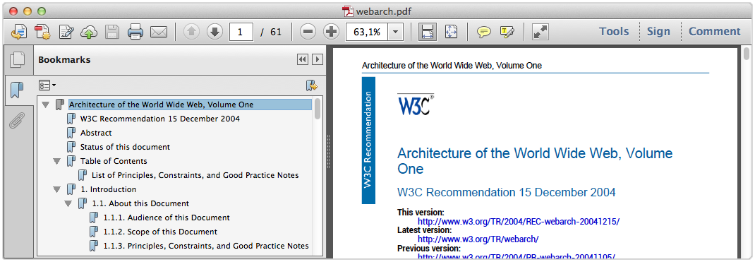 |
PDFreactor adds bookmarks to your document by using the following API method:
config.setAddBookmarks(true);
When the default HTML mode is enabled, the following bookmark levels are applied by default:
h1 { -ro-pdf-bookmark-level: 1;}
h2 { -ro-pdf-bookmark-level: 2;}
h3 { -ro-pdf-bookmark-level: 3;}
h4 { -ro-pdf-bookmark-level: 4;}
h5 { -ro-pdf-bookmark-level: 5;}
h6 { -ro-pdf-bookmark-level: 6;}
Using the #css-property-ro-pdf-bookmark-level style you can create bookmarks which link to arbitrary XML elements in your PDF files.
element { -ro-pdf-bookmark-level: 1 }
Using this property, one can structure the specified elements
within the bookmark view of the PDF viewer. The elements are ordered
in ascending order. The element with the lowest bookmark level is on top
of the bookmark hierarchy (similar to HTML headlines). Several bookmark
levels can be set using the -ro-pdf-bookmark-level style.
Links
PDFreactor can add links to your documents when using the following API method:
config.setAddLinks(true);
When the default HTML mode is enabled, the following link styles are applied by default:
a[href] { -ro-link: -ro-attr(href); }
a[name] { -ro-anchor: -ro-attr(name -ro-ident); }
Using the styles #css-property-ro-link and #css-property-ro-anchor arbitrary elements can be defined to be links or anchors.
linkElement[linkAttribute] { -ro-link: -ro-attr(linkAttribute); }
anchorElement[anchorAttribute] { -ro-anchor: -ro-attr(anchorAttribute -ro-ident); }
Please also see #Attachments.
The clickable areas of links. The style #css-property-ro-link-area can be used to specify how the 'clickable' areas of a link are determined:
-ro-link-area on block and split inline elements| Value | Clickable areas for block elements | Clickable areas for split inline elements |
|---|---|---|
content | one for each piece of content | one for each part |
block | one for the whole block | the bounding rectangle of all parts |
content-block | the bounding rectangle of the content | the bounding rectangle of all parts |
This style is not inherited. It has to be set on the same element as -ro-link.
Comments
It is possible to add PDF comments to the document using the following API method:
config.setAddComments(true);
Depending on how the comment information is stored in your HTML source document, there are several style rules that can be applied. The most common use-cases are to either create a comment from an empty element (where any information is stored in its attributes) or to create a comment from a non-empty element (where the content is the text encompassed by the element):
HTML.
<span class="comment" text="My Comment."></span>
CSS.
span.comment {
    -ro-comment-content: -ro-attr(text);
}
HTML.
<span class="comment">This text is commented</span>
CSS.
span.comment {
    -ro-comment-content: content();
}
There are different styles to visualize a comment in the PDF:
noteCreates a small icon. This is the default style for all comments.invisibleDoes not create any visual effects.highlightHighlights the background of a section of text.underlineUnderlines a section of text with a straight line.strikeoutStrikes out a section of text.squigglyUnderlines a section of text with a squiggly line.
The comment styles highlight, underline, strikeout
and squiggly are only applicable to comments that encompass a section of text.
The following example demonstrates how to style a simple comment.
HTML.
<span class="comment">This is a styled comment</span>
CSS.
span.comment {
    -ro-comment-content: content();
    -ro-comment-style: underline;
}
Note
The visualization is ultimately dependent on the PDF viewer and may vary across viewers and/or platforms.
Comments can be customized further by using a variety of style rules. Besides content and style, you can also customize the following properties:
Title: The title of the comment. In some cases, this is also used for the author. Use the CSS property #css-property-ro-comment-title to specify the title.
Color: The color of the comment. The default value for the color depends on the comment style chosen. Use the CSS property #css-property-ro-comment-color to set a color.
Date: The date of the comment. When no date is specified, the current date is used. Use the CSS property #css-property-ro-comment-date to set the date.
Date Format: The format of the date you specified. The syntax is identical to Java's SimpleDateFormat. Use the CSS property #css-property-ro-comment-dateformat to specify a date format for the comment's date.
Position: The position of the comment icon (only applicable for the comment style
note). Use the CSS property #css-property-ro-comment-position to specify a position for the comment's note icon.Initial state: The initial state of the comment, i.e. whether the comment should be open or closed when the PDF is opened in a viewer. Use the CSS property #css-property-ro-comment-state to specify the initial state of the comment bubbles. The state can be either
openorclosedwith the latter being the default value.
The following sample shows how to customize all of the aforementioned properties.
.comment {
    /* Content: get the content of the comment from the text content of the element */
    -ro-comment-content: content();
    /* Title: get the title from the "author" attribute of the element */
    -ro-comment-title: -ro-attr(author);
    /* Style: set the comment style to "note" */
    -ro-comment-style: note;
    /* Color: specify a color for the comment */
    -ro-comment-color: steelblue;
    /* Date: get the date from the "date" attribute of the element */
    -ro-comment-date: -ro-attr(date);
    /* Date Format: specify a custom date format */
    -ro-comment-dateformat: "yyyy/dd/MM HH:mm:ss";
    /* Position: shift the comment icon to the right side of the page */
    -ro-comment-position: page-right;
    /* Initial state: open comment bubbles when the PDF is opened */
    -ro-comment-state: open;
    /* additional styles */
}
Please see the documentation of the individual CSS properties for more information.
Advanced Comments. In some cases, comments have a separate start and end tag. In this case the additional style rules -ro-comment-start or -ro-comment-end have to be set to match the comment's start and end elements.
commentstart {
    /* some customizations */
    -ro-comment-content: -ro-attr(text);
    -ro-comment-title: -ro-attr(author);
    -ro-comment-style: highlight;

    /* define the comment start element */
    -ro-comment-start: -ro-attr(uid)
}

commentend {
    /* define the comment end element */
    -ro-comment-end: -ro-attr(uid);
}
Metadata
The title of a generated PDF document,
as well as the additional metadata author,
subject and keywords,
can be specified in multiple ways:
By default the <title> tag as well as
various <meta> tags are read.
The metadata can also be read from other elements using the properties #css-property-ro-title, #css-property-ro-author, #css-property-ro-subject and #css-property-ro-keywords.
Note:
When a metadata property applies to multiple elements the values are concatenated. Therefore it is recommended to disable the default set elements when specifying other ones:
title from first heading/* Disable setting title from title or meta tags */ head * { -ro-title: none; } /* Set title from first heading */ body > h1:first-of-type { -ro-title: content(); }
The metadata of the document can be overridden from the API:
config.setAuthor("John Doe");
config.setTitle("Architecture of the World Wide Web, Volume One");
config.setSubject("Architecture of the world wide web");
config.setKeywords("w3c, www");
The code above creates metadata as shown in the screenshot below:
 |
Custom Properties. You can also add custom properties to the documents, for which you can define the name and value, e.g.
config.getCustomDocumentProperties().add(
        new KeyValuePair("feedback address", "peter@miller.com"));
Interactive PDF Forms
HTML forms are automatically rendered by PDFreactor. In addition, you can also convert HTML forms to fully functional interactive PDF forms (sometimes referred to as AcroForms) using the proprietary CSS property #css-property-ro-pdf-format. This property must be specified for the forms you wish to convert to an interactive PDF form.
Example form:
<form id="credentials">
    First Name: <input type="text" value="firstname" />
    Last Name: <input type="text" value="lastname" />
    <input type="submit" />
</form>
To convert the form with the ID "credentials" to an AcroForm, you can use this style declaration:
#credentials, #credentials > input { -ro-pdf-format: pdf; }Using this style declaration, only the form with the ID "credentials" and the input fields contained in this form are converted to an AcroForm when the PDF is rendered. Only the forms and form elements having this CSS style are converted. You can convert all forms and input fields using this CSS code:
form, form input { -ro-pdf-format: pdf; }
Tagged PDF
Tagged PDF files contain information about the structure of the document. The information about the structure is transported via so-called "PDF tags". Tagging a PDF makes it accessible assitive technology like screen readers. Furthermore, it can improve the results of copy and paste and enable advanced export from the PDF, allowing destinations to replicate the document structure and to reflow text.
Using the setAddTags API method, you can add PDF tags to the
PDF documents generated with PDFreactor. If you are generating a
PDF from HTML input, the HTML elements and the resulting layout are automatically
mapped to the appropriate PDF tag structures, so all you have to do is set
the following property to enable this feature:
config.setAddTags(true);
Note:
PDF tagging is automatically enabled when it is required by a PDF conformance, like PDF/A-1a, PDF/A-3a or PDF/UA.
Creating tagged PDFs from non-HTML input documents. When generating PDFs from XML dialects, like DocBook, the elements of this XML language cannot be mapped to PDF tag types automatically. Most of the tag structure is still generated from the information available from the layout of paragraphs, lists, tables and so on. It is, however, necessary to manually mark elements with semantic or structural properties, especially headings.
To do so you can map XML elements to PDF tag types using proprietary CSS. The relevant properties are #css-property-ro-pdf-tag-type and #css-property-ro-alt-text, as well as to some extend #css-property-ro-pdf-tag-table-summary and #css-property-ro-pdf-tag-actual-text .
"-ro-pdf-tag-type" is used to map an element of the XML language you are using to a PDF tag, for example:
sect1 > title {
    -ro-pdf-tag-type: "H2";
}
If you were using DocBook, this would map the "title" elements inside "sect1" elements to the PDF tag "H2" (heading, level 2).
The property "-ro-alt-text" is used to specify an alternative description for an XML element. Example:
img {
    -ro-pdf-tag-type: "Figure";
}
img[alt] {
    -ro-alt-text: -ro-attr(alt);
}
The example above maps the HTML element <img> to the PDF tag "Figure",
and the content of its alt attribute to an alternative description for this tag.
You can use the property #css-property-ro-formelement-name to define
which elements or attributes in the input document are used as the source for the names of form elements in the generated PDF.
By default, the names are adopted from the value attribute of the form element.
Using the #css-property-ro-radiobuttonelement-group, the name for radio button groups can be adopted in the same way.
By default, it will be adopted from the name attribute of the radio button element.
PDF/A Conformance
PDFreactor
supports the creation of PDF/A-1a or PDF/A-3a
conformant files, as well as other PDF/A sub-formats, which, however, will not be covered in detail.
PDF/A is a family of ISO standards ("ISO 19005") for long-term archiving of documents.
The goal of these standards is to ensure the reproduction of the visual appearance as well as the inclusion of the document's structure.
All information necessary for displaying the document in the same way every time is embedded in the file.
Dependencies on external resources are not permitted. PDF/A-1a and PDF/A-3a
also require the output PDF documents to be tagged, providing accessible documents. PDFreactor will automatically ensure the requirements are met as far as possible.
Many companies and government organizations worldwide require PDF/A conformant documents.
PDF/A-1a is the strictest PDF/A standard while the newer PDF/A-3a is more lenient, e.g. allowing transparency and attachments.
PDF/A imposes the following restrictions, which PDFreactor
automatically enforces (overriding configuration settings), so no manual intervention is required unless noted otherwise:
All used fonts are embedded.
All images are embedded.
Multi-media content is forbidden.
PDF Script is prohibited. (Does not affect JavaScript in the source HTML document)
Encryption is disallowed.
The PDF must be tagged.
Metadata included in the PDF is required to be standard-based XMP.
Colors are specified in a device-independent manner. (see below)
Transparency is disallowed. (PDF/A-1 only)
Attachments are disallowed. (PDF/A-1 only)
PDF/A documents must use either RGB or CMYK colors exclusively (color keywords and gray
colors will be converted appropriately). By default RGB colors are expected. Using CMYK requires an output intent including an ICC profile.
(It is also possible to specify an RGB profile to replace the default sRGB.) Please see #OutputIntent.
To create a PDF/A conformant document, the method setConformance
can be used in the PDFreactor integration, e.g.:
config.setConformance(Conformance.PDFA3A);
The supported PDF/A conformance levels are PDF/A-1a, PDF/A-1b,
PDF/A-2a, PDF/A-2b, PDF/A-2u,
PDF/A-3a, PDF/A-3b and PDF/A-3u.
Recommendation:
It is also possible to create documents that are PDF/UA
compliant in addition to being PDF/A compliant, combining the benefits of both formats for maximum accessibility and archivability.
We highly recommend adding PDF/UA conformance when creating PDF/A documents:
config.setConformance(Conformance.PDFA3A_PDFUA);
PDF/UA Conformance
PDF/UA is a standard for accessible PDF documents,
which has been adopted as a recommendation or requirement by many organizations worldwide.
It primarily defines correct PDF tagging. The only other restriction that may require manual intervention is that the document must have a title.
(If the title is not specified in the input document, it can be set via the API method setTitle.)
PDFreactor can create PDF/UA compliant documents.
Tagging is done by a sophisticated algorithm. For most documents it does not require any manual tweaking
to produce results that pass accessibility checks with no errors and little to no warnings.
To create a PDF/UA conformant document, the method setConformance
can be used in the PDFreactor integration, e.g.:
config.setConformance(Conformance.PDFUA);
Recommendation:
It is also possible to create documents that are PDF/A compliant
in addition to being PDF/UA compliant, combining the benefits of both formats for maximum accessibility and archivability.
We recommend adding PDF/A-3a conformance when creating PDF/UA documents,
as long as the additional restrictions are met by the input document.
config.setConformance(Conformance.PDFA3A_PDFUA);
PDF/X Conformance
PDFreactor supports the creation of PDF/X conformant files,
specifically PDF/X-1a:2001, PDF/X-3:2002,
PDF/X-1a:2003, PDF/X-3:2003,
PDF/X-4 and PDF/X-4p.
PDF/X restrictions and requirements are enforced as far as possible, which may cause configuration settings to be overridden
or conversions to fail with an error message describing non-compliant content or settings that have to be resolved manually.
The restrictions and requirements of PDF/X include:
All Fonts must be embedded.
Multimedia content and non-printable annotations are prohibited.
Encryption is prohibited.
No scripts may be embedded. (This does not affect JavaScript in the input document.)
Transparency is prohibited (except in
PDF/X-4).Colors must be specified as CMYK, gray, keywords or spot. (
PDF/X-3relaxes this restriction to allow RGB. However, this requires ICC profile based conversion, which not ever print workflow can handle.)An output intent is required, consisting of an output condition identifier string and an ICC profile. (Depending on the exact conformance and target environment it may be legal or required to omit the ICC profile, as long as the identifier is known to the target environment. Constants for the default profiles of Adobe Acrobat Pro DC are available for usage with
PDF/X-4p. Please note that the availability of these default profiles may vary between different versions of Acrobat Pro.) Please see #OutputIntent.If the title is not specified in the input document, it can be set via the API method
setTitle.)
To create a PDF/X conformant document, the method setConformance
can be used in the PDFreactor integration, e.g.:
config.setConformance(Conformance.PDFX4);
ICC Profiles and Output Intents
PDFreactor allows you to set the output intent of the PDF document, consisting of an identifier and an ICC profile.
This is required for certain PDF/A and PDF/X conformance modes, with the ICC profile being optional in some cases.
The example below demonstrates how to use the API method setOutputIntent():
Configuration config = new Configuration();

OutputIntent outputIntent = new OutputIntent();
outputIntent.setIdentifier("ICC profile identifier");

// Use this if you are loading the ICC profile via URL (ignored if data is set)
outputIntent.setUrl("URL/to/ICC/profile");

// Use this if you want to specify the ICC profile's binary data
outputIntent.setData(iccProfileByteArray);

config.setOutputIntent(outputIntent);
The method setIdentifier() sets a string identifying the intended output device or production condition in human- or machine-readable form.
The method setUrl points to an ICC profile file and the method setData sets the binary data of such a profile, the latter having priority.
Print Dialog Prompt
PDFreactor can be configured to immediately display a print dialog when a PDF file created with PDFreactor is opened. To do so, the setPrintDialogPrompt method of the PDFreactor class must be used. Example:
config.setPrintDialogPrompt(true);
PDF Compression
Using the API method setFullCompression, PDF files can be generated with full compression, thus reducing the file size of the resulting PDF document.
Example usage:
config.setFullCompression(true);
Note
Your PDF reader needs to support Adobe PDF version 1.5 in order to be able to display PDF documents created with full compression enabled.
Encryption and Restrictions
PDFreactor can protect generated PDF documents via 40 or 128 bit encryption.
To encrypt the output PDF, set the encryption strength to a value other than ENCRYPTION_NONE:
config.setEncryption(Encryption.TYPE_128);
When the PDF document is opened, the user has to supply the user password in order to view the content. When no user password is set, the PDF can be viewed by any user. In either case, certain restrictions are imposed. These can be suspended by supplying the owner password. You can set the passwords as follows:
config.setUserPassword("upasswd");
config.setOwnerPassword("opasswd");
Both passwords are optional, but recommended for security reasons.
By default, all restrictions are imposed on the PDF document. You can, however, exclude selected ones by using the following methods:
| Method name | Allows ... |
|---|---|
setAllowPrinting | printing |
setAllowCopy | copying or otherwise extracting content |
setAllowAnnotations | adding or modifying annotations and interactive form fields |
setAllowModifyContents | modifying the content of the document |
setAllowDegradedPrinting | printing (same as setAllowPrinting, however, with a limited resolution) (128 bit encryption only) |
setAllowFillIn | filling in form fields (128 bit encryption only) |
setAllowAssembly | inserting, removing and rotating pages and adding bookmarks (128 bit encryption only) |
setAllowScreenReaders | extracting content for use by accessibility devices (128 bit encryption only) |
See:
API docs for further information.
Viewer Preferences
You can configure the initial presentation of the document in the viewer by setting viewer preferences. Setting viewer preferences will activate / deactivate certain options of the viewer, for example it allows to hide the viewer's toolbar when the document is opened.
Note that these preferences are not enforced, i.e. if you decide to set the HIDE_TOOLBAR preference, the user can still display
the toolbar again when viewing this PDF if he decides to do so. Setting this preference only affects the default state of the toolbar
when the document is opened, but does not enforce this state.
Some viewer preferences also influence the default settings of the print dialog of the viewer.
You can set viewer preferences by using the method setViewerPreferences. Multiple preferences can be combined
using the OR operator, e.g.:
config.getViewerPreferences().add(ViewerPreferences.PAGE_LAYOUT_SINGLE_PAGE);
config.getViewerPreferences().add(ViewerPreferences.DISPLAY_DOC_TITLE);
PDFreactor supports the following viewer preferences:
| Viewer Preference | Effect |
|---|---|
PAGE_LAYOUT_SINGLE_PAGE | Display one page at a time. (default) |
PAGE_LAYOUT_ONE_COLUMN | Display the pages in one column. |
PAGE_LAYOUT_TWO_COLUMN_LEFT | Display the pages in two columns, with odd numbered pages on the left. |
PAGE_LAYOUT_TWO_COLUMN_RIGHT | Display the pages in two columns, with odd numbered pages on the right. |
PAGE_LAYOUT_TWO_PAGE_LEFT | Display two pages at a time, with odd numbered pages on the left. |
PAGE_LAYOUT_TWO_PAGE_RIGHT | Display two pages at a time, with odd numbered pages on the right. |
PAGE_MODE_USE_NONE | Show no panel on startup. |
PAGE_MODE_USE_OUTLINES | Show bookmarks panel on startup. |
PAGE_MODE_USE_THUMBS | Show thumbnail images panel on startup. |
PAGE_MODE_FULLSCREEN | Switch to full screen mode on startup. |
PAGE_MODE_USE_OC | Show optional content group panel on startup. |
PAGE_MODE_USE_ATTACHMENTS | Show attachments panel on startup. |
HIDE_TOOLBAR | Hide the viewer application's tool bars when the document is active. |
HIDE_MENUBAR | Hide the viewer application's menu bar when the document is active. |
HIDE_WINDOW_UI | Hide user interface elements in the document's window. |
FIT_WINDOW | Resize the document's window to fit the size of the first displayed page |
CENTER_WINDOW | Position the document's window in the center of the screen. |
DISPLAY_DOC_TITLE | Display the document's title in the top bar. |
NON_FULLSCREEN_PAGE_MODE_USE_NONE | Show no panel on exiting full-screen mode. Has to be combined with PageModeFullScreen. |
NON_FULLSCREEN_PAGE_MODE_USE_OUTLINES | Show bookmarks panel on exiting full-screen mode. Has to be combined with PageModeFullScreen. |
NON_FULLSCREEN_PAGE_MODE_USE_THUMBS | Show thumbnail images panel on exiting full-screen mode. Has to be combined with PageModeFullScreen. |
NON_FULLSCREEN_PAGE_MODE_USE_OC | Show optional content group panel on exiting full-screen mode. Has to be combined with PageModeFullScreen. |
DIRECTION_L2R | Position pages in ascending order from left to right. |
DIRECTION_R2L | Position pages in ascending order from right to left. |
PRINTSCALING_NONE | Print dialog default setting: disabled scaling |
PRINTSCALING_APPDEFAULT | Print dialog default setting: set scaling to application default value |
DUPLEX_SIMPLEX | Print dialog default setting: simplex |
DUPLEX_FLIP_SHORT_EDGE | Print dialog default setting: duplex (short edge) |
DUPLEX_FLIP_SHORT_EDGE | Print dialog default setting: duplex (long edge) |
PICKTRAYBYPDFSIZE_FALSE | Print dialog default setting: do not pick tray by PDF size |
PICKTRAYBYPDFSIZE_TRUE | Print dialog default setting: pick tray by PDF size |
Note:
The PAGE_LAYOUT_ preferences are overridden by the
@-ro-preferences properties
#css-property-page-layout and
#css-property-first-page-side-view.
Merging PDFs
A generated PDF can easily be merged with existing ones. To merge
with a single PDF use the setMergeURL(String)
method that declares the path to the existing PDF file.
config.setMergeURL("http://www.myserver.com/overlaid.pdf");
To merge multiple PDFs use the methods setMergeURLs
or setMergeByteArrays.
String[] urls = {"http://www.myserver.com/overlaid1.pdf",
        "http://www.myserver.com/overlaid2.pdf"};
config.setMergeURLs(urls);
Whether the generated PDF is appended or laid over the existing PDFs depends on the general type of merge:
Concatenation
Arrange
Overlay
Concatenation merges append the generated PDF before or after the existing ones. The following sample shows how to append the generated PDF after the existing one:
config.setMergeURL("http://www.myserver.com/appendDoc.pdf");
config.setMergeMode(MergeMode.APPEND);
To append the generated PDF before the existing ones use MergeMode.PREPEND.
Arrange inserts specified pages of PDFs into the generated PDF.
This merge mode has to be combined with setPageOrder
(see #PageOrder)
in order to specify which page should be inserted where.
The following sample shows how to insert the first page of an existing PDF
after the second page of the generated one:
config.setMergeURL("http://www.myserver.com/insertionDoc.pdf");
config.setMergeMode(MergeMode.ARRANGE);
config.setPageOrder("1,1:1,2..-1");
More information on the syntax can be found at #MergeModeArrange
Overlay merges add the generated PDF above or below existing PDFs. The following sample shows how to overlay an existing PDF:
config.setMergeURL("http://www.myserver.com/overlaid.pdf");
config.setMergeMode(MergeMode.OVERLAY);
To add the generated PDF below the existing one use MergeMode.OVERLAY_BELOW.
PDFreactor allows to repeat the pages of PDFs with less pages than
other PDFs involved in the merger. The API method
setOverlayRepeat offers different options to do
this:
repeat only the last page
repeat all pages of the PDF
do not repeat any pages
trim to page count of the shorter document
In the following example, all pages are repeated:
config.setOverlayRepeat(Overlay.REPEAT_ALL_PAGES);
The default merge behavior of PDFreactor is a concatenation after the pages of the existing PDFs.
Digital Signing
PDFreactor is able to sign the PDFs it creates. This allows to validate the identity of the creator of the document. A self-signed certificate may be used. A keystore file in which the certificate is included, is required.
The keystore type is required to be one of the following formats:
"pkcs12"
"jks"
PDFreactor supports the following three modes to sign a PDF:
Self-signed
Windows certificate
VeriSign
To sign a PDF digitally use the API method
setSignPDF.
Note:
If a PDF is signed via the VeriSign signing mode, a plugin for the PDF viewer is required to show the signature.
Font Embedding
By default, PDFreactor automatically embeds the required subsets
of all fonts used in the document. This can be disable using the method setDisableFontEmbedding.
config.setDisableFontEmbedding(true);
Doing so reduces the file size of the resulting PDF documents. However, these documents are likely to not look the same on all systems. Therefore this method should only be used when necessary.
Overprinting
Overprinting means that one color is printed on top of another color. As this is a feature for printing it should be used with CMYK colors.
PDFreactor can set the values of the PDF graphics state parameters overprint
and overprint mode via CSS. This can be enabled using the API method setAddOverprint:
config.setAddOverprint(true);
Using the styles -ro-pdf-overprint and -ro-pdf-overprint-content
you can specify the overprint properties of elements and their content to
either none (default), mode0 or mode1 (nonzero overprint mode).
-ro-pdf-overprint affects the entire element, while -ro-pdf-overprint-content
only affects the content of the element (not its borders and backgrounds). In both cases the children of the element
are affected entirely, unless overprint styles are applied to them as well.
The following example sets small text on solid background to overprint, without enabling overprinting for the background of either the paragraphs or the highlighting spans:
p.infobox {
    border: 1pt solid black;
    background-color: lightgrey;
    color: black;
    font-size: 8pt;
    -ro-pdf-overprint-content: mode1;
}
p.infobox span.marked {
    background-color: yellow;
    -ro-pdf-overprint: none;
    -ro-pdf-overprint-content: mode1;
}
Note:
When having small text with a background, overprinting can be very helpful to avoid white lines around the text, if the printing registration is imperfect.
Attachments
Alternatively to linking to external URLs (see #Links) PDFreactor also allows embedding their content into the PDF.
Attachments can be defined via CSS, which can be enabled by the API
method setAddAttachments:
config.setAddAttachments(true);
The following styles can be used to specify attachments:
#css-property-ro-pdf-attachment-url:
A URL pointing to the file to be embedded. This URL can be relative. Specifying "#" will embed the source document.
#css-property-ro-pdf-attachment-name:
The file name associated with the attachment. It is recommended to specify the correct file extension. If this is not specified the name is derived from the URL.
#css-property-ro-pdf-attachment-description:
The description of the attachment. If this is not specified the name is used.
#css-property-ro-pdf-attachment-location:
element(default): The attachment is related to the area of the element. Viewers may show a marker near that area.document: The file is attached to the document with no relation to the element.
Attachments can be specified for specific elements as follows:
#downloadReport {
    -ro-pdf-attachment-url: "../resources/0412/report.doc";
    -ro-pdf-attachment-name: "report-2012-04.doc";
    -ro-pdf-attachment-description: "Report for April of 2012";
}
Strings can be dynamically read from the document using the CSS functions -ro-attr
and #css-property-content, that read specified attributes or the text content of the element respectively.
Using those, certain a-tags can be changed from links to attachments:
.downloadReports a[href] {
    -ro-link: none;
    -ro-pdf-attachment-url: -ro-attr(href);
    -ro-pdf-attachment-description: content() " (" -ro-attr(href) ")";
}
Attachments can also be set via the API method addAttachment.
This method also allows specifying the content of the attachment as a byte array instead of an URL,
so dynamically created data can be attached:
config.getAttachments().add(new Attachment("sample attachment text".getBytes(), null,
        "sample.txt", "a dynamically created attachment containing text"));
config.getAttachments().add(new Attachment(null, "../resources/0412/report.doc",
        "report-2012-04.doc", "Report for April of 2012"));
PDF Script
Note:
This chapter refers to Scripts added to the resulting PDFs, processed by the PDF-viewer. There are also:
Some PDF viewers (e.g. Adobe Reader) allow the execution of JavaScript, which has been added to the PDF. This way, the document can be changed and dynamic content can be added long after the conversion is complete. Of course the structure of the PDF is different from the HTML and addressing certain elements with PDF scrips has to be done differently.
Please note, that support for PDF scripts is not wide spread among PDF reader software.
PDFreactor allows two ways to add such scripts to the converted PDF. The scripts
can be added using the API method addPdfScriptAction. The parameters
are the script as a string and the event which should trigger the script.
The known events are:
open: These scripts are triggered when opening the PDF in a viewer.
close: These scripts are triggered when closing the PDF.
before save: These events are triggered just before the viewer saves the PDF.
after save: These events are triggered after the viewer has saved the PDF.
before print: These events are triggered just before the viewer prints the PDF.
after print: These events are triggered after the viewer has printed the PDF.
Note:
These PDF scripts must not be confused with the JavaScript that is executed while creating the PDF. PDF scripts basically use the JavaScript syntax, however, they are executed (if this feature is supported and enabled by the viewer application) at a completely different time, e.g. when opening the PDF.
The second way to set scripts is by using the proprietary CSS property pdf-script-action. By using this property, one can define the PDF scripts in the original document. For more information on this property, please see #DocumentSpecificPreferences.
Please note, that the PDF scripts set via the CSS property have a higher priority than those defined via API.
For each trigger event there can be only one script. When setting scripts several times on the same event, only the last one set will be added to the PDF.
Image Output
In addition to PDF, PDFreactor, with the optional Raster Image Output, supports the following image output formats:
PNG (optionally with transparent background)
JPEG
GIF
TIFF (supports multi-page images; can use the following compression methods: LZW, PackBits, Uncompressed, CCITT 1D, CCITT Group 3 & CCITT Group 4)
BMP
These can be selected using the method setOutputFormat, e.g.:
config.setOutputFormat(new OutputFormat(OutputType.PNG, 512, -1, false));
The later two parameters set the width and height of the resulting images in pixels.
If either of these is set to a value of less than 1 it is
computed from the other value and the aspect ratio of the page.
See:
#MediaFeatures for the media feature -ro-output-format,
which allows setting styles specific for PDF or image output.
Selecting a page
All image output formats, except for the TIFF formats, create an image of a single page.
By default, this is the first page. A different page can be selected using the method setPageOrder, e.g.:
config.setPageOrder("5");Converting a Document Into Multiple Images
To convert a document into multiple images, you have to set
the multiImage parameter of your OutputFormat to
true e.g. like this:
config.setOutputFormat(new OutputFormat(OutputType.PNG, 512, -1, true));
The getDocumentArray() method of the Result object then
returns an array of byte arrays, each containing an image representing one page of the document.
Continuous Output
The method setContinuousOutput sets PDFreactor to continuous mode.
In this mode each document is converted into one image. Also screen styles will be used and print styles will be ignored,
resulting in a very browser-like look for the output image.
config.setContinuousOutput(new ContinuousOutput(1024, 768));
The first parameter sets the width of the layout. This has the same effect as the width of a browser window.
This only changes the layout. The result will still be scaled to the width specified by setOutputFormat
The second parameter sets the height. This has the same effect as the height of a browser window,
i.e. it will cut off the image or increase its height.
Values of less than 1 cause the full height of the laid out document to be used.
Layout Documents
- Basic Page Layout
- Breaking Text
- Generated Content
- Page Header & Footer
- Generated Content for Pages
- Transforms
- Multi-column Layout
- Line Grids and Snapping
- Region Layout
- Breaking Boxes
- Advanced Page Layout
- Leaders
- Table of Contents
- Shrink-to-Fit
- Page Order
- Pages Per Sheet
- Booklet
- Pixels per Inch
- Media Queries
- Document-Specific Preferences
This chapter provides information on how to lay out a document.
The document layout mostly depends on CSS but there are PDFreactor API methods and JavaScript functionality that may be of use too to achieve the desired results.
Basic knowledge about CSS is recommended.
Basic Page Layout
PDFreactor renders HTML and XML documents on pages. The rules to achieve that are provided by CSS.
The document content is laid out page by page, whenever there is no more space left on a page, PDFreactor automatically breaks text and boxes to the next.
Note:
Basic page styles are provided for HTML. Page style for XML documents need to be created based on the document language.
Page Selectors
To create an individual page layout pages need to be selected with CSS. In principle it works the same way as selecting an element, but the selector is different.
To select all pages of the document, the @page
rule is used instead of the usual element selector.
@page {
    margin: 1in
}
Using the pseudo-classes :first,
:left and :right makes it
possible to select the first, all left or all right pages. This
allows to define different style for certain pages, e.g. for a
title page.
@page{
    margin-top: 2in;
    margin-bottom: 6in
}
@page:left{
    margin-left: 4in;
    margin-right: 3in
}
@page:right{
    margin-left: 3in;
    margin-right: 4in
}
Note:
Which pages are left or right can be specified via the @-ro-preferences property #css-property-first-page-side
Nth Page
It is possible to select any page by using the prefixed CSS3
pseudo-class :-ro-nth(). This pseudo-class takes the
a function of the form An+B, similar to the pseudo-class
:nth-child().
A single page can be selected (:-ro-nth(3) selects the
third page) or the function can be used to select multiple pages. For example,
:-ro-nth(2n) selects every second page (i.e. even pages), while
:-ro-nth(2n+1) selects the first and every other page (odd pages).
Note that the selected page number is independent of the page counter, which is used to display page numbers and which can be manipulated.
Last Page
As the counterpart to :first, there is the
proprietary selector :-ro-last. It allows to select
the last page of the document.
Please note that as the content of the last page is only known after its content has been computed, there can be situations where the last page is empty. This can happen if the styles that are applied to the last page influence the layout of the page content, e.g. changing the page margins.
Page Size & Orientation
The size and orientation of a page can be set with the #css-property-size property. PDFreactor supports many different page sizes, see Appendix Supported Page Size Formats.
@page{
    size: letter portrait
}
To set a page to landscape orientation, "portrait" is replaced by "landscape":
@page{
    size: letter landscape
}
Instead of setting fixed page formats with a specified orientation it is also possible to set two length values. These then define page size and orientation.
@page{
    size: 4.25in 6.75in
}
Named Pages
With Named Pages an element is able to create and appear on a special page that has a name. This name can be used as part of a Page Selector to attach additional style properties to all pages of that name.
To create a Named Page, an element receives the #css-property-page property with a page name as identifier.
<table> elements have
to appear on pages with the name pageName.
table{
    page: pageName
}
A page break will be inserted before an element that has the
page property set. Another page break will
be inserted for the next element that defines a different page
name (or none) to ensure the Named Page only contains elements
that specify its name.
To attach style to a named page, the page name is added to
the @page rule. The page name is not a
pseudo-class as :first is. There is a space
between @page and the page name, not a
colon.
@page pageName{
    size: letter landscape
}
Breaking Text
Text is broken whenever there is not enough space left, e.g. inside the line or on the page.
Automatic Hyphenation
Automatic Hyphenation allows breaking words in a way appropriate for the language of the word.
To use Automatic Hyphenation two requirements must be met:
The text to hyphenate requires a language set in the document.
The language set for the hyphenated text is supported by PDFreactor (see Appendix #HyphenationDictionaries for more information)
The lang attribute in HTML or the
xml:lang attribute in XML allow defining a
language for the document and on individual elements, in case
they deviate from the document language.
<html lang="en">
    ...
</html>
Hyphenation is enabled or disabled via CSS with the #css-property-hyphens property:
noHyphenation class.
html {
    hyphens: auto
}
p.noHyphenation {
    hyphens: none
}
In addition it is possible to specify the number of minimum letters before or after which text can be broken within a word. This is done with the #css-property-hyphenate-before and #css-property-hyphenate-after properties.
Widows & Orphans
Definition: Widow
If the last line of a paragraph is also the first line of a page it is called a widow.
Definition: Orphan
If the first line of a paragraph is also the last line of a page it is called an orphan.
By default, PDFreactor avoids widows and orphans by adding a page break before the paragraph. This behavior can be changed with the CSS properties #css-property-widows and #css-property-orphans.
p {
    orphans: 2;
    widows: 2
}
Changing the value to 1 will allow widows and orphans.
Changing it to higher integer values will prevent even multiple
line widows and orphans. (e.g.: orphans: 5
means that if the first 4 lines of a paragraph are the last 4
lines of a page these lines are considered an orphan.)
Generated Content
Generated content does not originate from the document. It is created by CSS during the rendering process and appears in the rendered result as if it was part of the document.
The pseudo-elements ::before and
::after are used to generate content before or
after an element. The actual content is created with the
#css-property-content property.
Generated Text
To create generated text, set a String as value of the
content property.
<div> element.HTML:
<div>This is a note.</div>
CSS:
div::before{
    /* Adds the text "Note:" at the start of the element. */
    content: "Note:";

    padding-right: 0.1in;
    font-weight: bold
}
div{
    border: 1px solid black;
    background-color: palegoldenrod;
    padding: 0.1in
}
As a result, the <div> would look
like this:
This is a note.
Sometimes it is necessary to add an explicit line break to
generated text. To create such a line break, a
"\A" needs to be added to the String and the
#css-property-white-space property needs to be set to either
pre, pre-wrap or
pre-line.
div::before{
    content: "RealObjects\APDFreactor";
    white-space: pre
}
The result would look like this:
If the first character after the line break
is an HTML entity, add an additional space between the
"\A" and the entity.
Generated Images
A generated image can be created with the image's URL set as
value of the content property.
h1::before{
    content: url("http://mydomain/pictures/image.svg")
}
Counters
Counters can be used to count elements or pages and then add the value of the Counter to generated text.
A Counter needs to be defined either with the
#css-property-counter-reset or the
#css-property-counter-increment property. Its value is
read with the counter() function as value of
the content property.
A common use-case for Counters are numbered headings. The chapter heading of a document is intended to display a number in front of its text that increases with each chapter.
<h1>
elements using Counters and Generated Text.h1{
/* increases the counter "heading1" by 1 on each <h1> element */
counter-increment: heading1 1
}
h1::before{
/* Adds the current value of "heading1" before the <h1> element's
text as decimal number */
content: counter(heading1, decimal)
}Subchapter headings, work the same way, with a simple
addition. The number of each subchapter is intended to be
reset whenever a new chapter begins. To restart numbering, the
counter-reset property is used.
h1{
    /* resets the value of counter "heading2" to 0 on every  <h1> element */
    counter-reset: heading2 0
}
h2{
    counter-increment: heading2 1
}

h2::before{
    /* Shows the current value of "heading1" and "heading2", separated by a
       generated text ".", the value of "heading2" is shown as lower-case
       letter */
    content: counter(heading1, decimal) "." counter(heading2, lower-alpha)
}Generated Content for Pages
Additional features for #GeneratedContent are available within Page Margin Boxes.
Page Counters
To add page numbers to documents, Page Counters are used. Page Counters work like regular counters, but are defined on pages and accessed in page margin boxes.
The default Page Counter is named "page" and automatically defined in HTML documents.
@page{
    @bottom-right{
        content: counter(page)
    }
}
Note:
For XML documents you can define the Page Counter as follows.
@page:first {
    counter-reset: page applicationValue("com/realobjects/pdfreactor/start-page-number");
}
Additionally there is the "pages" counter,
which is always defined as the total number of pages of the laid out document.
page and pages counters.content: "Page " counter(page) " of " counter(pages)
Named Strings
Named Strings allow to store the text of an element and its #GeneratedContent as String for use in Page Margin Boxes.
A Named String is defined very similar to a
Counter and
is used in a similar way. To create a Named String the property
#css-property-string-set is used, which requires an
identifier and a definition of the contents of the String. To
read a Named String the string() function is
used as value of the content property.
headingString" created
from the heading's text with the function
content() and read with the
string() function from the page header.
h1 {
    string-set: headingString content(text);
}
@page{
    @top-left{
        content: string(headingString);
    }
}
The content of a named String is very flexible and can take a
combination of Strings, counter() functions
and Named String keywords.
/* Creates a Named String in the form of "Chapter [chapter number]: [chapter title]". */
h1{
    string-set: headingString "Chapter " content(before) ": " content()
}
/* Retrieves the first letter of an address element, useful as part of a page header
    for a sorted list of addresses */
address{
    string-set: addressEntry content(first-letter);
}
Named Strings are similar to
#RunningElements
in that they can occur multiple times on the same page and are
accessed from Page Margin Boxes. Similar to the
element() function, the
string() function allows to add a second
argument to specify which Named String inside a page should be
used:
startRetrieves the latest Named String of the name from previous pages.
If there is none, nothing is displayed.
firstRetrieves the first Named String of the name on the page.
If there is none, it falls back to the behavior of
start.This is the default behavior if no argument is given.
lastRetrieves the last Named String of the name on the page.
If there is none, it falls back to the behavior of
start.
last-exceptIf a Named String of the name is on the page, nothing is displayed.
If there is none, it falls back to the behavior of
start.
Cross-references
A Cross-reference is a piece of text that references another location in the document in order to establish a thematic relationship to that location.
Although it is perfectly possible to add such references by hand, this approach is prone to error when creating and modifying the document. After a change the numbering and page numbers might not match the numbering from when the cross-reference was first defined. The same could happen to the reference text if it includes the chapter title.
To automatically keep the reference up-to-date with the
referenced location, CSS provides the
target-counter() and target-text()
functions to automatically retrieve the exact numbering, title
or page number of the referenced location.
Note:
PDFreactor only resolves internal links referring to an anchor in the same input document, see the chapter #Links for more information.
Counter Cross-references
The target-counter() function is used
inside the content property the same
way a counter() function would be used.
It receives a URL to the referenced location and the name
of the counter as identifier. It may receive an optional
third argument to define the output style of the counter,
just like the counter() function.
target-counter() functions to retrieve
the page and chapter numbers.HTML:
...
<p>For more information <a href="#chapter">see</a>.
...
<h1 id="chapter">Cross-references</h1>
...
CSS:
@page{
    counter-increment: pageCounter;
    @bottom-right{
        content: counter(pageCounter);
    }
}
h1{
    counter-increment: chapterCounter;
}
h1::before{
    content: counter(chapterCounter, upper-roman);
}
a[href]::after{
    content: "Chapter " target-counter(-ro-attr(href url), chapterCounter, upper-roman)
                " on page " target-counter(-ro-attr(href url), pageCounter);
}
Assuming the referenced chapter would render on page 5 as the third chapter, the cross-reference would read:
For more information, see Chapter III on page 5.
Text Cross-references
The target-text()
function is used inside the content property in a similar way as the
target-counter() function is used. It
receives a URL to the referenced location and takes one of
these four keywords to specify the text to retrieve:
content- Retrieves the textual content of the element. This is the default keyword if no keyword is present.first-letter- Retrieves the first letter of the element's textual content.before- Retrieves the before #GeneratedContent of an element.after- Retrieves the after #GeneratedContent of an element.
The following example shows a cross-reference that references a heading and shows its before Generated Content and text:
a[href]{
    content: target-text(-ro-attr(href url), before) " "
        target-text(-ro-attr(href url), content);
}
Note:
target-text() makes it easy to
retrieve the before Generated Content of an element,
which may include its numbering. This method does not
require any knowledge about how this before Generated
Content is created but it also does not allow to
rebuild it into something different.
If the before Generated Content of an element is
"2.1" and the page header should be
"Chapter 2, Section 1" the
target-counter()
function provides the necessary means to retrieve all
the
#Counters
individually.
Footnotes
A footnote is a text note placed on the bottom of a page. It references a specific part of the main content of the document, giving further explanations or information about a citation. A footnote is marked by a defined symbol both in the main content of the page and in the footnote area at the bottom of the page, to show which parts belong together.
For content that is required to have a footnote, the following style can be applied:
float: footnote
The text content
of the element that the style applied to, will appear in the footnote area at the bottom of the page. Content in the footnote area
can be styled via CSS using the footnote rule.
.footnote {
    float: footnote;
}
@page {
    @footnote {
        border-top: solid black 1px;
    }
}
By defining a footnote, a footnote call is left behind in the main content. Its content and style can be influenced by the
footnote-call pseudo-element.
For every footnote element, there is also a footnote-marker pseudo-element added. Usually this contains the same
number or symbol as the footnote-call it belongs to.
.footnote::footnote-call {
    content: counter(footnote, decimal)
}
.footnote::footnote-marker {
    content: counter(footnote, decimal);
}
By default, the footnote counter is available and is automatically incremented for every element with the style:
float: footnote
By default, this counter numbers the footnotes sequentially for the entire document. To number footnotes on a per-page basis, the counter has to be reset on every page, using the following style:
@page {
    counter-reset: footnote;
}
Note:
PDFreactor currently does not support Footnotes inside Multi-column layouts.
Transforms
2D Transforms
PDFreactor is capable of transforming elements with the #css-property-transform property, which makes moving, rotating and scaling document content possible.
Note:
2D Transforms do not have an impact on the document layout, e.g. content with scaled up size will not push other content away to prevent overlapping.
Reduce Table Width with Rotated Table Headers
#awesomizr is able to automatically reduce the width of table headers with 2D transforms.
The rotateTableHeaders() function
transforms and rotates a table header, in order to reduce
its width. If there is no table header, the first line is
converted to one.
This function takes two parameters:
table: The HTML node of the tableparams: An object of optional parameters
| Key | Description | Default |
|---|---|---|
angle | The angle in degrees at which the header will
be rotated. Should be between
-90 and 90 | 45 |
width | The width that the header cells should have after
the transformation, e.g. "20pt". | "auto" |
firstCol | Whether to prevent the first column from being transformed. | false |
lastCol | Whether to prevent the last column from being transformed. | false |
footer | Whether to automatically create a <tfoot>
element from the last row in the table. Has no effect if
the table already contains a <tfoot>. | false |
Multi-column Layout
The content of a document can be arranged in columns with elements like images or titles spanning through all columns if desired. Elements are laid out in a way similar to pages, text and boxes will break whenever no space is left in a column.
Multi-column layout is often used in print products like newspapers or magazines, it is intended to reduce the line width to make text easier to read.
The following box shows how text flows in a three-column layout. The paragraphs are numbered to better visualize the effect of multi-column layout.
[1] Lorem ipsum dolor sit amet, consectetur adipiscing elit. Nulla in libero turpis. Sed sed dolor diam, eu dapibus quam. Quisque ut nulla purus, iaculis sollicitudin erat. Nullam dictum suscipit porttitor.
[2] Aliquam aliquam elementum elementum. Donec vel odio nec diam ullamcorper ultricies vel sit amet elit. Cras non aliquet lectus.
[3] Donec sollicitudin lorem placerat est condimentum rutrum. Fusce tempor cursus rutrum. Duis mattis mattis sapien. Phasellus tempus iaculis tellus sed vestibulum.
[4] Etiam faucibus consectetur augue, sit amet interdum elit dapibus at.
To create a multi-column layout inside an element add either the property #css-property-column-count or #css-property-column-width or both. By adding them the element becomes a multi-column element.
The column-count property defines the number of columns inside the element. Any number greater than 1 will create a multi-column layout. The column-count property is especially useful if the actual width of the columns is not as important as the number of columns.
The column-width property is used to control how wide columns inside the element should be. The number of columns is computed from that value. Therefore the actual width of the columns may be wider or narrower than the specified width. This property is useful if the general width of the columns is more important than the number of columns.
If both properties are used the resulting layout tries to honor both values. column-count will provide the maximum number of columns in most cases.
/* define two columns */
div.twoColumns{ column-count: 2 }

/* define columns with a width of 2in */
div.twoInchColumns { column-width: 2in }
Note:
PDFreactor currently does not support #Footnotes inside Multi-column layouts.
By default, PDFreactor aims to balance the content of columns so that the content of all individual columns is equally long, if possible. This has the effect of keeping the height of each column at the possible minimum, which automatically determines the height of the multi-column element as a whole if it wasn't defined by a height property or attribute.
This behavior can also be modified to fill columns sequentially. In this case, the columns are filled until no more space is available in one column and the rest of the content needs to be moved to the next column. With this behavior a multi-column element whose height is not restricted will take up all the remaining space inside the multi-column-element, up to the remaining space available on the page until it breaks to another column.
The filling behavior can be controlled with the #css-property-column-fill property:
/* sequential filling behavior */
div.sequentialFill{ column-fill: auto }

/* balanced filling behavior */
div.balancedFill{ column-fill: balance }
A defined height on the multi-column element will be used for an element, regardless of the filling behavior. If there is less content than there is space inside the multi-column-element a balanced filling behavior will create smaller columns, leaving space at the bottom of the multi-column element. Sequential filling behavior may not have enough content to fill all the columns. If there is more content than there is space inside the multi-column element, the multi-column element will create a page break and continue on the next page, at the first column.
Usually elements inside a multi-column element are laid out one after another in columns automatically defined by the filling behavior. Some elements, however, may require a certain behavior when inside columns.
There are elements that are required to span all columns inside the multi-column element instead of only one. Headings, pictures or tables are the most common examples. To have an element span all columns the #css-property-column-span property is used.
/* a heading that spans all columns */
h1{ column-span: all }

/* a table in a single column */
table{ column-span: none }
To add some visual appeal to the multi-column element borders, backgrounds and padding can be used. Beside these standard styles multi-column elements can also receive additional styles for the space between columns.
To visually separate columns it is possible to define the gap width. Gaps can be considered as padding between columns. To define the gap width for a multi-column element the #css-property-column-gap property is used.
/* a gap of 0.25in */
div.multiColumn{ column-gap: 0.25in }
In addition to the gap a rule can be added between the columns as additional visual aid for separating columns. To define rules for a multi-column element the property either the #css-property-column-rule shorthand or the individual properties #css-property-column-rule-width, #css-property-column-rule-style or #css-property-column-rule-color can be used.
/* a solid black rule with 0.1in width*/
div.multiColumn{
    column-rule-width: 0.1in;
    column-rule-style: solid;
    column-rule-color: black
}

/* the same definition as shorthand */
div.multiColumn{ column-rule: 0.1in solid black }
Note
A Multi-column layout with justified text looks best when the text is laid out with #AutomaticHyphenation enabled.
Line Grids and Snapping
With CSS it is possible to align lines of text to invisible grids in the document. This greatly improves readability of duplex printing or for documents with multi-column layouts. Lines remain at the same position on every page, thus keeping a vertical rhythm which is very beneficial to the reading experience.
The below images show how snapping to the line grid works and how it improves readability in a text with two columns (the line grid is visualized by the dotted lines).
 |
 |
Snapping to grid can be enabled by using the CSS property #css-property-ro-line-snap. In addition to snapping to the baseline of the grid, it is also possible snap line boxes to the center of two of the grid's lines. The latter may be beneficial for text that contains small and large font sizes because the space in the grid is used more efficiently.
/* snapping to baseline */
p {
    -ro-line-snap: baseline;
}

/* snapping between grid lines */
p {
    -ro-line-snap: contain;
}
Line grids are created automatically. Normally, one line grid is created for the root element on each page and is then used by all its block-level descendants. It is also possible to create a new line grid for a block using its own font and line height settings. This is very useful for multi-column containers as it might be undesirable for such a container to use its parent's grid. A new grid can be created with the following style declaration, using the CSS property #css-property-ro-line-grid:
div {
    -ro-line-grid: create
}
Region Layout
Regions are containers for document content similar to pages or columns, but they can be positioned individually. In contrast to automatically created pages and columns, regions are based on block elements from the document, which presents them with more styling options.
Regions belong to a region chain, that connects them and tells how their contents flows from one to another. The content of a region chain is called the named flow and elements can be added to a named flow to be displayed in regions.
Adding Regions to Region Chains
Most block elements can be defined as a region. They are not required to be of the same size nor are they required to be the same node name.
To create a region from a block element, the #css-property-ro-flow-from property is used. It receives an identifier. A region chain contains all regions of the same identifier in document order. The identifier is also the name of the named flow these regions will display.
Note
A region element will not have its subtree rendered. It either displays content from a named flow or nothing.
div elements with IDs
"region1" and
"region2".
#region1, #region2{
    -ro-flow-from: regionChainName;
}
PDFreactor automatically lays out content inside regions and breaks text and boxes where no space is left. The number of regions inside a region chain is limited by the number of associated Region elements though and it is possible that the content of a named flow occupies more space than is available inside the regions of a region chain. In that case content from the named flow overflows the last region inside the region chain.
Note
A region does not influence the style of the content it contains. No style is inherited from a region into the displayed named flow and style that would influence the content of an element has no effect on a region's content.
Adding Content to a Named Flow
The –ro-flow-into property adds document content to a named flow. The content may consist of content from one or more elements. Content assigned to a named flow is not rendered at its position inside the document but inside one of the regions inside the region chain.
The property receives an identifier which is the name of the named flow the content belongs to. An optional keyword defines what part of the styled element should be taken into the named flow:
elementAdds the entire element to the named flow.
If no keyword is given, this is the default behavior.
contentAdds the element's content to the named flow.
<article> elements while an HTML
<section> element from one of the
articles is moved to a different named flow.
HTML:
<article>...</article>
<article>
    ...
    <section id="info">...</section>
</article>
CSS:
article{
    -ro-flow-into: articleNamedFlowName;
}
section#info{
    -ro-flow-into: infoNamedFlowName;
}
Note
The content of a named flow may be rendered inside regions, but it still inherits style and computes its style the same way it would as if it did not appear inside a region.
Region Generated Content
A region element can have before and after #GeneratedContent just like any other element. This generated content is rendered above or below the region's content and is not moved to the next region due to lack of space. Instead the available space inside a region is reduced. If there is still not enough space left, the region's content flows over.
Breaking Boxes
Although PDFreactor performs automatic breaks between boxes for pages, columns and regions, it is often necessary to add explicit breaks in certain situations or breaks should be avoided to keep content together where it belongs together. This chapter explains how both can be achieved.
Note
PDFreactor provides style for HTML that influences the break behavior for certain elements like headings and lists. Break Styles for XML documents need to be created based on the document language.
Breaking Around Boxes
To manipulate the break behavior before and after boxes, the break-before and break-after properties are used. They provide keywords to force or avoid page, column and region breaks.
<h1> element, used to make
a chapter start on top of a new page.
h1{
    break-before: always;
}<h1> element, that makes
the chapter start on a right page.
h1{
    break-before: right;
}
This style creates a page break before the h1 and moves it to the next page. In case this is a left page another page break is performed, to move it to a right page again.
h1, h2, h3, h4, h5, h6{
    break-after: avoid;
}
Note
PDFreactor also supports the CSS 2.1 properties
page-break-before and
page-break-after. They are resolved
as shorthands for break-before
and break-after.
Avoid Breaking Inside Boxes
To manipulate the break behavior inside a box, the property #css-property-break-inside is used. It specifies whether breaking should be avoided inside the box or not.
<div> element.div{
break-inside: avoid;
}Note
PDFreactor also accepts the CSS 2.1 property
page-break-inside and resolves it as
shorthand for break-inside.
Adaptive Page Breaks
#awesomizr
is able to automatically add page breaks depending on the
amount of space left below an element with the help of the
applyAdaptivePageBreaks() function.
A possible use case is to prevent a new section from beginning at the bottom of a page.
The function also prevents large whitespaces that occur when in situations where only a couple of sentences from a previous section are followed by a page break as the next section begins.
The function takes two parameters:
selector: (optional) The CSS selector for the elements that may require a new page break. Default value:"h1, h2"threshold: (optional) If an element is below this percentage of the page height, a page break is inserted. Default value:67
Advanced Page Layout
PDFreactor provides additional means for professional printing that allow to specify oversized pages, a bleed area and marks for cutting sheets to the final page size and color proofing.
PDF Page Boxes
Page boxes are used to specify the page geometry, especially in professional printing. PDFreactor supports the TrimBox, MediaBox, BleedBox, CropBox and ArtBox.
TrimBox
The TrimBox defines the size of the final print result, the final page. It contains the page content.
The size of the TrimBox is defined equivalent to the page size, as mentioned in chapter #PageSizeAndOrientation, using the #css-property-size property.
size property also automatically specifies the TrimBox.size: A4 portrait;
MediaBox
In prepress, a printed document can contain more information than just the actual content in the TrimBox (e.g. bleed or #PrinterMarks ).
As this information does not belong to the print result and instead needs to be printed around it, a print sheet larger than the print result is needed. The MediaBox defines the size of the print sheet.
Special oversize formats are used as print sheet in such cases. For DIN standard-based formats, the matching oversize formats to the A series are the DIN-RA and DIN-SRA formats. An overview of all supported page sizes can be found in the Appendix #SupportedPageSizes
The property #css-property-ro-media-size is used to specify the media size.
-ro-media-size: SRA4;
The MediaBox is the largest of all 5 page boxes and contains all others which can be smaller or equal than this box.
BleedBox
The BleedBox contains the TrimBox and is slightly larger. Content from the TrimBox may "bleed" into the BleedBox where it is still painted.
This is necessary for content that should reach to the edge of the print result. It prevents having unprinted areas due to unprecise trimming of the printed sheet.
The size of the BleedBox is defined as a width that adds to the TrimBox' size on all four sides. Common bleed values are 3-5 mm (Europe) or 1/8 inch (USA/UK).
Setting the bleed size can be achieved by using the property #css-property-ro-bleed-width.
-ro-bleed-width: 3mm;
CropBox
The CropBox defines the complete area of the document that should be displayed on screen or printed out.
The crop size can be defined using the property #css-property-ro-crop-size.
The crop size can be set to a specific page size format (like setting the trim size) or to one of the page boxes. It is not set by default.
-ro-crop-size: media;
ArtBox
The ArtBox is used to define a specific area inside which the page's content is located.
Using the property #css-property-ro-art-size, the ArtBox can be set to a specific page size or one of the page boxes. It is not set by default.
Note:
When generating a PDF/A conformant file
(see PDF/A conformance), the
ArtBox is required not to be defined.
Printer Marks
Printer Marks are special pieces of information located outside of the actual print result. They are used to prove the correctness of the result in prepress printing and are placed outside the #TrimBox.
Cutting out the print result of the print sheet is done inside the bleed area. Trim and bleed marks indicate where this area starts and ends. Both types of marks are displayed as hairlines in the corner of the print sheet.
Registration marks show whether the printer's colors are aligned properly. They are printed as crosshair-shaped objects located on each side of the print sheet.
Color bars show if the colors of the print result meet the expected result. They consist of a variety of colors that can be checked individually.
The property #css-property-ro-marks is used to add trim, bleed and registration marks. The property #css-property-ro-marks-width sets the width of the mark lines, #css-property-ro-marks-color sets their color.
-ro-marks: trim bleed registration;
-ro-marks-width: 1pt;
-ro-marks-color: red;
Setting one of the -ro-colorbar-* properties defines where a color bar is added to the document.
-ro-colorbar-bottom-left: gradient-tint;
-ro-colorbar-bottom-right: progressive-color;
Leaders
Leaders are often used to draw a visual connection between an entry in a table of contents or similar structures, and a corresponding value.
In CSS, drawing leaders is accomplished via the use of the leader() function. This function accepts the following values:
dottedsolidspace<string>
A leader may be added using the content property, and can be freely combined with other generated content such as counters.
a.toc_ah2::after{
         content: leader(dotted) " " target-counter(-ro-attr(href url), page);
}
This may result in a display such as:
Table of Contents
A table of contents can be automatically inserted into a document to generate a list of the chapters or other important sections in the document.
This feature is usually used together with cross-references to add links to a table of contents. With the addition of counters, it can be complemented with the page numbers of the linked chapters.
The createTableOfContents() function
provided by
#awesomizr
allows to insert a table of contents that is generated from
given elements.
Note:
The table of contents requires certain styles to work
properly. These styles are included in the awesomizr.css
and should be added either to the document or by using
the getUserStyleSheets()
method of the PDFreactor API.
The table of contents is inserted as an HTML
div element with the class
ro-toc. Inside this div
can be two headings (document title and a heading for the table
of contents with the class ro-toc-heading)
and the div elements with links to the pages
and a class depending on the level of the referenced element
(ro-toc-heading1,
ro-toc-heading2, ...)
The level of a TOC entry is determined by the position of its
selector in the elements array.
Awesomizr.createTableOfContents({elements: ["h1", "h2", "h3"]});The function's optional parameter is an object with several options:
| Key | Type | Description | Default |
|---|---|---|---|
insertiontarget | string | CSS selector string of the element where the table of contents should be inserted. | "body" |
insertiontype | string | Specifies where exactly the table of contents should be inserted:
| "afterbegin" |
elements | array | An array of the CSS selector strings of elements that should be
added to the table of contents. Each TOC entry gets a class name based on
the index of the corresponding selector in this array, e.g. by default the
h2 entries have the class ro-toc-level-2. | ["h1", "h2"] |
toctitle | string | The title of the table of contents. If an empty string is set, no title is inserted. | "Table of Contents" |
disabledocumenttitle | boolean | Whether the document title should NOT be inserted before the table of contents. | false |
text | function | By default, the text for the entries of the TOC is the text content of
the element matching the specified selector. Alternatively,
you can specify a function, the return value of which will be used as text for
the respective entry. The element representing the entry is passed as an argument
to the function. Returning false will skip the entry
entirely and not include it in the TOC. | null |
<h2> elements
<link href="css/awesomizr.css" type="text/css" rel="stylesheet" />
<script type="text/javascript" src="awesomizr.js"></script>
...
<body onload="Awesomizr.createTableOfContents({elements:['h2']});">Awesomizr.createTableOfContents({
elements: ['img'],
text: function(elem) {
// the entry text should be the image's alt text
var txt = elem.alt;
if (txt) {
return txt;
}
// skip images without alt text
return false;
}
});Note:
Alternatively, a table of contents can also be created by using XSLT. The two samples for table of contents demonstrate both approaches.
Shrink-to-Fit
For some documents parts of the content are too wide to fit the pages.
In most cases this is caused by HTML documents containing fixed widths intended for screens,
e.g. 1024px for the main container element.
While the best solution is adding a print style sheet to override the critical styles with relative widths, such content can also be shrunk automatically without changing the source document or adding specific styles.
There are two different shrink-to-fit functionalities available in PDFreactor,
setPixelsPerInchShrinkToFit and #css-property-ro-scale-content.
These are non-exclusive and are applied in the aforementioned order.
The method setPixelsPerInchShrinkToFit
This method adapts the "pixels per inch" value used for laying
out the document, i.e. it only scales lengths set as
px including such set via HTML attributes. It
does not cause gaps at the bottom of pages.
config.setPixelsPerInchShrinkToFit(true);
The pixels per inch can also be specified manually.
The property -ro-scale-content
This property must be part of the @page rule and allows the following values:
A percent value which is treated as a scaling factor for the content.
The value
nonecauses no scaling.The value
autoenables the automatic scaling of the content to fit the size of the page.
@page {
    -ro-scale-content: auto;
}
Note:
This functionality scales down entire pages, which can cause gaps at the bottom of pages.
Page Order
Usually, the page order of a PDF is only determined by its input document. However, using the API method "setPageOrder", the page order can be set by providing a string parameter.
For ease of use the following constants are available for the most common cases of page orders:
REVERSE— The page order is reversed.EVEN— All even pages are moved before all odd pages.ODD— All even pages are moved before all even pages.BOOKLET— All pages are ordered as in a booklet.BOOKLET_RTL— All pages are in right-to-left booklet order.
Instead of using a predefined order the parameter can also provide a custom order as comma-separated list of page numbers and ranges:
"x,y,z"— New page order x, y, z"x..y"— All consecutive pages from x to y"x*n"— The page x is repeated n times"-x"— Negative page numbers count backwards beginning from the last page and can be used in combination with all of the above"A"— All pages of the document. Same result as "1..-1"
config.setPageOrder("2,5,6*2,8..10,-1,-2");The page order shown above results in a PDF having the following page numbers from the original document, assuming it has 20 pages total: 2, 5, 6, 6, 8, 9, 10, 20, 19.
"2"— Page 2."5"— Page 5."6*2"— Page 6 two times."8..10"— Pages 8 to 10."-1"— The last page, here page 20."-2"— The second to last page, here page 19.
Note:
On the Python command line instead of --pageOrder "-1..1" we recommend using --pageOrder="-1..1" to specify the page order.
Merge Mode Arrange
The syntax of page order is extended when setting the merge mode to
MERGE_MODE_ARRANGE.
With the merge mode selected, PDFreactor requires as usual one or more merge PDFs to be set (see #MergingPDF).
The merge documents specified with the array are numbered, beginning with one for the first PDF (when using a method to specify a single document, it is also addressed with "1").
To select pages from a merge document, first use its number followed by a colon, which
then is followed by the page order syntax described above. Note that the converted
document can be addressed using "0:", however, this is not necessary,
as it is used by default if no document is specified.
config.setMergeMode(MergeMode.ARRANGE);
config.setMergeURLs(new String[] { "http://www.myserver.com/insert1.pdf",
        "http://www.myserver.com/insert2.pdf"});
config.setPageOrder("1, 1:1, 2:A, 2..-1, 1:2");
The order shown above would be:
"1"— Page 1 from the converted PDF."1:1"— Page 1 from insert1.pdf."2:A"— All Pages from insert2.pdf."2..-1"— Pages 2 to the last page from the converted PDF."1:2"— Page 2 from insert1.pdf.
Pages Per Sheet
Instead of containing only one page of the input document per PDF page, multiple pages of the input document can be displayed on one sheet.
The pages will be arranged in a grid on the sheet. The number of columns and rows of this grid are user-defined.
To utilize Pages Per Sheet use the API method
setPagesPerSheetProperties:
config.setPagesPerSheetProperties(new PagesPerSheetProperties(int cols, int rows,
        String sheetSize, String sheetMargin, String spacing, int direction));
The parameters rows and cols define the corresponding number of pages
that get laid out on a single page. Their values are required. The values for sheetSize,
sheetMargin and spacing can be set as CSS width values.
direction defines in which way the single pages are ordered.
There are the following options to set a direction:
PagesPerSheetDirection.RIGHT_DOWN— The single pages are ordered from left to right and top to bottom. This is the default value.PagesPerSheetDirection.RIGHT_UP— The single pages are ordered from left to right and bottom to top.PagesPerSheetDirection.LEFT_DOWN— The single pages are ordered from right to left and top to bottom.PagesPerSheetDirection.LEFT_UP— The single pages are ordered from left to right and bottom to top.PagesPerSheetDirection.UP_RIGHT— The single pages are ordered from bottom to top and left to right.PagesPerSheetDirection.UP_LEFT— The single pages are ordered from bottom to top and right to left.PagesPerSheetDirection.DOWN_RIGHT— The single pages are ordered from top to bottom and left to right.PagesPerSheetDirection.DOWN_LEFT— The single pages are ordered from top to bottom and right to left.
config.setPagesPerSheetProperties(new PagesPerSheetProperties(2, 2,
        "A4 landscape", "2,5cm", "2cm", PagesPerSheetDirection.RIGHT_UP));
Booklet
A Booklet is a set of folded pages meant to be read like a book. PDFreactor supports creating Booklets by combining the #PagesPerSheet functionality with the #PageOrder feature.
It orders the pages in booklet or rtl booklet page order and places two of these pages on each sheet, rotated by 90 degrees and side-to-side.
An API method allows to configure the page size and margins of the container page as well as to use the default booklet page order or a reversed order:
config.setBookletMode(new BookletMode("A4 landscape", "1cm", false));
Pixels per Inch
By default, lengths specified in pixels (i.e. via the CSS unit px or HTML attributes)
are converted to physical lengths at a rate of 96 pixels per inch. With the method setPixelsPerInch
this can be changed, e.g.:
config.setPixelsPerInch(120);
Increasing the pixels per inch can be used to shrink documents that would be to wide for pages due to fixed widths originally intended for screens.
Finding the optimum value can be automated using shrink to fit.
Media Queries
Media Types
Media Queries are a CSS3 extension of media types. Media types allow
to have styles that are only applied if the device or application displaying
the document accepts the specified type. For example the following media rule will
only be applied if the device accepts the media type print (which PDFreactor does):
@media print {
    p {
        background-color: transparent;
    }
}
If the styles of a certain media type have to be applied, but that media
type is not accepted by PDFreactor (e.g. @media screen), the
required media types can be set via API:
config.setMediaTypes(new String[] { "screen", "projection", "print" });This example sets the three media types screen,
projection and print, thereby overriding
PDFreactor's default types.
CSS that should only be used by PDFreactor can either be added by using
the API or if they depend on the specific document you can use the
proprietary media type -ro-pdfreactor.
For example the following rule disables the page background color only if the document is used by PDFreactor:
@media -ro-pdfreactor {
    @page {
        background-color: transparent;
    }
}
Media Features
Media Queries allow to make styles dependent on certain device features like
width and height of the viewport. As they extend media types they may start with
one type which can be followed by media features, each linked with the keyword
and.
Media features describe certain device properties, are always enclosed by
parentheses and resemble CSS properties. Additionally, most features may be
prefixed with min- or max- in
order to express "greater or equal to" and "less or equal to" relationships
to their value.
@media print and (max-device-width: 1024px) {
    ...
}
The styles of this media rule are only applied if the device width is
1024px or less.
The device properties for conversions can be set using the API:
config.getMediaFeatureValues().add(
        new MediaFeatureValue(MediaFeature.DEVICE_WIDTH, "1024px"));
The following table provides an overview of the supported media features. The default values can be found in the PDFreactor API documentation.
| Feature Name | Description | min-/max- |
|---|---|---|
width | The width of the targeted display area. | Yes |
height | The height of the targeted display area. | Yes |
device-width | The width of the rendering surface. | Yes |
device-height | The height of the rendering surface. | Yes |
orientation | Is portrait if height is greater than
or equal to width, or landscape otherwise. | No |
aspect-ratio | Calculated from width and height.
The value is a fraction, e.g. 16/10. | Yes |
device-aspect-ratio | Calculated from the device-width and
device-height. The value is a fraction,
e.g. 16/9. | Yes |
color | The number of bits per color component of the output device. | Yes |
color-index | The number of entries in the color lookup table. | Yes |
monochrome | The number of bits per pixel in a monochrome frame buffer. | Yes |
resolution | The device resolution in dpi, dpcm
or dppx. This also defines the value of the
window.devicePixelRatio property available from
JavaScript. | Yes |
grid | Whether the device is grid or bitmap based. | No |
-ro-output-format | (proprietary) The output format of the conversion,
either pdf or image. | No |
Note:
PDFreactor does not take account of the values of CSS properties in the document when determining the values of media features. For example, setting the page height to 50mm will
have no effect on a media query that tests the max-height of the document. Instead, the media features supported by PDFreactor all have default values (for details
see the Configuration.MediaFeature class in the PDFreactor API documentation). These default values can be overridden through the PDFreactor API.
Document-Specific Preferences
PDFreactor allows setting certain configurations via the CSS of the document that
is converted. This is done using the proprietary at-rule -ro-preferences.
Example:
@-ro-preferences {
    // The first page of the document should be a right page
    first-page-side: right;
}
| Property Name | Values | Description |
|---|---|---|
first-page-side |
| Sets on which side the first page of the document should be. |
first-page-side-view |
| Sets on which side the first page of the document should appear in viewers, without
having an impact on the styles or layout.
The default value is the same side as set by first-page-side. |
page-layout |
| Sets the initial view mode for the document. Whether two pages should be next to each other and how scrolling between the pages should work. |
initial-zoom |
| Sets the initial zoom factor when opening the document. Can either be specific percentage value or the zoom factor can be computed dynamically so that the page (or its content) fits into the window of the viewer application. Please note, that not all fit-values are supported by all viewers. Generally, fit-page support is more common. |
initial-page |
| Sets number of the page that should be scrolled to when opening the document. |
pdf-script-action |
| Sets a PDF script that is executed when the PDF is opened by a viewer application,
that supports PDF scripts and the corresponding event is triggered (e.g. on opening the PDF).
This can also be set via the PDFreactor API. If set by both, the scripts set via API are
overridden by those set via the CSS property (only if both are registered on the same event).
The property allows a comma separated list of action and event pairs.
More information can be found in the
property description
|
PDFreactor Cookbook
- How Do I Create Running Table Headers?
- How Do I Set CSS & XSLT Stylesheets?
- How Do I Set Styles for Print or Screen Only?
- Automatic Resizing of Form Controls
- How Do I Set Colors in CSS?
- How Do I Resize Background Images?
- How Do I Create Rounded Corners?
- How Do I Place an Image in the Header?
- How Do I Use HTML in Headers and Footers?
- How Do I Create a Document With a Text Direction of Right-to-Left?
- How Do I Save Memory if a Document Refers to Many or Very Large Image Files?
- How can I determine programmatically that content fits into its pages
- How Can I Retrieve the Number of Pages of a Converted Document Programmatically?
- How Do I Access Resources That Are Secured Via Basic or Digest Authentication?
- How Can I Set Request Headers And Cookies For The Outgoing Connections of PDFreactor?
- How Can I Add a Smooth Color Transition to the Background of an Element?
- How Can I Rotate Text by 90 Degrees?
- How Can I Style The First N Pages?
- How Can I Remove the First Page From the Generated PDF?
- How Can the Log Output Be Matched to a Specific Application or Document?
- How Can I Use the REST API With cURL or Wget?
- How Can I Set a Time Limit For Conversions?
- How Can I Add a Watermark to the PDF?
This chapter will guide you through some of the topics that will most frequently arise when using PDFreactor, and will give you hands-on advice in each case.
How Do I Create Running Table Headers?
If a page break occurs in a table with running table headers, the table headers are repeated for each page the table runs over. To ensure that the table headers are repeated, all you have to do is using the corresponding page markup.
Example:
<table>
    <thead>
        <tr>
            <td>A Simple Heading</td>
        </tr>
    </thead>
    <tr>
        <td>Row 1</td>
    </tr>
    <tr>
        <td>Row 2</td>
    </tr>
</table>
How Do I Set CSS & XSLT Stylesheets?
You can set CSS style sheets either by referencing them in your document, setting or adding them using an API method, or inline in your document.
Defining a CSS style sheet in the "style" Section of the Document:
<head><style type="text/css">p { color: red }</style></head>Referencing an external CSS style sheet using the <link> Element:
<link href="http://someServer/css/layout.css" rel="stylesheet" type="text/css" />
Defining CSS Styles Inline:
<table style="color: red">...</table>
Adding a CSS style sheet Using an API Method:
Java: config.getUserStyleSheets().add(new Resource("", "http://server/layout.css"));
PHP:  $config["userStyleSheets"] = array(array("uri" => "http://server/layout.css"));
.NET: config.UserStyleSheets = new List<Resource> {
        new Resource("", "http://server/layout.css") };
CLI:  --userStyleSheets "" "http://server/layout.css"
Java: config.getUserStyleSheets().add(new Resource("p { color: red }", ""));
PHP: $config["userStyleSheet"] = array(array("content" => "p { color: red }"));
.NET: config.UserStyleSheets = new List<Resource> {
new Resource("p { color: red }", "") };
CLI: --userStyleSheets "p { color: red }" ""XSLT style sheets can be set either using an API method, or by referencing them in the document. They cannot be specified directly inline as CSS style sheets can be.
Note:
XSLT style sheets are applied in a pre-processing step, before the document is laid out and CSS or JavaScript is processed.
Adding an XSLT style sheet using an API method:
Java: config.getUserStyleSheets().add(new Resource("", "style.xsl"));
PHP:  $config["xsltStyleSheets"] = array(array("uri" => "style.xsl"));
.Net: config.UserStyleSheets = new List<Resource> { new Resource("", "style.xsl") };
CLI:  --xsltStyleSheets "" "file:///C:/xsl-style.xsl"
Referencing an external XSLT style sheet via the <link> element:
<link href="wizardOfOz.css" type="text/css" rel="stylesheet"/>
How Do I Set Styles for Print or Screen Only?
All styles inside this block will only affect print media:
@media print{...}All styles inside this block will only affect screen media:
@media screen{...}
Automatic Resizing of Form Controls
When HTML form controls such as input fields and text areas are rendered on screen, they usually have a fixed size determined by their attributes or by the browser. If the content of the form control is larger than the form control itself, the browser usually adds scroll bars to the control or allows navigation using a caret.
This, of course, is not possible on print or in a paged environment. To overcome this, PDFreactor supports some style properties which allow the automatic resizing of form controls according to their content. If these properties are set, the form controls' size automatically adjusts according to its content.
These properties are: #css-property-ro-width and #css-property-ro-height.
-ro-width automatically adjusts the width of a form control if the width of the content exceeds the
width defined for the form control.
-ro-height automatically adjusts the height of a form control if the height of the content exceeds the
height defined for the form control.
Example usage of these properties:
input[type="text"] {
    -ro-width: auto;
}
textarea {
    -ro-height: auto;
}
How Do I Set Colors in CSS?
How do I set RGB colors? In CSS you can specify RGB colors in the following ways:
#followed by a 6 digit RGB value in hexadecimal notation, e.g.#00ff00for perfect green.You can abbreviate this notation by using only 3 digits which will be expanded internally, e.g.
#0f5equals#00ff55.Using the function rgb. It takes the 3 RGB component values as parameters in decimal or percent notation, e.g.
rgb(0,255,0)orrgb(0%,100%,0%)for perfect green.
How do I set RGBA colors? RGBA
colors are also supported and can be specified by using the function rgba.
It takes the 3 RGB component values as well as 1 alpha component value as parameters in decimal or percent notation,
e.g. rgba(0,0,255,0.5) or rgba(0%,100%,0%,50%) for semi-translucent blue.
While it is currently possible to set RGBA colors on any CSS border, complex border settings (e.g. table cells borders) or border styles other than "solid" are not yet supported and may cause unexpected visual outcome.
How do I set CMYK colors?
Besides rgb and rgba PDFreactor also supports the non-standard function cmyk.
It takes the 4 CMYK component values as parameters in decimal or percent notation,
e.g. cmyk(0,0,1,0) or cmyk(0%,0%,100%,0%) for perfect yellow.
An optional fifth parameter can be used to define the color's alpha value, e.g.
cmyk(0%,0%,100%,0%,10%) would be a transparent yellow with
an alpha of only 10%.
Color key words can be converted automatically into CMYK using the
setDefaultColorSpace API method:
config.setDefaultColorSpace(ColorSpace.CMYK);
CMYK colors are also supported in SVGs.
How do I set HSL colors?
HSL is another representation of the RGB colorspace.
The hue value is in the range of 0 to 360, the saturation and lightness
values range between 0 and 1. It is possible to set HSL colors using the function
hsl. It takes
the 3 HSL component values as parameters in decimal or percent notation, e.g. hsl(240,0,0) or
hsl(66%,0%,0%) for blue. As with rgb,
there is also the function hsla
with an additional parameter for the alpha value.
How do I use color key words? Instead of using color functions or the hexadecimal notation a single human readable key word can be used. For more information which key words are supported by PDFreactor see the CSS Color Keywords table. The key words are internally converted into the user-set color space. By default, they are converted into RGB colors.
How do I use spot colors? Spot or separation colors, e.g. Pantone colors, are special named colors for professional printing. The specific color name is passed as is to the print workflow. As they cannot be displayed on screen (or printed without the correct named color), a fallback color must be specified, e.g. a similar CMYK color. A spot color can be used via the CSS functions -ro-spot and -ro-separation. The functions take three parameters: The spot color name, the color tint (with 1.0 representing maximum "opacity") and the fallback color.
How Do I Resize Background Images?
You can use the property #css-property-background-size to resize background images:
background-size: 100px 50px /* set size to 100 x 50 pixels */
background-size: 100% 100% /* set size to 100% of the size
                              of the containing element */
background-size: 50% /* set width to 50% of the width of
                        the containing element and keeps
                        the aspect ratio of the image */
background-size: auto 80px /* set height to 80 pixels and keeps
                              the aspect ratio of the image */
background-size: cover /* set size so that image completely
                          covers the area */
background-size: contain /* set size so that image completely
                            fits the area */
How Do I Create Rounded Corners?
To create rounded corners for borders, you can use the property #css-property-border-radius, e.g.:
border-radius: 0.2cm;
How Do I Place an Image in the Header?
Adding images as generated content is explained in #GeneratedImages. This also works for the content of Page Margin Boxes.
@page{
    @top-left{
        content: url("http://mydomain/pictures/image.svg")
    }
}
How Do I Create a Document With a Text Direction of Right-to-Left?
PDFreactor automatically analyzes the document to handle both left-to-right and right-to-left text correctly.
The base direction of the document defaults to left-to-right. You can set it to right-to-left
by specifying the dir attribute of the root element as in the following example:
<html dir="rtl">
You can also override the base direction specifically for certain elements via the property #css-property-direction:
div.english {
  direction: rtl;
}
You can override the automatically selected text direction by combining direction with the property #css-property-unicode-bidi:
span.forcertl {
  unicode-bidi: bidi-override;
  direction: ltr;
}
How Do I Save Memory if a Document Refers to Many or Very Large Image Files?
To reduce the memory consumption caused by converting documents referencing many or large images, set the
processing preference PROCESSING_PREFERENCES_SAVE_MEMORY_IMAGES:
config.setProcessingPreferences(new ProcessingPreferences[] {
    ProcessingPreferences.SAVE_MEMORY_IMAGES });
This setting will have an impact on the performance and should therefore only be used when necessary.
How can I determine programmatically that content fits into its pages
Content that does not fit into its pages can be logged as well as programmatically analyzed.
This functionality is enabled and configured by the method setLogExceedingContent,
which takes two arguments:
| Constant | Description |
|---|---|
NONE | Disable this functionality (default) |
CONTENT | analyze content (text and images) only |
CONTENT_AND_BOXES | analyze content as well as boxes. (catches exceeding borders and backgrounds) |
CONTENT_AND_STATIC_BOXES | analyze content as well as boxes, except for those with absolute or relative positioning |
| Constant | Description |
|---|---|
NONE | Disable this functionality (default) |
PAGE_BORDERS | Find content exceeding the actual edges of the page |
PAGE_CONTENT | Find content exceeding the page content area. (avoids content extending into the page margins) |
PARENT | Find content exceeding its parent (i.e. any visible overflow) |
For example:
config.setLogExceedingContent(new LogExceedingContent(
        ExceedingContentAnalyze.CONTENT_AND_STATIC_BOXES,
        ExceedingContentAgainst.PAGE_CONTENT)
);
To programmatically process the results you can get an array of ExceedingContent
objects using the method getExceedingContents. Please see the API documentation for details on this class.
How Can I Retrieve the Number of Pages of a Converted Document Programmatically?
After converting a document you can use the methods getNumberOfPagesLiteral and
getNumberOfPages of the result object to retrieve the number of pages
of the final PDF or of the laid out input document without any postprocessing.
Result result = pdfReactor.convert(config);
int numberOfPages = result.getNumberOfPagesLiteral();
How Do I Access Resources That Are Secured Via Basic or Digest Authentication?
Documents or other resources that are secured via Basic or Digest authentication can be accessed by setting
authentication credentials for PDFreactor using the setAuthenticationCredentials API method:
config.setAuthenticationCredentials(new KeyValuePair("user", "password"));The credentials are set for all outgoing HTTP connections.
How Can I Set Request Headers And Cookies For The Outgoing Connections of PDFreactor?
Using the method setRequestHeader, you can set request headers for all outgoing HTTP connections of PDFreactor, used to load the document
and its resources like images and style sheets.
Similarly you can set cookies using the method setCookie.
Both expect a key-value-pair as parameters and can be called multiple times to set multiple headers or cookies. Existing keys will be overwritten.
config.getRequestHeaders().add(new KeyValuePair("User-Agent", "PDFreactor"));
config.getCookies().add(new KeyValuePair("name", "Peter"));
This functionality can be used to pass a session ID from the integration to PDFreactor.
How Can I Add a Smooth Color Transition to the Background of an Element?
A color transition of two and more colors can be added to elements using CSS gradients. CSS gradients are dynamically generated images used as backgrounds. Following an example that generates a background with a fine blue gradient.
background-image: linear-gradient(skyblue, cornflowerblue);
How Can I Rotate Text by 90 Degrees?
Text can be rotated and transformed via #Transforms.
label class is rotated by -90 degrees and moved to the left side..label {
transform-origin: 0px;
transform: rotate(-90deg) translateY(-100%);
}How Can I Style The First N Pages?
This can be archived by using :-ro-nth(An+B) pseudo-class with A being -1
and B being the number of pages that should be selected.
@page :-ro-nth(-1n+4) {
    margin: 0;
}
How Can I Remove the First Page From the Generated PDF?
Manipulating the page order or removing pages from the generated PDF can be done by using the
setPageOrder API method with an appropriate page order expression.
config.setPageOrder("2..-1");How Can the Log Output Be Matched to a Specific Application or Document?
The API method setConversionName(String) can be used to specify a user-defined
name for the conversion. The name can be an arbitrary string such as an application name, document title,
website URL, etc. The conversion name will be logged if set, which means that the log output can then
be clearly matched to the producing application, document or website later. This is especially useful
if you have multiple documents or applications using PDFreactor and want to identify the source
of certain log outputs.
How Can I Use the REST API With cURL or Wget?
The PDFreactor Web Service features a REST API
(see #usingREST) that can be used by
practically any client that can perform HTTP requests. The two examples below show how to use the
REST API via cURL and Wget to convert the configuration config.json and save
the result to result.pdf.
curl -v -X POST --header "Content-Type: text/json" --data-binary @config.json http://localhost:9423/service/rest/convert.pdf -o result.pdf
Please note that you should use --data-binary instead of -d to set the
POST payload as -d removes all line breaks which is oftentimes undesirable.
wget --header="Content-Type: text/json" --post-file=config.json http://localhost:9423/service/rest/convert.pdf -O result.pdf
How Can I Set a Time Limit For Conversions?
Conversions can be terminated on arbitrary conditions like timeouts. For this, you have to implement a
ProgressEventListener and set it on the PDFreactor configuration. With the ProgressEvent,
which is passed as an argument to the listener's only method, you can terminate the conversion by calling the
event's method terminateConversion().
Since a timeout is one of the most common conditions for terminating a conversion, PDFreactor
includes an implementation of a ProgressEventListener that does exactly that. This implementing class is
TimeoutListener and its constructor takes the timeout in seconds as single argument.
Configuration config = new Configuration();
// Conversions will terminate after 15 seconds
config.addProgressEventListener(new TimeoutListener(15));
This functionality is only available in the Java API of the PDFreactor library. When using the
Web Service, you can use the parameter conversionTimeout to set a timeout for all conversions.
How Can I Add a Watermark to the PDF?
Watermarks can be added in various ways. If you already have an existing watermark in form of a PDF, you could just use the overlay functionality (see #MergingPDF). Alternatively, a watermark can be added via CSS. The following sample CSS uses a page margin box to add the semi-transparent text "CONFIDENTIAL" above each page:
@page {
  @left-middle {
    content: "Confidential";
    z-index: 100;
    font-family: sans-serif;
    font-size: 80pt;
    font-weight: bold;
    color: gray(0, 0.3);
    text-align: center;
    text-transform: uppercase;
    transform: rotate(-54.7deg);
    position: absolute;
    left: 0;
    top: 0;
    width: 100%;
    height: 100%;
  }
} |
Fonts
To be able to display text PDFreactor requires font data. This font data must be in TTF or in OTF format and may come from different types of sources (see Font Sources).
Important:
Using OpenType fonts requires Oracle Java SE 7 or higher.
Font Sources
The font data of PDFreactor may come from different types of sources.
Core Fonts Pack
PDFreactor contains fonts that will be used for the Default Font Mapping when no other fonts could be registered on the system, e.g. because of insufficient file permissions or due to the fact that there are no fonts available.
These fonts are distributed by RealObjects and licensed by their respective authors under the SIL Open Font License, the Apache License or a custom license.
| Original Font Name | Type | PDFreactor Font Name | License |
|---|---|---|---|
Arimo | sans-serif | RealObjects core sans-serif | Apache License, Version 2.0 |
Tinos | serif | RealObjects core serif | Apache License, Version 2.0 |
Cousine | monospace | RealObjects core monospace | Apache License, Version 2.0 |
Quivira | symbol | RealObjects core symbol | Custom License ( http://en.quivira-font.com/notes.php) |
Additionally the core fonts contain fallback fonts for symbols and characters from non-Latin languages.
Those are Droid Sans Fallback (Apache License), the Noto fonts (Apache License) and Noto Emoji (SIL Open Font License).
System and JVM Font Directories
The main sources PDFreactor uses to retrieve font data are:
fonts registered with the Java VM
fonts located in the system font folder
Both provide fonts physically available to PDFreactor.
Java VM fonts are usually located in JAVA_HOME/jre/lib/fonts.
The location of the system font folder is platform dependent.
PDFreactor registers fonts from these sources automatically.
If PDFreactor was unable to retrieve any font data, fonts from the Core Fonts Pack will be used. (see #CoreFontsPack).
Note:
PDFreactor can be configured to ignore all system fonts and only use fonts that either have been specifically added via API method or that are webfonts from the document:
config.setDisableSystemFonts(true);
Additional Fonts & Font Directories
PDFreactor allows setting additional fonts that are neither located in the system font directory nor the font directory of the Java VM. These fonts still need to be physically available to PDFreactor.
To register these fonts with PDFreactor via the Java API, use the following methods:
addFontDirectory— The fonts in the specified directory and all its subdirectories will be used by PDFreactor.addFont— Adds an additional font from a specified source URL.
For each directory added by the addFontDirectory method and
for each of their subdirectories, a font cache is created.
Should the contents of these directories change, please delete the font cache
files before running PDFreactor. See the Chapter The Font Cache
Mechanism for more information about the font cache.
CSS Defined Fonts
PDFreactor is capable of using fonts defined in CSS via the
@font-face rule. These fonts are retrieved by PDFreactor along
with other resources of the document (i.e. images) and will
only be used to render the document they belong to.
@font-face {
    font-family: "My Font";
    src: url("http://www.my-server.com/fonts/my-font.ttf");
}
The Font Cache Mechanism
One of the steps PDFreactor performs on startup is registering fonts. The first time this is done will take some time since every font inside the font directories available to PDFreactor will be identified and registered.
At the end of this step PDFreactor creates font cache files that will be used on subsequent starts to significantly reduce its startup time. The font caching ensures the rendering process will start as soon as possible.
If a font cache file is present, new fonts put into the font directories available to PDFreactor will be ignored by PDFreactor unless the font cache file has been deleted. Then PDFreactor will create a new font cache file on startup as it would on its first startup.
To delete the font cache file, visit the user.home/.PDFreactor
directory and delete all files inside it.
When using the PDFreactor Web Service, the font cache is located in the
jetty/pdfreactor/fontcache directory of your PDFreactor
installation instead (unless otherwise configured, see
Customizing the Server Configuration)
Controlling the Font Registration and Caching Mechanism
It is possible to customize the registration and caching of fonts via the Java API:
setFontCachePath— Specifies the location where the font cache file should be stored.setCacheFonts— Activates or deactivates the font cache.setDisableFontRegistration— Specifies whether fonts are registered with PDFreactorsetDisableSystemFonts— If set to true, PDFreactor will neither register system fonts, nor use the respective font cache.
Font Matching
Matching CSS Font Families
The default CSS font families are mapped as follows:
| CSS Font Family | Used Font | Core Font |
|---|---|---|
| sans-serif | Arial | Arimo |
| serif | Times New Roman | Tinos |
| monospace | Courier New | Cousine |
Font Alias Names
It is possible to add a font alias name for a font available in the system font directory or the font directory of the Java VM. The font alias name allows referencing to a font using a different name.
Authors can thus use a font alias name as the font-family value in CSS instead of the actual font name. Exchanging the font in all these documents can be done by changing the actual font behind the alias.
To define a font alias name via the Java API use the following method:
addFontAlias— Adds an alias family for a registered font.
Automatic Font Fallback
Whenever the current font cannot be used to display a certain character, an automatic font fallback is used to find a replacement font for this character. To do so fonts are iterated according to the following parameters:
The font-family property of the current element
The method setFontFallback
An internal list of recommended fonts
All fonts on the system, starting with those with the most glyphs
CSS Support
CSS Pseudo-Elements and -Classes
PDFreactor supports the following pseudo-elements:
| Pseudo-Element/-Class | Meaning | CSS Level |
|---|---|---|
| ::before | Generated content before an element | CSS 2.1 |
| ::after | Generated content after an element | CSS 2.1 |
| ::footnote-call | Generated content replacing elements that are moved to the footnote area. | CSS 3 |
| ::footnote-marker | Generated content preceding footnotes. | CSS 3 |
PDFreactor supports the following pseudo-classes:
| Pseudo-Element/-Class | Meaning | CSS Level |
|---|---|---|
| :first-child | An element, first child of its parent | CSS 2.1 |
| :last-child | An element, last child of its parent | CSS 3 |
| :nth-child(n) | An element, nth child of its parent | CSS 3 |
| :nth-last-child(n) | An element, nth last child of its parent | CSS 3 |
| :first-of-type | An element, first sibling of its type. | CSS 3 |
| :last-of-type | An element, last sibling of its type. | CSS 3 |
| :only-of-type | An element, only sibling of its type. | CSS 3 |
| :nth-of-type(n) | An element, nth sibling of its type. | CSS 3 |
| :nth-last-of-type(n) | An element, nth last sibling of its type. | CSS 3 |
| :empty | An element without children (including text nodes) | CSS 3 |
| :checked | A checked checkbox or radio button. | CSS 3 |
| :enabled | An enabled form field. | CSS 3 |
| :disabled | A disabled form field. | CSS 3 |
| :-ro-matches(s) | An element that matches selector s. | level 4 |
| :not(s) | An element that does not match selector s. | CSS 3 |
PDFreactor supports the following page pseudo-classes (see #PageSelectors for details):
| Page Pseudo-Class | Meaning | CSS Level |
|---|---|---|
| :first | The first page of the document. | CSS 2.1 |
| :left | A left page of the document. | CSS 2.1 |
| :right | A right page of the document. | CSS 2.1 |
| :-ro-last | The last page of the document. | proprietary |
| :-ro-nth(n) | The nth page of the document. | CSS 3 |
CSS Attribute Selector
PDFreactor supports the following CSS selectors which select elements that have certain attributes:
| Attribute selector | Meaning | CSS Level |
|---|---|---|
| Elem[attr] | An Elem element with a attr attribute. | CSS 2.1 |
| Elem[attr="val"] | An Elem element whose attr attribute value is exactly equal to "val". | CSS 2.1 |
| Elem[attr~="val"] | An Elem element whose attr attribute value is a list of whitespace-separated values, one of which is exactly equal to "val". | CSS 2.1 |
| Elem[attr^="val"] | An Elem element whose attr attribute value begins exactly with the string "val". | CSS 3 |
| Elem[attr$="val"] | An Elem element whose attr attribute value ends exactly with the string "val". | CSS 3 |
| Elem[attr*="val"] | An Elem element whose attr attribute value contains the substring "val". | CSS 3 |
CSS At-Rules
| Name | Syntax | Notes |
|---|---|---|
| @page |
@page [
|
Page selectors, see #BasicPageLayout for more information. |
| @charset | @charset " |
The character encoding that is used. Please see the restrictions. |
| @font-face | @font-face {
|
A custom font. See #CSSDefinedFonts. |
| @media | @media |
The specific media types to which this style sheet will apply. Also see #PrintStyles. |
| @import | @import { |
Imports another style sheet into this one. |
| @namespace | @namespace [ |
Declares an XML namespace, usually with a prefix. |
Note:
The at-rule @charset does not work for a style sheet
that is imported via @import.
Supported Page Size Formats
| A series | Size [mm] | RA oversizes | Size [mm] | SRA oversizes | Size [mm] |
|---|---|---|---|---|---|
| A0 | 841 x 1189 | RA0 | 860 x 1220 | SRA0 | 900 x 1280 |
| A1 | 594 x 841 | RA1 | 610 x 860 | SRA1 | 640 x 900 |
| A2 | 420 x 594 | RA2 | 430 x 610 | SRA2 | 450 x 640 |
| A3 | 297 x 420 | RA3 | 305 x 430 | SRA3 | 320 x 450 |
| A4 | 210 x 297 | RA4 | 215 x 305 | SRA4 | 225 x 320 |
| A5 | 148 x 210 | RA5 | 152 x 215 | SRA5 | 160 x 225 |
| A6 | 105 x 148 | RA6 | 107 x 152 | SRA6 | 112 x 160 |
| A7 | 74 x 105 | RA7 | 76 x 107 | SRA7 | 80 x 112 |
| A8 | 52 x 74 | RA8 | 53 x 76 | SRA8 | 56 x 80 |
| A9 | 37 x 52 | ||||
| A10 | 26 x 37 |
| B series | Size [mm] |
|---|---|
| B1 | 707 x 1000 |
| B2 | 500 x 707 |
| B3 | 353 x 500 |
| B4 | 250 x 353 |
| B5 | 176 x 250 |
| B6 | 125 x 176 |
| B7 | 88 x 125 |
| B8 | 62 x 88 |
| B9 | 44 x 62 |
| B10 | 31 x 44 |
| C series | Size [mm] |
|---|---|
| C1 | 648 x 917 |
| C2 | 458 x 648 |
| C3 | 324 x 458 |
| C4 | 229 x 324 |
| C5 | 162 x 229 |
| C6 | 114 x 162 |
| C7 | 81 x 114 |
| C8 | 57 x 81 |
| C9 | 40 x 57 |
| C10 | 28 x 40 |
| Page format | Size [in] |
|---|---|
| Letter | 8.5 x 11 |
| Legal | 8.5 x 14 |
| Ledger | 11 x 17 |
| Invoice | 5.5 x 8 |
| Executive | 7.25 x 10.5 |
| Broadsheet | 17 x 22 |
Hyphenation Dictionaries
| ISO 639-1 Language code | Language name |
|---|---|
| af | Afrikaans |
| as | Assamese |
| bg | Bulgarian |
| bn | Bengali, Bangla |
| ca | Catalan |
| cy | Welsh |
| da | Danish |
| de | New German |
| de-1901 | German traditional |
| de-CH | German, Switzerland |
| el | Greek, Modern |
| el_Polyton.hyp | Greek, Polyton |
| en | English (US) |
| en-GB | English (GB) |
| eo | Esperanto |
| es | Spanish |
| et | Estonian |
| eu | Basque |
| fi | Finnish |
| fr | French |
| fur | Friulian |
| gl | Galician |
| grc | Greek, Ancient |
| gu | Gujarati |
| hi | Hindi |
| hr | Croatian |
| hsb | Upper Sorbian |
| ia | Interlingua |
| id | Indonesian (Bahasa Indonesia) |
| is | Icelandic |
| it | Italian |
| ka | Georgian |
| kmr | Kurmanji (Northern Kurdish) |
| kn | Kannada |
| la | Latin |
| la | Latin |
| la-CL | Latin |
| lt | Lithuanian |
| ml | Malayalam |
| mn | Mongolian |
| mr | Marathi |
| mul | Multiple languages |
| nb | Norwegian Bokmål |
| nl | Dutch |
| nn | Norwegian Nynorsk |
| oc | Occitan |
| or | Oriya |
| pa | Panjabi |
| pl | Polish |
| pms | Piemontese |
| pt | Portuguese |
| rm | Romansh |
| ro | Romanian |
| ru | Russian |
| sa | Sanskrit |
| sl | Slovenian |
| sr-Cyrl | Serbian, Cyrillic |
| sr-Latn | Serbian, Latin |
| sv | Swedish |
| ta | Tamil |
| te | Telugu |
| th | Thai |
| tk | Turkmen |
| tr | Turkish |
| uk | Ukrainian |
Supported length units
| Length unit | Description |
|---|---|
| mm | millimeters |
| cm | centimeters |
| q | quarter-millimeters |
| in | inches |
| pt | points |
| px | pixels |
| pc | pica |
| % | percent |
| em | Relative to the font size of the element. |
| rem | Relative to the font size of the root element. |
| ex | Equal to the used x-height of the first available font. |
| ch | Equal to the width of the "0" glyph in the font of the element. |
| vw | Equal to 1% of the width of the content area of the first page. |
| vh | Equal to 1% of the height of the content area of the first page. |
| vmin | Equal to the smaller of 'vw' and 'vh'. |
| vmax | Equal to the larger of 'vw' and 'vh'. |
CSS Color Keywords
| Color name | Color | hex RGB | Decimal |
|---|---|---|---|
| aliceblue | #F0F8FF | 240,248,255 | |
| antiquewhite | #FAEBD7 | 250,235,215 | |
| aqua | #00FFFF | 0,255,255 | |
| aquamarine | #7FFFD4 | 127,255,212 | |
| azure | #F0FFFF | 240,255,255 | |
| beige | #F5F5DC | 245,245,220 | |
| bisque | #FFE4C4 | 255,228,196 | |
| black | #000000 | 0,0,0 | |
| blanchedalmond | #FFEBCD | 255,235,205 | |
| blue | #0000FF | 0,0,255 | |
| blueviolet | #8A2BE2 | 138,43,226 | |
| brown | #A52A2A | 165,42,42 | |
| burlywood | #DEB887 | 222,184,135 | |
| cadetblue | #5F9EA0 | 95,158,160 | |
| chartreuse | #7FFF00 | 127,255,0 | |
| chocolate | #D2691E | 210,105,30 | |
| coral | #FF7F50 | 255,127,80 | |
| cornflowerblue | #6495ED | 100,149,237 | |
| cornsilk | #FFF8DC | 255,248,220 | |
| crimson | #DC143C | 220,20,60 | |
| cyan | #00FFFF | 0,255,255 | |
| darkblue | #00008B | 0,0,139 | |
| darkcyan | #008B8B | 0,139,139 | |
| darkgoldenrod | #B8860B | 184,134,11 | |
| darkgray/darkgrey | #A9A9A9 | 169,169,169 | |
| darkgreen | #006400 | 0,100,0 | |
| darkkhaki | #BDB76B | 189,183,107 | |
| darkmagenta | #8B008B | 139,0,139 | |
| darkolivegreen | #556B2F | 85,107,47 | |
| darkorange | #FF8C00 | 255,140,0 | |
| darkorchid | #9932CC | 153,50,204 | |
| darkred | #8B0000 | 139,0,0 | |
| darksalmon | #E9967A | 233,150,122 | |
| darkseagreen | #8FBC8F | 143,188,143 | |
| darkslateblue | #483D8B | 72,61,139 | |
| darkslategray/darkslategrey | #2F4F4F | 47,79,79 | |
| darkturquoise | #00CED1 | 0,206,209 | |
| darkviolet | #9400D3 | 148,0,211 | |
| deeppink | #FF1493 | 255,20,147 | |
| deepskyblue | #00BFFF | 0,191,255 | |
| dimgray/dimgrey | #696969 | 105,105,105 | |
| dodgerblue | #1E90FF | 30,144,255 | |
| firebrick | #B22222 | 178,34,34 | |
| floralwhite | #FFFAF0 | 255,250,240 | |
| forestgreen | #228B22 | 34,139,34 | |
| fuchsia | #FF00FF | 255,0,255 | |
| gainsboro | #DCDCDC | 220,220,220 | |
| ghostwhite | #F8F8FF | 248,248,255 | |
| gold | #FFD700 | 255,215,0 | |
| goldenrod | #DAA520 | 218,165,32 | |
| gray/grey | #808080 | 128,128,128 | |
| green | #008000 | 0,128,0 | |
| greenyellow | #ADFF2F | 173,255,47 | |
| honeydew | #F0FFF0 | 240,255,240 | |
| hotpink | #FF69B4 | 255,105,180 | |
| indianred | #CD5C5C | 205,92,92 | |
| indigo | #4B0082 | 75,0,130 | |
| ivory | #FFFFF0 | 255,255,240 | |
| khaki | #F0E68C | 240,230,140 | |
| lavender | #E6E6FA | 230,230,250 | |
| lavenderblush | #FFF0F5 | 255,240,245 | |
| lawngreen | #7CFC00 | 124,252,0 | |
| lemonchiffon | #FFFACD | 255,250,205 | |
| lightblue | #ADD8E6 | 173,216,230 | |
| lightcoral | #F08080 | 240,128,128 | |
| lightcyan | #E0FFFF | 224,255,255 | |
| lightgoldenrodyellow | #FAFAD2 | 250,250,210 | |
| lightgray/lightgrey | #D3D3D3 | 211,211,211 | |
| lightgreen | #90EE90 | 144,238,144 | |
| lightpink | #FFB6C1 | 255,182,193 | |
| lightsalmon | #FFA07A | 255,160,122 | |
| lightseagreen | #20B2AA | 32,178,170 | |
| lightskyblue | #87CEFA | 135,206,250 | |
| lightslategray/lightslategrey | #778899 | 119,136,153 | |
| lightsteelblue | #B0C4DE | 176,196,222 | |
| lightyellow | #FFFFE0 | 255,255,224 | |
| lime | #00FF00 | 0,255,0 | |
| limegreen | #32CD32 | 50,205,50 | |
| linen | #FAF0E6 | 250,240,230 | |
| magenta | #FF00FF | 255,0,255 | |
| maroon | #800000 | 128,0,0 | |
| mediumaquamarine | #66CDAA | 102,205,170 | |
| mediumblue | #0000CD | 0,0,205 | |
| mediumorchid | #BA55D3 | 186,85,211 | |
| mediumpurple | #9370DB | 147,112,219 | |
| mediumseagreen | #3CB371 | 60,179,113 | |
| mediumslateblue | #7B68EE | 123,104,238 | |
| mediumspringgreen | #00FA9A | 0,250,154 | |
| mediumturquoise | #48D1CC | 72,209,204 | |
| mediumvioletred | #C71585 | 199,21,133 | |
| midnightblue | #191970 | 25,25,112 | |
| mintcream | #F5FFFA | 245,255,250 | |
| mistyrose | #FFE4E1 | 255,228,225 | |
| moccasin | #FFE4B5 | 255,228,181 | |
| navajowhite | #FFDEAD | 255,222,173 | |
| navy | #000080 | 0,0,128 | |
| oldlace | #FDF5E6 | 253,245,230 | |
| olive | #808000 | 128,128,0 | |
| olivedrab | #6B8E23 | 107,142,35 | |
| orange | #FFA500 | 255,165,0 | |
| orangered | #FF4500 | 255,69,0 | |
| orchid | #DA70D6 | 218,112,214 | |
| palegoldenrod | #EEE8AA | 238,232,170 | |
| palegreen | #98FB98 | 152,251,152 | |
| paleturquoise | #AFEEEE | 175,238,238 | |
| palevioletred | #DB7093 | 219,112,147 | |
| papayawhip | #FFEFD5 | 255,239,213 | |
| peachpuff | #FFDAB9 | 255,218,185 | |
| peru | #CD853F | 205,133,63 | |
| pink | #FFC0CB | 255,192,203 | |
| plum | #DDA0DD | 221,160,221 | |
| powderblue | #B0E0E6 | 176,224,230 | |
| purple | #800080 | 128,0,128 | |
| rebeccapruple | #663399 | 102,51,153 | |
| red | #FF0000 | 255,0,0 | |
| rosybrown | #BC8F8F | 188,143,143 | |
| royalblue | #4169E1 | 65,105,225 | |
| saddlebrown | #8B4513 | 139,69,19 | |
| salmon | #FA8072 | 250,128,114 | |
| sandybrown | #F4A460 | 244,164,96 | |
| seagreen | #2E8B57 | 46,139,87 | |
| seashell | #FFF5EE | 255,245,238 | |
| sienna | #A0522D | 160,82,45 | |
| silver | #C0C0C0 | 192,192,192 | |
| skyblue | #87CEEB | 135,206,235 | |
| slateblue | #6A5ACD | 106,90,205 | |
| slategray/slategrey | #708090 | 112,128,144 | |
| snow | #FFFAFA | 255,250,250 | |
| springgreen | #00FF7F | 0,255,127 | |
| steelblue | #4682B4 | 70,130,180 | |
| tan | #D2B48C | 210,180,140 | |
| teal | #008080 | 0,128,128 | |
| thistle | #D8BFD8 | 216,191,216 | |
| tomato | #FF6347 | 255,99,71 | |
| turquoise | #40E0D0 | 64,224,208 | |
| violet | #EE82EE | 238,130,238 | |
| wheat | #F5DEB3 | 245,222,179 | |
| white | #FFFFFF | 255,255,255 | |
| whitesmoke | #F5F5F5 | 245,245,245 | |
| yellow | #FFFF00 | 255,255,0 | |
| yellowgreen | #9ACD32 | 154,205,50 | |
| -ro-comment-highlight | #FFFF0B | 255,255,11 | |
| -ro-comment-underline | #23FF06 | 35,255,6 | |
| -ro-comment-strikeout | #FB0007 | 251,0,7 |
Counter and Ordered List Style Types
| Counter style name | 1 | 12 | 123 | 1234 |
|---|---|---|---|---|
| decimal | ||||
| decimal-leading-zero | ||||
| super-decimal | ||||
| upper-hexadecimal | ||||
| lower-hexadecimal | ||||
| octal | ||||
| binary | ||||
| upper-roman | ||||
| lower-roman | ||||
| upper-alpha | ||||
| lower-alpha | ||||
| arabic-indic | ||||
| armenian | ||||
| upper-armenian | ||||
| lower-armenian | ||||
| bengali | ||||
| cambodian | ||||
| devanagari | ||||
| georgian | ||||
| upper-greek | ||||
| lower-greek | ||||
| gujarati | ||||
| gurmukhi | ||||
| hiragana | ||||
| hiragana-iroha | ||||
| japanese-formal | ||||
| japanese-informal | ||||
| kannada | ||||
| katakana | ||||
| katakana-iroha | ||||
| khmer | ||||
| lao | ||||
| upper-latin | ||||
| lower-latin | ||||
| malayalam | ||||
| mongolian | ||||
| myanmar | ||||
| oriya | ||||
| persian | ||||
| simp-chinese-formal | ||||
| simp-chinese-informal | ||||
| telugu | ||||
| thai | ||||
| tibetan | ||||
| urdu | ||||
| -ro-spelled-out-en | ||||
| -ro-spelled-out-en-ordinal | ||||
| -ro-spelled-out-de | ||||
| -ro-spelled-out-fr |
CSS Documentation
PDFreactor supports the following CSS properties and functions.
Properties
-ro-align-content
Aligns the content of a block-level element inside the element. The property has no effect if the height of the content is larger than the block element's height.
| Value: | auto | start | center | end |
| Initial: | auto |
| Applies To: | block-level elements |
| Inherited: | No |
- auto
The content is positioned as usual inside the block.
- start
Content is positioned at the top of the block.
- center
Content is vertically centered inside the block.
- end
Content is positioned at the bottom of the block.
Source: CSS3, Proprietary
-ro-alt-text
The property -ro-alt-text is used to specify an alternative description for an element for use in PDF tags.
| Value: | none | <string> | -ro-attr(<attribute>) |
| Initial: | |
| Inherited: | No |
- none
The element receives no alternate text.
- <string>
Defines alternate text for the element.
- -ro-attr(<attribute>)
Defines alternate text for the element from an attribute of the element.
Source: Proprietary
More information: #TaggedPDF
-ro-anchor
            This property allows to define an anchor via style.
            Note: an element defined as an anchor automatically also is assigned a PDF ID ("named destination") equal to the given identifier.
| Value: | none | <identifier> | -ro-attr(<attribute> -ro-ident) |
| Initial: | none |
| Inherited: | No |
- none
The element is not an anchor.
- <identifier>
The element is an anchor with the given identifier.
- -ro-attr(<attribute> -ro-ident)
The element is an anchor with the given identifier resolved from the -ro-attr() function.
Source: Proprietary
More information: #Links
-ro-art-size
Specifies the size of the ArtBox, one of the PDF page boxes.
| Value: | none | <length>{1,2} | [ <page-size> || [ portrait | landscape] ] | media | trim | crop |
| Initial: | none |
| Applies To: | page context |
| Inherited: | No |
- none
The element does not specify an ArtBox.
- media
The ArtBox is specified with the same dimensions as the MediaBox.
- trim
The ArtBox is specified with the same dimensions as the TrimBox.
- crop
The ArtBox is specified with the same dimensions as the CropBox.
Source: Proprietary
More information: #PageBoxes
-ro-author
Sets the author in the metadata of the PDF document. Multiple values are concatenated to one string. (When applied to multiple elements the values are concatenated, separated by a comma.)
| Value: | none | [ <string> | content() | -ro-attr(<attribute>) ]+ |
| Initial: | none |
| Applies To: | all elements |
| Inherited: | No |
- none
Does not set a author.
- <string>
Sets the specified string as author.
- content()
Sets the author from the content of the element.
- -ro-attr(<attribute>)
Sets the author from the specified attribute of the element.
Source: Proprietary
See also: -ro-keywords, -ro-subject, -ro-title
More information: #Metadata
background
This property is a shorthand property for setting most background properties at the same place in the style sheet. Note that only the final background layer may have a background-color.
| Value: | [ <bg-layer> , ]* <final-bg-layer> |
| Initial: | see individual properties |
| Inherited: | No |
- bg-layer
<bg-image> || <position> [ / <bg-size> ]? || <repeat-style> || <attachment> || <box> || <box>
- final-bg-layer
<bg-image> || <position> [ / <bg-size> ]? || <repeat-style> || <attachment> || <box> || <box> || <'background-color'>
Source: CSS 2.1, CSS3
See also: background-attachment, background-color, background-image, background-origin, background-position, background-repeat, background-size
background-attachment
            If background images are specified, this property specifies whether they are fixed with regard to the viewport ('fixed') or scroll along with the element ('scroll').
            <attachment> = scroll | fixed | inherit
| Value: | <attachment> [ , <attachment> ]* |
| Initial: | scroll |
| Inherited: | No |
- scroll
This keyword means that the background is fixed with regard to the element itself and does not scroll with its contents. (It is effectively attached to the element's border.)
- fixed
This keyword means that the background is fixed with regard to the viewport. Even if an element has a scrolling mechanism, a 'fixed' background doesn't move with the element.
Source: CSS 2.1, CSS3
background-clip
Determines the background painting area, which determines the area within which the background is painted.
| Value: | border-box | padding-box | content-box [, border-box | padding-box | content-box]* |
| Initial: | border-box |
| Inherited: | No |
- border-box
The background is painted within (clipped to) the border box.
- padding-box
The background is painted within (clipped to) the padding box.
- content-box
The background is painted within (clipped to) the content box.
Source: CSS3
background-color
This property sets the background color of an element. The color is drawn behind any background images.
| Value: | <color> | transparent | inherit |
| Initial: | transparent |
| Inherited: | No |
- <color>
Is a CSS <color> that describes the uniform color of the background. Even if one or several background-image are defined, this color can be affect the rendering, by transparency if the images aren't opaque.
Source: CSS 2.1
More information: #ColorKeywords
background-image
This property sets the background image of an element. When setting a background image, authors should also specify a background color that will be used when the image is unavailable. When the image is available, it is rendered on top of the background color. (Thus, the color is visible in the transparent parts of the image).
| Value: | <uri> | none [, <uri> | none]* |
| Initial: | none |
| Inherited: | No |
- <uri>
The format of a URI value is 'url(' followed by optional white space followed by an optional single quote (') or double quote (") character followed by the URI itself, followed by an optional single quote (') or double quote (") character followed by optional white space followed by ')'. The two quote characters must be the same.
Source: CSS 2.1, CSS3
background-origin
For elements rendered as a single box, specifies the background positioning area. For elements rendered as multiple boxes (e.g. boxes on several pages), specifies which boxes 'box-decoration-break' operates on to determine the background positioning area(s).
| Value: | border-box | padding-box | content-box | -ro-page-box | -ro-bleed-box [, border-box | padding-box | content-box | -ro-page-box | -ro-bleed-box]* |
| Initial: | padding-box |
| Inherited: | No |
- padding-box
The position is relative to the padding box. (For single boxes '0 0' is the upper left corner of the padding edge, '100% 100%' is the lower right corner.)
- border-box
The position is relative to the border box.
- content-box
The position is relative to the content box.
- -ro-page-box
Only valid for background-images of pages. The background is positioned relative to the page box (including the page margins)
- -ro-bleed-box
Only valid for background-images of pages. The background is positioned relative to the bleed box.
Source: CSS3
See also: box-decoration-break
background-position
            If a background image has been specified, this property specifies its initial position. If only one value is specified, the second value is assumed to be 'center'. If at least one value is not a keyword, then the first value represents the horizontal position and the second represents the vertical position. Negative <percentage> and <length> values are allowed.
            <position> = [
              [ left | center | right | top | bottom | <percentage> | <length> ]
            |
              [ left | center | right | <percentage> | <length> ]
              [ top | center | bottom | <percentage> | <length> ]
            |
              [ center | [ left | right ] [ <percentage> | <length> ]? ] &&
              [ center | [ top | bottom ] [ <percentage> | <length> ]? ]
            ]
            | inherit
| Value: | <position> [ , <position> ]* |
| Initial: | 0% 0% |
| Inherited: | No |
- <percentage>
A percentage X aligns the point X% across (for horizontal) or down (for vertical) the image with the point X% across (for horizontal) or down (for vertical) the element's padding box. For example, with a value pair of '0% 0%',the upper left corner of the image is aligned with the upper left corner of the padding box. A value pair of '100% 100%' places the lower right corner of the image in the lower right corner of the padding box. With a value pair of '14% 84%', the point 14% across and 84% down the image is to be placed at the point 14% across and 84% down the padding box.
- <length>
A length L aligns the top left corner of the image a distance L to the right of (for horizontal) or below (for vertical) the top left corner of the element's padding box. For example, with a value pair of '2cm 1cm', the upper left corner of the image is placed 2cm to the right and 1cm below the upper left corner of the padding box.
- top
Equivalent to '0%' for the vertical position.
- right
Equivalent to '100%' for the horizontal position.
- bottom
Equivalent to '100%' for the vertical position.
- left
Equivalent to '0%' for the horizontal position.
- center
Equivalent to '50%' for the horizontal position if it is not otherwise given, or '50%' for the vertical position if it is.
Source: CSS 2.1, CSS3
background-repeat
            If a background image is specified, this property specifies whether the image is repeated (tiled), and how. All tiling covers the content, padding and border areas of a box.
            <repeat-style> = repeat-x | repeat-y | [repeat | space | round | no-repeat]{1,2}
            If two keywords are used, the first defines the horizontal repeat style, the second the vertical one.
| Value: | <repeat-style> [ , <repeat-style> ]* |
| Initial: | repeat |
| Inherited: | No |
- repeat
The image is repeated both horizontally and vertically. Or for one direction if used together with another keyword.
- repeat-x
The image is repeated horizontally only.
- repeat-y
The image is repeated vertically only.
- no-repeat
The image is not repeated: only one copy of the image is drawn.
- space
The image is repeated as often as possible without clipping. The remaining space is then distributed between the images.
- round
The image is repeated as often as possible without clipping. Then the remaining space is filled by scaling the images until they fit.
Source: CSS 2.1, CSS3
background-size
            Specifies the size of the background images.
            <bg-size> = [ <length> | <percentage> | auto ]{1,2} | cover | contain
| Value: | <bg-size> [ , <bg-size> ]* |
| Initial: | auto |
| Inherited: | No |
- [ <length> | <percentage> | auto ]{1,2}
The first value gives the width of the corresponding image, the second value its height. If only one value is given the second is assumed to be 'auto'. A percentage is relative to the background positioning area. An 'auto' value for one dimension is resolved by using the image's intrinsic ratio and the size of the other dimension, or failing that, using the image's intrinsic size, or failing that, treating it as 100%. If both values are 'auto' then the intrinsic width and/or height of the image should be used, if any, the missing dimension (if any) behaving as 'auto' as described above. If the image has neither an intrinsic width nor an intrinsic height, its size is determined as for 'contain'. Negative values are not allowed.
- cover
Scales the image so that it completely covers the area, without changing its aspect ratio.
- contain
Scales the image so that it completely fits in the area, without changing its aspect ratio.
Source: CSS3
-ro-bleed-width
Specifies the width of the bleed area around the TrimBox. This implicitly defines the size of the BleedBox. Twice the bleed widthadded up on the width and height of the TrimBox' (twice for both sides of the TrimBox).
| Value: | none | <length> |
| Initial: | none |
| Applies To: | page context |
| Inherited: | No |
- none
There is no bleed area round the TrimBox.
- <length>
The length of the bleed area on each side of the TrimBox.
Source: Proprietary
See also: size
More information: #PageBoxes
-ro-bookmarks-enabled
            This property allows to enable or disable PDF bookmarks for the content inside an iframe.
            If the iframe is seamless, this property is set to true by default.
| Value: | true | false |
| Initial: | false |
| Applies To: | iframe |
| Inherited: | No |
Source: Proprietary
More information: #iframes
border
This property is a shorthand property for setting the same width, color, and style for all four borders of a box.
| Value: | <line-width> || <line-style> || <color> |
| Initial: | see individual properties |
| Inherited: | No |
border-bottom-left-radius border-bottom-right-radius border-top-left-radius border-top-right-radius
The two length or percentage values of the 'border-*-radius' properties define the radii of a quarter ellipse that defines the shape of the corner of the outer border edge. The first value is the horizontal radius, the second the vertical radius. If the second value is omitted it is copied from the first. If either length is zero, the corner is square, not rounded. Percentages for the horizontal radius refer to the width of the border box, whereas percentages for the vertical radius refer to the height of the border box. Negative values are not allowed.
| Value: | [<length> | <percentage>]{1,2} |
| Initial: | 0 |
| Applies To: | all elements (but see prose) |
| Inherited: | No |
Source: CSS3
border-collapse
This property selects a table's border model. The value 'separate' selects the separated borders border model. The value 'collapse' selects the collapsing borders model.
| Value: | collapse | separate | inherit |
| Initial: | separate |
| Applies To: | 'table' and 'inline-table' elements |
| Inherited: | Yes |
Source: CSS 2.1
border-color
            The 'border-color' property sets the color of the four borders.
            The 'border-color' property can have from one to four component values, and the values are set on the different sides as for 'border-width'.
| Value: | [ <color> | transparent ]{1,4} | inherit |
| Initial: | see individual properties |
| Inherited: | No |
- <color>
Specifies a color value.
- transparent
The border is transparent (though it may have width).
Source: CSS 2.1
See also: border-*-color
More information: #ColorKeywords
border-radius
The 'border-radius' shorthand sets all four 'border-*-radius' properties. If values are given before and after the slash, then the values before the slash set the horizontal radius and the values after the slash set the vertical radius. If there is no slash, then the values set both radii equally. The four values for each radii are given in the order top-left, top-right, bottom-right, bottom-left. If bottom-left is omitted it is the same as top-right. If bottom-right is omitted it is the same as top-left. If top-right is omitted it is the same as top-left.
| Value: | [ <length> | <percentage> ]{1,4} [ / [ <length> | <percentage> ]{1,4} ]? |
| Initial: | see individual properties |
| Applies To: | all elements (but see prose) |
| Inherited: | No |
Source: CSS3
See also: border-*-radius
border-spacing
            The lengths specify the distance that separates adjoining cell borders. If one length is specified, it gives both the horizontal and vertical spacing. If two are specified, the first gives the horizontal spacing and the second the vertical spacing. Lengths may not be negative.
            The distance between the table border and the borders of the cells on the edge of the table is the table's padding for that side, plus the relevant border spacing distance. For example, on the right hand side, the distance is padding-right + horizontal border-spacing.
| Value: | <length> <length>? | inherit |
| Initial: | 0 |
| Applies To: | 'table' and 'inline-table' elements |
| Inherited: | Yes |
Source: CSS 2.1
border-style
The 'border-style' property sets the style of the four borders. It can have from one to four component values, and the values are set on the different sides as for 'border-width'.
| Value: | <border-style>{1,4} | inherit |
| Initial: | see individual properties |
| Inherited: | No |
- <border-style>
see individual properties
Source: CSS 2.1
See also: border-*-style
border-top border-right border-bottom border-left
This is a shorthand property for setting the width, style, and color of the top, right, bottom, and left border of a box.
| Value: | [ <border-width> || <border-style> || 'border-top-color' ] | inherit |
| Initial: | see individual properties |
| Inherited: | No |
Source: CSS 2.1
See also: border-*-color, border-*-style, border-*-width
border-top-color border-right-color border-bottom-color border-left-color
The 'border-*-color' properties set the color of the specified border.
| Value: | <color> | transparent | inherit |
| Initial: | the value of the 'color' property |
| Inherited: | No |
- <color>
Specifies a color value.
- transparent
The border is transparent (though it may have width).
Source: CSS 2.1
border-top-style border-right-style border-bottom-style border-left-style
The border style properties specify the line style of a box's border (solid, double, dashed, etc.). The properties defined in this section refer to the <border-style> value type, which may take one of the following values:
| Value: | <border-style> | inherit |
| Initial: | none |
| Inherited: | No |
- none
No border; the computed border width is zero.
- hidden
Same as 'none', except in terms of border conflict resolution for table elements.
- dotted
The border is a series of dots.
- dashed
The border is a series of short line segments.
- solid
The border is a single line segment.
- double
The border is two solid lines. The sum of the two lines and the space between them equals the value of 'border-width'.
- groove
The border looks as though it were carved into the canvas.
- ridge
The opposite of 'groove': the border looks as though it were coming out of the canvas.
- inset
The border makes the box look as though it were embedded in the canvas.
- outset
The opposite of 'inset': the border makes the box look as though it were coming out of the canvas.
Source: CSS 2.1
border-top-width border-right-width border-bottom-width border-left-width
The border width properties specify the width of the border area. The properties defined in this section refer to the <border-width> value type, which may take one of the following values:
| Value: | <border-width> | inherit |
| Initial: | medium |
| Inherited: | No |
- thin
A thin border.
- medium
A medium border.
- thick
A thick border.
- <length>
The border's thickness has an explicit value. Explicit border widths cannot be negative.
Source: CSS 2.1
border-width
            This property is a shorthand property for setting 'border-top-width', 'border-right-width', 'border-bottom-width', and 'border-left-width' at the same place in the style sheet.
            If there is only one component value, it applies to all sides. If there are two values, the top and bottom borders are set to the first value and the right and left are set to the second. If there are three values, the top is set to the first value, the left and right are set to the second, and the bottom is set to the third. If there are four values, they apply to the top, right, bottom, and left, respectively.
| Value: | <border-width>{1,4} | inherit |
| Initial: | see individual properties |
| Inherited: | No |
Source: CSS 2.1
See also: border-*-width
bottom
Like 'top', but specifies how far a box's bottom margin edge is offset above the bottom of the box's containing block. For relatively positioned boxes, the offset is with respect to the bottom edge of the box itself.
| Value: | <length> | <percentage> | auto | inherit |
| Initial: | auto |
| Applies To: | positioned elements |
| Inherited: | No |
- <length>
The offset is a fixed distance from the reference edge. Negative values are allowed.
- <percentage>
The offset is a percentage of the containing block's height. Negative values are allowed.
- auto
For non-replaced elements, the effect of this value depends on which of related properties have the value 'auto' as well. For replaced elements, the effect of this value depends on the intrinsic dimensions of the replaced content.
Source: CSS 2.1
box-decoration-break
            When a block is split, this property determines whether margins, borders and paddings wrap the edges of the split box or if they should be "sliced".
            If a block has a background, this property determines whether the background is "sliced".
| Value: | slice | clone |
| Initial: | clone |
| Inherited: | No |
- clone
Each box fragment is rendered individually. Margins, borders, and paddings wrap around all edges of the box. Backgrounds are restart in each fragment.
- slice
The box fragments are rendered as if they were sliced. Background images are continued in the next fragment, margins, border and paddings are removed "between" the fragments.
Source: CSS3
box-sizing
Defines which box is used to calculate the widths and heights of elements.
| Value: | content-box | border-box |
| Initial: | content-box |
| Inherited: | No |
- content-box
This is the behavior as specified by CSS2.1. The width and height properties apply to the width and height of the content box of the element. The padding and border of the element are laid out and drawn outside the specified width and height.
- border-box
Width and height properties on this element determine the border box of the element. That means that any padding or border specified on the element is laid out and drawn inside this specified width and height.
Source: CSS3
break-before break-after
These properties describe page/column/region break behavior before/after the element's box.
| Value: | auto | always | avoid | left | right | page | column | region | avoid-page | avoid-column | avoid-region |
| Initial: | auto |
| Applies To: | block-level elements |
| Inherited: | No |
- auto
Neither force nor forbid a page/column/region break before/after the box.
- always
Always force a page break before/after the box.
- avoid
Avoid a page/column/region break before/after the box.
- left
Force one or two page breaks before/after the box so that the next page is formatted as a left page.
- right
Force one or two page breaks before/after the box so that the next page is formatted as a right page.
- page
Always force a page break before (after) the box.
- column
Always force a column break before/after the box.
- region
Always force a region break before/after the box.
- avoid-page
Avoid a page break before/after the box.
- avoid-column
Avoid a column break before/after the box.
- avoid-region
Avoid a region break before/after the box.
Source: CSS3
More information: #BreakingBoxes
break-inside
This property describes the page/column/region break behavior inside the element's box.
| Value: | auto | avoid | avoid-page | avoid-column | avoid-region |
| Initial: | auto |
| Applies To: | block-level elements |
| Inherited: | No |
- auto
Neither force nor forbid a page break inside the generated box.
- avoid
Avoid any break inside the generated box.
- avoid-page
Avoid a page/column/region break inside the generated box.
- avoid-column
Avoid a column break inside the generated box.
- avoid-region
Avoid a region break inside the generated box.
Source: CSS3
More information: #BreakingBoxes
caption-side
This property specifies the position of the caption box with respect to the table box.
| Value: | top | bottom | inherit |
| Initial: | top |
| Applies To: | 'table-caption' elements |
| Inherited: | Yes |
- top
Positions the caption box above the table box.
- bottom
Positions the caption box below the table box.
Source: CSS 2.1
clear
This property indicates which sides of an element's box(es) may not be adjacent to an earlier floating box. The 'clear' property does not consider floats inside the element itself or in other block formatting contexts.
| Value: | none | left | right | both | inherit |
| Initial: | none |
| Inherited: | No |
- left
Requires that the top border edge of the box be below the bottom outer edge of any left-floating boxes that resulted from elements earlier in the source document.
- right
Requires that the top border edge of the box be below the bottom outer edge of any right-floating boxes that resulted from elements earlier in the source document.
- both
Requires that the top border edge of the box be below the bottom outer edge of any right-floating and left-floating boxes that resulted from elements earlier in the source document.
- none
No constraint on the box's position with respect to floats.
Source: CSS 2.1
clip
A clipping region defines what portion of an element's border box is visible. By default, the element is not clipped. However, the clipping region may be explicitly set with the 'clip' property.
| Value: | <shape> | auto | inherit |
| Initial: | auto |
| Applies To: | absolutely positioned elements |
| Inherited: | No |
- auto
The element does not clip.
- <shape>
In CSS 2.1, the only valid <shape> value is: rect(<top>, <right>, <bottom>, <left>) where <top> and <bottom> specify offsets from the top border edge of the box, and <right>, and <left> specify offsets from the left border edge of the box. Authors should separate offset values with commas. <top>, <right>, <bottom>, and <left> may either have a <length> value or 'auto'. Negative lengths are permitted. The value 'auto' means that a given edge of the clipping region will be the same as the edge of the element's generated border box (i.e., 'auto' means the same as '0' for <top> and <left>, the same as the used value of the height plus the sum of vertical padding and border widths for <bottom>, and the same as the used value of the width plus the sum of the horizontal padding and border widths for <right>, such that four 'auto' values result in the clipping region being the same as the element's border box).
Source: CSS 2.1
color
This property describes the foreground color of an element's text content.
| Value: | <color> | inherit |
| Initial: | depends on user agent |
| Inherited: | Yes |
- <color>
Specifies the foreground color.
Source: CSS 2.1
More information: #ColorKeywords
-ro-colorbar-top-left -ro-colorbar-top-right -ro-colorbar-bottom-left -ro-colorbar-bottom-right -ro-colorbar-left-top -ro-colorbar-left-bottom -ro-colorbar-right-top -ro-colorbar-right-bottom
Color bars for print layout in oversized pages.
| Value: | gradient-tint | progressive-color | [<color>]+ | none |
| Initial: | none |
| Applies To: | page context |
| Inherited: | No |
- gradient-tint
Defines a set of 11 grayscale colors, starting with a CMYK value of 0% each and raising the cyan, magenta and yellow values by 10% on every step.
- progressive-color
Defines a set including solid process colors (cyan, magenta, yellow, black), solid overprint colors (cyan & magenta, cyan & yellow, magenta & yellow) and a 50% tint of each of the process colors.
- [<color>]+
One or more colors which will be sequentially painted from left to right or from top to bottom respectively.
Source: Proprietary
More information: #PrinterMarks
-ro-column-break-before -ro-column-break-after
These properties describe column break behavior before/after the element's box.
| Value: | auto | always | avoid | inherit |
| Initial: | auto |
| Applies To: | block-level elements |
| Inherited: | No |
Source: Proprietary
Deprecated! Use break-before, break-after instead.
column-count
This property describes the number of columns of a multicol element.
| Value: | <integer> | auto |
| Initial: | auto |
| Applies To: | non-replaced block-level elements (except table elements), table cells, and inline-block elements |
| Inherited: | No |
- auto
means that the number of columns will be determined by other properties (e.g., 'column-width', if it has a non-auto value).
- <integer>
describes the optimal number of columns into which the content of the element will be flowed. Values must be greater than 0. If both 'column-width' and 'column-count' have non-auto values, the integer value describes the maximum number of columns.
Source: CSS3
More information: #MultiColumnLayout
-ro-column-count
This property describes the number of columns of a multicol element.
| Value: | <integer> | auto |
| Initial: | auto |
| Inherited: | No |
Source: CSS3, Experimental
Deprecated! Use column-count instead.
column-fill
In continuous media, this property will only be consulted if the length of columns has been constrained. Otherwise, columns will automatically be balanced.
| Value: | balance | auto |
| Initial: | balance |
| Applies To: | multicol elements |
| Inherited: | No |
- balance
Balance content equally between columns, if possible.
- auto
Fills columns sequentially.
Source: CSS3
More information: #MultiColumnLayout
-ro-column-fill
In continuous media, this property will only be consulted if the length of columns has been constrained. Otherwise, columns will automatically be balanced.
| Value: | balance | auto |
| Initial: | balance |
| Inherited: | No |
Source: CSS3, Experimental
Deprecated! Use column-fill instead.
column-gap
The 'column-gap' property sets the gap between columns. If there is a column rule between columns, it will appear in the middle of the gap.
| Value: | <length> | normal |
| Initial: | normal |
| Applies To: | multicol elements |
| Inherited: | No |
- normal
The 'normal' value is UA-specific.
- <length>
Specifies the width of the gap. Column gaps cannot be negative.
Source: CSS3
More information: #MultiColumnLayout
-ro-column-gap
The 'column-gap' property sets the gap between columns. If there is a column rule between columns, it will appear in the middle of the gap.
| Value: | <length> | normal |
| Initial: | normal |
| Inherited: | No |
Source: CSS3, Experimental
Deprecated! Use column-gap instead.
column-rule
This property is a shorthand for setting 'column-rule-width', 'column-rule-style', and 'column-rule-color' at the same place in the style sheet. Omitted values are set to their initial values.
| Value: | <color> | <border-style> | <border-width> | <percentage> | none |
| Initial: | see individual properties |
| Applies To: | multicol elements |
| Inherited: | No |
Source: CSS3
More information: #MultiColumnLayout
-ro-column-rule
This property is a shorthand for setting 'column-rule-width', 'column-rule-style', and 'column-rule-color' at the same place in the style sheet. Omitted values are set to their initial values.
| Value: | <color> | <border-style> | <border-width> | <percentage> | none |
| Initial: | see individual properties |
| Inherited: | No |
Source: CSS3, Experimental
Deprecated! Use column-rule instead.
column-rule-color
This property sets the color of the column rule.
| Value: | <color> | none |
| Initial: | same as for 'color' property |
| Applies To: | multicol elements |
| Inherited: | No |
Source: CSS3
More information: #MultiColumnLayout, #ColorKeywords
-ro-column-rule-color
This property sets the color of the column rule.
| Value: | <color> | none |
| Initial: | same as for 'color' property |
| Inherited: | No |
Source: CSS3, Experimental
Deprecated! Use column-rule-color instead.
column-rule-style
The 'column-rule-style' property sets the style of the rule between columns of an element. The <border-style> values are defined in CSS2.1 and the values are interpreted as in the collapsing border model.
| Value: | <border-style> | none |
| Initial: | none |
| Applies To: | multicol elements |
| Inherited: | No |
Source: CSS3
More information: #MultiColumnLayout
-ro-column-rule-style
The 'column-rule-style' property sets the style of the rule between columns of an element. The <border-style> values are defined in CSS2.1 and the values are interpreted as in the collapsing border model.
| Value: | <border-style> | none |
| Initial: | none |
| Inherited: | No |
Source: CSS3, Experimental
Deprecated! Use column-rule-style instead.
column-rule-width
This property sets the width of the rule between columns. Negative values are not allowed.
| Value: | <border-width> | <percentage> | none |
| Initial: | medium |
| Applies To: | multicol elements |
| Inherited: | No |
Source: CSS3
More information: #MultiColumnLayout
-ro-column-rule-width
| Value: | <border-width> | <percentage> | none |
| Initial: | |
| Inherited: | No |
Source: CSS3, Experimental
Deprecated! Use column-rule-width instead.
column-span
This property describes how many columns an element spans across.
| Value: | none | all |
| Initial: | none |
| Applies To: | block-level elements, except floating and absolutely positioned elements |
| Inherited: | No |
- none
The element does not span multiple columns.
- all
The element spans across all columns. Content in the normal flow that appears before the element is automatically balanced across all columns before the element appears. The element establishes a new block formatting context.
Source: CSS3
More information: #MultiColumnLayout
-ro-column-span
This property describes how many columns an element spans across.
| Value: | none | all |
| Initial: | none |
| Inherited: | No |
Source: CSS3, Experimental
Deprecated! Use column-span instead.
column-width
This property describes the width of columns in multicol elements.
| Value: | <length> | auto |
| Initial: | auto |
| Applies To: | non-replaced block-level elements (except table elements), table cells, and inline-block elements |
| Inherited: | No |
- auto
means that the column width will be determined by other properties (e.g., 'column-count', if it has a non-auto value).
- <length>
describes the optimal column width. The actual column width may be wider (to fill the available space), or narrower (only if the available space is smaller than the specified column width). Specified values must be greater than 0.
Source: CSS3
More information: #MultiColumnLayout
-ro-column-width
This property describes the width of columns in multicol elements.
| Value: | <length> | auto |
| Initial: | auto |
| Inherited: | No |
Source: CSS3, Experimental
Deprecated! Use -ro-column-width instead.
columns
This is a shorthand property for setting 'column-width' and 'column-count'. Omitted values are set to their initial values.
| Value: | <integer> | <length> | auto |
| Initial: | see individual properties |
| Applies To: | non-replaced block-level elements (except table elements), table cells, and inline-block elements |
| Inherited: | No |
Source: CSS3
More information: #MultiColumnLayout
-ro-columns
This is a shorthand property for setting 'column-width' and 'column-count'. Omitted values are set to their initial values.
| Value: | <integer> | <length> | auto |
| Initial: | see individual properties |
| Inherited: | No |
Source: CSS3, Experimental
Deprecated! Use columns instead.
-ro-comment-color
Specifies the color of the comment. The initial value of this property depends on the value of the '-ro-comment-style' property: '-ro-comment-highlight' for 'note' and 'highlight', '-ro-comment-underline' for 'underline' and 'squiggly', '-ro-comment-strikeout' for 'strikeout'
| Value: | <color> | currentColor |
| Initial: | see text |
| Inherited: | No |
- <color>
The color of the comment.
- currentColor
Sets the color of the comment to the same value as the computed value of the "color" CSS property.
Source: Proprietary
More information: #Comments, #ColorKeywords
-ro-comment-content
Specifies the content of a comment.
| Value: | none | [ <string> | content() | -ro-attr(<attribute>) ]+ |
| Initial: | none |
| Inherited: | No |
- none
The comment receives no content.
- <string>
Defines the content of the comment.
- content()
Defines the content of the comment from the content of the element.
- -ro-attr(<attribute>)
Defines the content of the comment from an attribute of the element.
Source: Proprietary
More information: #Comments
-ro-comment-date
Specifies the date of the comment which will be formatted according to the value of the "-ro-comment-dateformat" property. If no date is specified, the current date will be used.
| Value: | <string> |
| Initial: | see text |
| Inherited: | No |
- <string>
The date of the comment.
Source: Proprietary
More information: #Comments
-ro-comment-dateformat
            The format wich is applied to the string value of the "-ro-comment-date" property. The format of this value is similar to the Java SimpleDateFormat class.
            The initial value is the ISO date format.
| Value: | <string> |
| Initial: | "yyyy-MM-dd'T'kk:mm:ss" |
| Inherited: | No |
- <string>
The date format for the comment.
Source: Proprietary
More information: #Comments
-ro-comment-position
The position of the note icon of the comment. This property is only applicable when the value of the property "-ro-comment-style" is set to note.
| Value: | auto | page-left | page-right |
| Initial: | auto |
| Inherited: | No |
- page-left
Shifts the note icon to the left side of the page.
- page-right
Shifts the note icon to the right side of the page.
Source: Proprietary
More information: #Comments
-ro-comment-start -ro-comment-end
Specifies the start or end elements which encompass commented text. Both properties have to be specified in the respective element to link the start element of the comment with the end element.
| Value: | <string> | -ro-attr(<attribute>) || [<string>] |
| Initial: | see text |
| Inherited: | No |
- <string>
A unique identifier which links start and end element.
- -ro-attr(<attribute>)
A unique identifier from an attribute of the element which links start and end element.
- [<string>]
An optional second identifier to link start and end properties. This should only be used if the unique identifier is not unique for all elements but only for certain elements.
Source: Proprietary
More information: #Comments
-ro-comment-state
The initial state of the comment bubbles displayed by the viewer. This property only affects certain PDF viewers.
| Value: | open | closed |
| Initial: | closed |
| Inherited: | No |
- open
All comment bubbles will be opened and displayed when the document is opened in the PDF viewer.
- closed
All comment bubbles will be closed when the document is opened in the PDF viewer.
Source: Proprietary
More information: #Comments
-ro-comment-style
Specifies the style of the comment.
| Value: | note | highlight | underline | strikeout | squiggly | invisible |
| Initial: | note |
| Inherited: | No |
- note
Displays the comment as a note icon.
- highlight
Highlights the background of the comment area in a certain color.
- underline
Underlines the text of the comment area with a straight line.
- strikeout
Strikes out the text of the comment area.
- squiggly
Underlines the text of the comment area with a squiggly line.
- invisible
Does not visualize the comment in any way.
Source: Proprietary
More information: #Comments
-ro-comment-title
Specifies the title or author of the comment.
| Value: | none | <string> | -ro-attr(<attribute>) |
| Initial: | none |
| Inherited: | No |
- none
The comment receives no title.
- <string>
Defines the title of the comment.
- -ro-attr(<attribute>)
Defines the content of the comment from an attribute of the element.
Source: Proprietary
More information: #Comments
content
This property is used with the :before and :after pseudo-elements to generate content in a document.
| Value: | normal | none | [ <string> | <counter> | attr(<identifier>) | <target-counter> | <target-text> | <named-string> | <leader> ]+ | <running-element> | inherit |
| Initial: | normal |
| Applies To: | :before and :after pseudo-elements |
| Inherited: | No |
- none
The pseudo-element is not generated.
- normal
Computes to 'none' for the :before and :after pseudo-elements.
- <string> ☛
Text content.
- <counter> ☛
Counters may be specified with two different functions: 'counter()' or 'counters()'.
- attr(<attribute>)
This function returns as a string the value of attribute <attribute> for the subject of the selector.
- <target-counter> ☛
Target counters may be specified with two different functions: 'target-counter()' or 'target-counters()'.
- <target-text> ☛
Target text may be specified with the function: 'target-text()'.
- <named-string> ☛
Named strings may be specified with the function: 'string()'. The string function has two arguments. The name of the named string as identifier and the location on the page (which is optional).
- <leader> ☛
Leaders may be specified with the function: 'leader()'.
- <running-element> ☛
Running Elements may be specified with the function: 'element()' from a position property. The element function has two arguments. The name of the running element as identifier and the location on the page (which is optional).
Source: CSS 2.1, CSS3
More information: #GeneratedContent, #PageHeaderAndFooter, #GeneratedContentForPages
counter-increment
The 'counter-increment' property accepts one or more names of counters (identifiers), each one optionally followed by an integer. The integer indicates by how much the counter is incremented for every occurrence of the element. The default increment is 1. Zero and negative integers are allowed.
| Value: | none | [ <identifier> <integer>? ]+ | inherit |
| Initial: | none |
| Inherited: | No |
Source: CSS 2.1
More information: #Counters, #PageCounters
counter-reset
The 'counter-reset' property contains a list of one or more names of counters, each one optionally followed by an integer. The integer gives the value that the counter is set to on each occurrence of the element. The default is 0.
| Value: | none | [ <identifier> <integer>? ]+ | inherit |
| Initial: | none |
| Inherited: | No |
Source: CSS 2.1
More information: #Counters, #PageCounters
-ro-counter-set
            The '-ro-counter-set' property contains a list of one or more names of counters, each one optionally followed by an integer.
            The integer gives the value that the counter is set to on each occurrence of the element. The default is 0.
            The difference to the 'counter-reset' property is, that '-ro-counter-set' does not create a new instance of a counter if an existing counter is present. This allows '-ro-counter-set' to reset an existing counter from anywhere inside the document.
| Value: | none | [ <identifier> <integer>? ]+ | inherit |
| Initial: | none |
| Inherited: | No |
Source: Proprietary
More information: #PageCounters
-ro-crop-size
Specifies the size of the CropBox, one of the PDF page boxes.
| Value: | none | <length>{1,2} | [ <page-size> || [ portrait | landscape] ] | media | trim | art |
| Initial: | none |
| Applies To: | page context |
| Inherited: | No |
- none
The element does not specify a CropBox.
- media
The CropBox is specified with the same dimensions as the MediaBox.
- trim
The CropBox is specified with the same dimensions as the TrimBox.
- art
The CropBox is specified with the same dimensions as the ArtBox.
Source: Proprietary
More information: #PageBoxes
cursor
This property specifies the type of cursor to be displayed for the pointing device.
| Value: | [ [<uri> ,]* [ auto | crosshair | default | pointer | move | e-resize | ne-resize | nw-resize | n-resize | se-resize | sw-resize | s-resize | w-resize | text | wait | help | progress ] ] | inherit |
| Initial: | auto |
| Inherited: | Yes |
- auto
The UA determines the cursor to display based on the current context.
- crosshair
A simple crosshair (e.g., short line segments resembling a "+" sign).
- default
The platform-dependent default cursor. Often rendered as an arrow.
- pointer
The cursor is a pointer that indicates a link.
- move
Indicates something is to be moved.
- e-resize, ne-resize, nw-resize, n-resize, se-resize, sw-resize, s-resize, w-resize
Indicate that some edge is to be moved. For example, the 'se-resize' cursor is used when the movement starts from the south-east corner of the box.
- text
Indicates text that may be selected. Often rendered as an I-beam.
- wait
Indicates that the program is busy and the user should wait. Often rendered as a watch or hourglass.
- progress
A progress indicator. The program is performing some processing, but is different from 'wait' in that the user may still interact with the program. Often rendered as a spinning beach ball, or an arrow with a watch or hourglass.
- help
Help is available for the object under the cursor. Often rendered as a question mark or a balloon.
- <uri>
The user agent retrieves the cursor from the resource designated by the URI. If the user agent cannot handle the first cursor of a list of cursors, it should attempt to handle the second, etc. If the user agent cannot handle any user-defined cursor, it must use the generic cursor at the end of the list. Intrinsic sizes for cursors are calculated as for background images, except that a UA-defined rectangle is used in place of the rectangle that establishes the coordinate system for the 'background-image' property. This UA-defined rectangle should be based on the size of a typical cursor on the UA's operating system. If the resulting cursor size does not fit within this rectangle, the UA may proportionally scale the resulting cursor down until it fits within the rectangle.
Source: CSS 2.1
direction
This property specifies the base writing direction of blocks and the direction of embeddings and overrides (see 'unicode-bidi') for the Unicode bidirectional algorithm. In addition, it specifies such things as the direction of table column layout, the direction of horizontal overflow, the position of an incomplete last line in a block in case of 'text-align: justify'.
| Value: | ltr | rtl | inherit |
| Initial: | ltr |
| Applies To: | all elements (but see prose) |
| Inherited: | Yes |
- ltr
Left-to-right direction.
- rtl
Right-to-left direction.
Source: CSS 2.1
See also: unicode-bidi
More information: #RightToLeft
display
            The computed value is the same as the specified value, except for positioned and floating elements (see Relationships between 'display', 'position', and 'float') and for the root element. For the root element, the computed value is changed as described in the section on the relationships between 'display', 'position', and 'float'.
            Note that although the initial value of 'display' is 'inline', rules in the user agent's default style sheet may override this value. See the sample style sheet for HTML 4 in the appendix.
| Value: | inline | block | list-item | inline-block | table | inline-table | table-row-group | table-row | table-cell | none | inherit |
| Initial: | inline |
| Inherited: | No |
- block
This value causes an element to generate a block box.
- inline-block
This value causes an element to generate an inline-level block container. The inside of an inline-block is formatted as a block box, and the element itself is formatted as an atomic inline-level box.
- inline
This value causes an element to generate one or more inline boxes.
- list-item
This value causes an element (e.g., LI in HTML) to generate a principal block box and a marker box. For information about lists and examples of list formatting, please consult the section on lists.
- none
This value causes an element to not appear in the formatting structure (i.e., in visual media the element generates no boxes and has no effect on layout). Descendant elements do not generate any boxes either; the element and its content are removed from the formatting structure entirely. This behavior cannot be overridden by setting the 'display' property on the descendants. Please note that a display of 'none' does not create an invisible box; it creates no box at all. CSS includes mechanisms that enable an element to generate boxes in the formatting structure that affect formatting but are not visible themselves. Please consult the section on visibility for details.
- table, inline-table, table-row-group, table-column, table-column-group, table-header-group, table-footer-group, table-row, table-cell, and table-caption
These values cause an element to behave like a table element (subject to restrictions described in the chapter on tables).
Source: CSS 2.1
empty-cells
In the separated borders model, this property controls the rendering of borders and backgrounds around cells that have no visible content. Empty cells and cells with the 'visibility' property set to 'hidden' are considered to have no visible content.
| Value: | show | hide | inherit |
| Initial: | show |
| Applies To: | 'table-cell' elements |
| Inherited: | Yes |
- show
When this property has the value 'show', borders and backgrounds are drawn around/behind empty cells (like normal cells).
- hide
A value of 'hide' means that no borders or backgrounds are drawn around/behind empty cells. Furthermore, if all the cells in a row have a value of 'hide' and have no visible content, then the row has zero height and there is vertical border-spacing on only one side of the row.
Source: CSS 2.1
first-page-side
Defines whether the first page of the document is a left or right page.
| Value: | left | right |
| Initial: | left |
| Applies To: | @-ro-preferences |
| Inherited: | No |
Source: Proprietary
More information: #DocumentSpecificPreferences
first-page-side-view
Defines whether the first page should appear to be left or a right page. In contrast to first-page-side, this property does not influence the layout, only on which side the page is shown in the viewer application.
| Value: | left | right |
| Initial: | left |
| Applies To: | @-ro-preferences |
| Inherited: | No |
Source: Proprietary
More information: #DocumentSpecificPreferences
float
This property specifies whether a box should float to the left, right, or not at all. It may be set for any element, but only applies to elements that generate boxes that are not absolutely positioned.
| Value: | left | right | footnote | none | inherit |
| Initial: | none |
| Inherited: | No |
- left
The element generates a block box that is floated to the left. Content flows on the right side of the box, starting at the top (subject to the 'clear' property).
- right
Similar to 'left', except the box is floated to the right, and content flows on the left side of the box, starting at the top.
- none
The box is not floated.
Source: CSS 2.1
See also: position
More information: #Footnotes
-ro-flow-from
The 'flow-from' property makes a block container a region and associates it with a named flow.
| Value: | none | <identifier> | inherit |
| Initial: | |
| Applies To: | Non-replaced block containers. |
| Inherited: | No |
- none
The block container is not a CSS Region.
- <identifier>
The block container becomes a CSS Region, and is ordered in a region chain according to its document order.
Source: CSS3, Experimental
More information: #RegionLayout
-ro-flow-into
            The 'flow-into' property can place an element or its contents into a named flow.
            Content that belongs to the same flow is laid out in regions associated with that flow.
            The 'flow-into' property neither affects the CSS cascade and inheritance nor the DOM position of an element or its contents.
            A named flow needs to be associated with one or more regions to be displayed.
| Value: | none | <identifier> [element|content]? |
| Initial: | none |
| Applies To: | All elements, but not pseudo-elements such as ::first-line, ::first-letter, ::before or ::after. |
| Inherited: | No |
- none
The element is not moved to a named flow and normal CSS processing takes place.
- <identifier>
If the keyword 'element' or neither keyword is present, the element is taken out of its parent's flow and placed into the named flow '<identifier>'. If the keyword 'content' is present, then only the element's contents is placed into the named flow. The values 'none', 'inherit', 'default', 'auto' and 'initial' are invalid flow names.
Source: CSS3, Experimental
More information: #RegionLayout
font
            The 'font' property is, except as described below, a shorthand property for setting 'font-style', 'font-variant', 'font-weight', 'font-size', 'line-height' and 'font-family' at the same place in the style sheet. The syntax of this property is based on a traditional typographical shorthand notation to set multiple properties related to fonts.
            All font-related properties are first reset to their initial values, including those listed in the preceding paragraph. Then, those properties that are given explicit values in the 'font' shorthand are set to those values.
| Value: | [ [ 'font-style' || 'font-weight' ]? 'font-size' [ / 'line-height' ]? 'font-family' ] | inherit |
| Initial: | see individual properties |
| Inherited: | Yes |
Source: CSS 2.1
See also: font-family, font-size, font-style, font-weight, line-height
font-family
The property value is a prioritized list of font family names and/or generic family names. Unlike most other CSS properties, component values are separated by a comma to indicate that they are alternatives.
| Value: | [[ <family-name> | <generic-family> ] [, <family-name>| <generic-family>]* ] | inherit |
| Initial: | depends on user agent |
| Inherited: | Yes |
- <family-name>
The name of a font family of choice.
- <generic-family>
The following generic families are defined: 'serif' (e.g., Times) 'sans-serif' (e.g., Helvetica) 'cursive' (e.g., Zapf-Chancery) 'fantasy' (e.g., Western) 'monospace' (e.g., Courier) Style sheet designers are encouraged to offer a generic font family as a last alternative. Generic font family names are keywords and must NOT be quoted.
Source: CSS 2.1
font-size
The font size corresponds to the em square, a concept used in typography. Note that certain glyphs may bleed outside their em squares.
| Value: | <absolute-size> | <relative-size> | <length> | <percentage> | inherit |
| Initial: | medium |
| Inherited: | Yes |
- <absolute-size>
An <absolute-size> keyword is an index to a table of font sizes computed and kept by the UA. Possible values are: [ xx-small | x-small | small | medium | large | x-large | xx-large ]
- <relative-size>
A <relative-size> keyword is interpreted relative to the table of font sizes and the font size of the parent element. Possible values are: [ larger | smaller ]. For example, if the parent element has a font size of 'medium', a value of 'larger' will make the font size of the current element be 'large'.
Source: CSS 2.1
font-style
The 'font-style' property selects between normal (sometimes referred to as "roman" or "upright"), italic and oblique faces within a font family.
| Value: | normal | italic | oblique | inherit |
| Initial: | normal |
| Inherited: | Yes |
Source: CSS 2.1
font-variant
Another type of variation within a font family is the small-caps. In a small-caps font the lower case letters look similar to the uppercase ones, but in a smaller size and with slightly different proportions. The 'font-variant' property selects that font.
| Value: | normal | small-caps | inherit |
| Initial: | normal |
| Inherited: | Yes |
Source: CSS 2.1
font-weight
            The 'font-weight' property selects the weight of the font. The values '100' to '900' form an ordered sequence, where each number indicates a weight that is at least as dark as its predecessor. The keyword 'normal' is synonymous with '400', and 'bold' is synonymous with '700'.
            The 'bolder' and 'lighter' values select font weights that are relative to the weight inherited from the parent.
| Value: | normal | bold | bolder | lighter | 100 | 200 | 300 | 400 | 500 | 600 | 700 | 800 | 900 | inherit |
| Initial: | normal |
| Inherited: | Yes |
Source: CSS 2.1
-ro-formelement-name
Defines from which element or attribute in the document the names of the form elements are adopted to a generated PDF.
| Value: | none | <string> | -ro-attr(<attribute>) |
| Initial: | none |
| Applies To: | Form elements |
| Inherited: | No |
Source: Proprietary
More information: #TaggedPDF
height
            This property specifies the content height of boxes.
            This property does not apply to non-replaced inline elements.
            Negative values for 'height' are illegal.
| Value: | <length> | <percentage> | auto | inherit |
| Initial: | auto |
| Applies To: | all elements but non-replaced inline elements, table columns, and column groups |
| Inherited: | No |
- <length>
Specifies the height of the content area using a length value.
- <percentage>
Specifies a percentage height. The percentage is calculated with respect to the height of the generated box's containing block. If the height of the containing block is not specified explicitly (i.e., it depends on content height), and this element is not absolutely positioned, the value computes to 'auto'. A percentage height on the root element is relative to the initial containing block.
- auto
The height depends on the values of other properties.
Source: CSS 2.1
-ro-height
            This property allows the automatic resizing of form controls according to
            their content. If this property is set to auto, the form controls' height automatically adjusts according to its content.
| Value: | auto | none |
| Initial: | none |
| Applies To: | Form elements |
| Inherited: | No |
- auto
automatically adjusts the height of a form control if the contents' height exceeds the height defined for the form control.
Source: Proprietary
More information: #AutomaticResizingOfFormControls
hyphenate-after
This property specifies the minimum number of characters in a hyphenated word after the hyphenation character. The 'auto' value means that the UA chooses a value that adapts to the current layout.
| Value: | <integer> | auto |
| Initial: | auto |
| Inherited: | Yes |
Source: CSS3
More information: #AutomaticHyphenation
hyphenate-before
This property specifies the minimum number of characters in a hyphenated word before the hyphenation character. The 'auto' value means that the UA chooses a value that adapts to the current layout.
| Value: | <integer> | auto |
| Initial: | auto |
| Inherited: | Yes |
Source: CSS3
More information: #AutomaticHyphenation
hyphenate-character
This property specifies a string that is shown when a hyphenate-break occurs. The 'auto' value means that the user agent should find an appropriate value.
| Value: | <string> | auto |
| Initial: | auto |
| Inherited: | Yes |
Source: CSS3
More information: #AutomaticHyphenation
hyphens
This property controls whether hyphenation is allowed to create more soft wrap opportunities within a line of text.
| Value: | none | manual | auto |
| Initial: | manual |
| Inherited: | Yes |
- none
Words are not hyphenated, even if characters inside the word explicitly define hyphenation opportunities.
- manual
Words are only hyphenated where there are characters inside the word that explicitly suggest hyphenation opportunities.
- auto
Words may be broken at appropriate hyphenation points either as determined by hyphenation characters inside the word or as determined automatically by a language-appropriate hyphenation resource. Conditional hyphenation characters inside a word, if present, take priority over automatic resources when determining hyphenation opportunities within the word.
Source: CSS3
More information: #AutomaticHyphenation
initial-page
This defines to which page a viewer application should scroll when opening this document.
| Value: | <integer> |
| Initial: | 1 |
| Applies To: | @-ro-preferences |
| Inherited: | No |
Source: Proprietary
More information: #DocumentSpecificPreferences
initial-zoom
Defines the initial zoom factor when opening the document in a viewer application.
| Value: | auto | <percentage> | fit-page | fit-page-height | fit-page-width | fit-content | fit-content-height | fit-content-width |
| Initial: | auto |
| Applies To: | @-ro-preferences |
| Inherited: | No |
- fit-page
The entire page is visible.
- fit-page-height
The page fills the view port height.
- fit-page-width
The page fills the view port width.
- fit-content
The content fills the complete view port.
- fit-content-height
The content fills the view port height.
- fit-content-width
The content fills the view port width.
Source: Proprietary
More information: #DocumentSpecificPreferences
-ro-keywords
Sets the keywords in the metadata of the PDF document. Multiple values are concatenated to one string. (When applied to multiple elements the values are concatenated, separated by a comma.)
| Value: | none | [ <string> | content() | -ro-attr(<attribute>) ]+ |
| Initial: | none |
| Applies To: | all elements |
| Inherited: | No |
- none
Does not set a keywords.
- <string>
Sets the specified string as keywords.
- content()
Sets the keywords from the content of the element.
- -ro-attr(<attribute>)
Sets the keywords from the specified attribute of the element.
Source: Proprietary
See also: -ro-author, -ro-subject, -ro-title
More information: #Metadata
left
Like 'top', but specifies how far a box's left margin edge is offset to the right of the left edge of the box's containing block. For relatively positioned boxes, the offset is with respect to the left edge of the box itself.
| Value: | <length> | <percentage> | auto | inherit |
| Initial: | auto |
| Applies To: | positioned elements |
| Inherited: | No |
- <length>
The offset is a fixed distance from the reference edge. Negative values are allowed.
- <percentage>
The offset is a percentage of the containing block's width. Negative values are allowed.
- auto
For non-replaced elements, the effect of this value depends on which of related properties have the value 'auto' as well. For replaced elements, the effect of this value depends on the intrinsic dimensions of the replaced content.
Source: CSS 2.1
letter-spacing
This property specifies spacing behavior between text characters.
| Value: | normal | <length> | inherit |
| Initial: | normal |
| Inherited: | Yes |
- normal
The spacing is the normal spacing for the current font. This value allows the user agent to alter the space between characters in order to justify text.
- <length>
This value indicates inter-character space in addition to the default space between characters.
Source: CSS 2.1
-ro-line-grid
Specifies whether this box creates a new baseline grid for its descendants or uses the same baseline grid as its parent.
| Value: | match-parent | create |
| Initial: | match-parent |
| Applies To: | block containers |
| Inherited: | No |
- match-parent
Box assumes the line grid of its parent.
- create
Box creates a new line grid using its own font and line layout settings.
Source: CSS3
More information: #LineGridsAndSnapping
line-height
On a block container element whose content is composed of inline-level elements, 'line-height' specifies the minimal height of line boxes within the element. The minimum height consists of a minimum height above the baseline and a minimum depth below it, exactly as if each line box starts with a zero-width inline box with the element's font and line height properties.
| Value: | normal | <number> | <length> | <percentage> | inherit |
| Initial: | normal |
| Inherited: | Yes |
- normal
Tells user agents to set the used value to a "reasonable" value based on the font of the element. The value has the same meaning as <number>. The computed value is 'normal'.
- <length>
The specified length is used in the calculation of the line box height. Negative values are illegal.
- <number>
The used value of the property is this number multiplied by the element's font size. Negative values are illegal. The computed value is the same as the specified value.
- <percentage>
The computed value of the property is this percentage multiplied by the element's computed font size. Negative values are illegal.
Source: CSS 2.1
-ro-line-snap
This property applies to all the line boxes directly contained by the element, and, when not none, causes each line box to shift until it snaps to the line grid specified by line-grid.
| Value: | none | baseline | contain |
| Initial: | none |
| Inherited: | Yes |
- none
Line boxes do not snap to the grid; they stack normally.
- baseline
The baseline snaps to the line grid applied to the element.
- contain
Two baselines are used to align the line box: the line box is snapped so that its central baseline is centered between two of the line grid's baselines.
Source: CSS3
More information: #LineGridsAndSnapping
-ro-link
This property allows to define hyperlinks via style. Multiple values are concatenated to one URL.
| Value: | none | [ <string> | -ro-attr(<attribute>) ]+ |
| Initial: | none |
| Applies To: | all elements |
| Inherited: | No |
- none
The element is not a hyperlink.
- <string>
The element is a hyperlink to the URL the <string> contains.
- -ro-attr(<attribute>) ☛
The element is a hyperlink to the URL the <string> resolved from the -ro-attr() function.
Source: Proprietary
See also: -ro-link-area
More information: #Links
-ro-link-area
This property can be used to specify how the 'clickable' areas of a link are determined.
| Value: | content | block | content-block |
| Initial: | content |
| Inherited: | No |
- content
For block elements there is one clickable area for each piece of content (text, image or empty block). For inline elements there is one clickable area for each part.
- block
For block elements there is one clickable area for the whole block. For inline elements there is one clickable area for the bounding rectangle of all parts.
- content-block
For block elements there is one clickable area for the bounding rectangle of the content. For inline elements there is one clickable area for the bounding rectangle of all parts.
Source: Proprietary
See also: -ro-link
More information: #Links
list-style
The 'list-style' property is a shorthand notation for setting the three properties 'list-style-type', 'list-style-image', and 'list-style-position' at the same place in the style sheet.
| Value: | [ 'list-style-type' || 'list-style-position' || 'list-style-image' ] | inherit |
| Initial: | see individual properties |
| Applies To: | elements with 'display: list-item' |
| Inherited: | Yes |
Source: CSS 2.1
See also: list-style-image, list-style-position, list-style-type
list-style-image
This property sets the image that will be used as the list item marker. When the image is available, it will replace the marker set with the 'list-style-type' marker.
| Value: | <uri> | none | inherit |
| Initial: | none |
| Applies To: | elements with 'display: list-item' |
| Inherited: | Yes |
Source: CSS 2.1
list-style-position
This property specifies the position of the marker box with respect to the principal block box.
| Value: | inside | outside | inherit |
| Initial: | outside |
| Applies To: | elements with 'display: list-item' |
| Inherited: | Yes |
- outside
The marker box is outside the principal block box. The position of the list-item marker adjacent to floats is undefined in CSS 2.1. CSS 2.1 does not specify the precise location of the marker box or its position in the painting order, but does require that for list items whose 'direction' property is 'ltr' the marker box be on the left side of the content and for elements whose 'direction' property is 'rtl' the marker box be on the right side of the content. The marker box is fixed with respect to the principal block box's border and does not scroll with the principal block box's content.
- inside
The marker box is placed as the first inline box in the principal block box, before the element's content and before any :before pseudo-elements.
Source: CSS 2.1
list-style-type
            This property specifies appearance of the list item marker if 'list-style-image' has the value 'none' or if the image pointed to by the URI cannot be displayed. The value 'none' specifies no marker, otherwise there are three types of marker: glyphs, numbering systems, and alphabetic systems.
            Glyphs are specified with disc, circle, and square.
| Value: | <counter-style> | none | inherit |
| Initial: | disc |
| Applies To: | elements with 'display: list-item' |
| Inherited: | Yes |
- <counter-style>
The list item marker is formatted according to the given counter style. Unordered types are: box, check, circle, diamond, disc, dash, square. Ordered types are for example lower-alpha, lower-greek or upper-roman.
Source: CSS 2.1, CSS3
More information: #listStyleTypes
-ro-listitem-value
The name of the property to determine the start number of a list item. The content contains the number a numbered itemized list starts width.
| Value: | <integer> |
| Initial: | 1 |
| Applies To: | list-item |
| Inherited: | No |
- <integer>
The starting number of the current list item.
Source: Proprietary
margin
            The 'margin' property is a shorthand property for setting 'margin-top', 'margin-right', 'margin-bottom', and 'margin-left' at the same place in the style sheet.
            If there is only one component value, it applies to all sides. If there are two values, the top and bottom margins are set to the first value and the right and left margins are set to the second. If there are three values, the top is set to the first value, the left and right are set to the second, and the bottom is set to the third. If there are four values, they apply to the top, right, bottom, and left, respectively.
| Value: | <margin-width>{1,4} | inherit |
| Initial: | see individual properties |
| Applies To: | all elements except elements with table display types other than table-caption, table and inline-table |
| Inherited: | No |
Source: CSS 2.1
See also: margin-*
margin-top margin-right margin-bottom margin-left
These properties set the top, right, bottom, and left margin of a box.
| Value: | <margin-width> | inherit |
| Initial: | 0 |
| Applies To: | all elements except elements with table display types other than table-caption, table and inline-table |
| Inherited: | No |
Source: CSS 2.1
-ro-marks
Adds the specified printer marks inside the page's MediaBox.
| Value: | none | [trim | bleed | registration] |
| Initial: | none |
| Applies To: | page context |
| Inherited: | No |
- none
No marks are added to the page.
- trim
Adds trim line marks to the four corners of the page.
- bleed
Adds bleed line marks to the four corners of the page.
- registration
Adds registration marks to the four sides of the page.
Source: Proprietary
See also: -ro-marks-color, -ro-marks-width, -ro-media-size
More information: #PrinterMarks
-ro-marks-color
Sets the color of the printer marks.
| Value: | <color> |
| Initial: | The color "black". |
| Applies To: | page context |
| Inherited: | Yes |
Source: Proprietary
See also: -ro-marks
More information: #PrinterMarks
-ro-marks-width
Sets the width of the printer marks.
| Value: | none | <length> |
| Initial: | A length of "0.5pt" |
| Applies To: | page context |
| Inherited: | No |
Source: Proprietary
See also: -ro-marks
More information: #PrinterMarks
max-height
This property allows authors to limit box heights.
| Value: | <length> | <percentage> | none | inherit |
| Initial: | none |
| Applies To: | all elements but non-replaced inline elements, table columns, and column groups |
| Inherited: | No |
- <length>
Specifies a fixed maximum computed height.
- <percentage>
Specifies a percentage for determining the used value. The percentage is calculated with respect to the height of the generated box's containing block. If the height of the containing block is not specified explicitly (i.e., it depends on content height), and this element is not absolutely positioned, the percentage value is treated as 'none'.
- none
No limit on the height of the box.
Source: CSS 2.1
See also: min-height
max-width
This property allows authors to constrain content widths to a maximum.
| Value: | <length> | <percentage> | none | inherit |
| Initial: | none |
| Applies To: | all elements but non-replaced inline elements, table rows, and row groups |
| Inherited: | No |
- <length>
Specifies a fixed maximum used width.
- <percentage>
Specifies a percentage for determining the used value. The percentage is calculated with respect to the width of the generated box's containing block. If the containing block's width is negative, the used value is zero. If the containing block's width depends on this element's width, then the resulting layout is undefined in CSS 2.1.
- none
No limit on the width of the box.
Source: CSS 2.1
See also: min-width
-ro-media-size
            Specifies the size of the MediaBox, one of the PDF page boxes.
            The MediaBox defines an oversized paper sheet that allows to add a bleed area, marks and color bars around the normal page content.
            This property works the same way as the size property does.
| Value: | none | <length>{1,2} | auto | [ <page-size> || [ portrait | landscape] ] |
| Initial: | none |
| Applies To: | page context |
| Inherited: | No |
Source: Proprietary
See also: -ro-bleed-width, -ro-colorbar-*, -ro-marks, size
More information: #PageBoxes
min-height
This property allows authors to set a minimum box height.
| Value: | <length> | <percentage> | inherit |
| Initial: | 0 |
| Applies To: | all elements but non-replaced inline elements, table columns, and column groups |
| Inherited: | No |
- <length>
Specifies a fixed minimum computed height.
- <percentage>
Specifies a percentage for determining the used value. The percentage is calculated with respect to the height of the generated box's containing block. If the height of the containing block is not specified explicitly (i.e., it depends on content height), and this element is not absolutely positioned, the percentage value is treated as '0'.
Source: CSS 2.1
See also: max-height
min-width
This property allows authors to constrain content widths to a minimum value.
| Value: | <length> | <percentage> | inherit |
| Initial: | 0 |
| Applies To: | all elements but non-replaced inline elements, table rows, and row groups |
| Inherited: | No |
- <length>
Specifies a fixed minimum used width.
- <percentage>
Specifies a percentage for determining the used value. The percentage is calculated with respect to the width of the generated box's containing block. If the containing block's width is negative, the used value is zero. If the containing block's width depends on this element's width, then the resulting layout is undefined in CSS 2.1.
Source: CSS 2.1
See also: max-width
object-fit
Defines how the content of replaced elements like images fit into their box.
| Value: | fill | contain | cover | none | scale-down |
| Initial: | fill |
| Inherited: | No |
- fill
The content fills the complete element. The aspect ratio of images may be lost.
- contain
The size of the content is adjusted so that it fits in the element (scaling up or down). The aspect ratio is preserved.
- cover
The size of the content is adjusted so that it completely covers in element (scaling up or down). The aspect ratio is preserved.
- none
The size of the content is not adjusted in any way.
- scale-down
If the size of the content is too large, it is adjusted so that it fits in the element (as if "contain" was set). If it is smaller than the element, it keeps it size (as if "none" was set).
Source: CSS3
orphans
            The 'orphans' property specifies the minimum number of lines in a block container that must be left at the bottom of a page.
            Only positive values are allowed.
| Value: | <integer> | inherit |
| Initial: | 2 |
| Applies To: | block container elements |
| Inherited: | Yes |
Source: CSS 2.1
More information: #WidowsAndOrphans
outline
The 'outline' property is a shorthand property, and sets all three of 'outline-style', 'outline-width', and 'outline-color'.
| Value: | [ 'outline-color' || 'outline-style' || 'outline-width' ] | inherit |
| Initial: | see individual properties |
| Inherited: | No |
Source: CSS 2.1
See also: outline-color, outline-style, outline-width
outline-color
The 'outline-color' accepts all colors, as well as the keyword 'invert'. 'Invert' is expected to perform a color inversion on the pixels on the screen. This is a common trick to ensure the focus border is visible, regardless of color background.
| Value: | <color> | invert | inherit |
| Initial: | invert |
| Inherited: | No |
Source: CSS 2.1
More information: #ColorKeywords
outline-style
The 'outline-style' property accepts the same values as 'border-style', except that 'hidden' is not a legal outline style.
| Value: | <border-style> | inherit |
| Initial: | none |
| Inherited: | No |
Source: CSS 2.1
outline-width
The 'outline-width' property accepts the same values as 'border-width'.
| Value: | <border-width> | inherit |
| Initial: | medium |
| Inherited: | No |
Source: CSS 2.1
overflow
This property specifies whether content of a block container element is clipped when it overflows the element's box. It affects the clipping of all of the element's content except any descendant elements (and their respective content and descendants) whose containing block is the viewport or an ancestor of the element.
| Value: | visible | hidden |
| Initial: | visible |
| Applies To: | block containers |
| Inherited: | No |
- visible
This value indicates that content is not clipped, i.e., it may be rendered outside the block box.
- hidden
This value indicates that the content is clipped and that no scrolling user interface should be provided to view the content outside the clipping region.
Source: CSS 2.1
overflow-wrap word-wrap
This property specifies whether the UA may arbitrarily break within a word to prevent overflow when an otherwise unbreakable string is too long to fit within the line box. It only has an effect when 'white-space' allows wrapping.
| Value: | normal | break-word |
| Initial: | normal |
| Inherited: | Yes |
- normal
Lines may break only at allowed break points.
- break-word
An unbreakable "word" may be broken at an arbitrary point if there are no otherwise acceptable break points in the line. Shaping characters are still shaped as if the word were not broken, and grapheme clusters must together stay as one unit. No hyphenation character is inserted at the break point.
Source: CSS3
padding
The 'padding' property is a shorthand property for setting 'padding-top', 'padding-right', 'padding-bottom', and 'padding-left' at the same place in the style sheet.
| Value: | <padding-width>{1,4} | inherit |
| Initial: | see individual properties |
| Applies To: | all elements except table-row-group, table-header-group, table-footer-group, table-row, table-column-group and table-column |
| Inherited: | No |
Source: CSS 2.1
See also: padding-*
padding-top padding-right padding-bottom padding-left
These properties set the top, right, bottom, and left padding of a box.
| Value: | <padding-width> | inherit |
| Initial: | 0 |
| Applies To: | all elements except table-row-group, table-header-group, table-footer-group, table-row, table-column-group and table-column |
| Inherited: | No |
Source: CSS 2.1
page
This property is used to specify a particular type of page (called a named page) on which an element must be displayed. If necessary, a forced page break is introduced and a new page generated of the specified type.
| Value: | auto | <identifier> |
| Initial: | auto |
| Applies To: | boxes that create class 1 break points |
| Inherited: | No |
- <identifier>
The name of a particular page type. Page type names are case-sensitive identifiers.
Source: CSS3
More information: #NamedPages
page-break-before page-break-after
Shorthand for the 'break-before' and 'break-after' properties.
| Value: | auto | always | avoid | left | right | inherit |
| Initial: | auto |
| Applies To: | block-level elements |
| Inherited: | No |
- auto
Neither force nor forbid a page break before (after) the generated box.
- always
Always force a page break before (after) the generated box.
- avoid
Avoid a page break before (after) the generated box.
- left
Force one or two page breaks before (after) the generated box so that the next page is formatted as a left page.
- right
Force one or two page breaks before (after) the generated box so that the next page is formatted as a right page.
Source: CSS 2.1
See also: break-before, break-after
page-break-inside
Shorthand for the 'break-inside' property.
| Value: | avoid | auto | inherit |
| Initial: | auto |
| Applies To: | block-level elements |
| Inherited: | No |
- auto
Neither force nor forbid a page break inside the generated box.
- avoid
Avoid a page break inside the generated box.
Source: CSS 2.1
See also: break-inside
page-layout
            Defines the view mode that is initially used to view the document.
            The property values have some synonyms: Instead of "1" and "2", "single", "one" and "two" can be used. Page and column are also valid in their plural forms.
| Value: | auto | 1 column | 2 column | 1 page | 2 page |
| Initial: | |
| Applies To: | @-ro-preferences |
| Inherited: | No |
Source: Proprietary
More information: #DocumentSpecificPreferences
-ro-passdown-styles
            The -ro-passdown-styles property controls how style is passed down from an embedding document to an embedded document.
            Counters or Named Strings from the embedding document will remain available to the embedded document, independent of the value set
| Value: | all | stylesheets-only | none |
| Initial: | all |
| Applies To: | iframe, @page |
| Inherited: | No |
- all
Default value, all inheritable inline styles and all style sheets passed down to the embedded document.
- stylesheets-only
Styles that have been set via the style-attribute (inline styles) are ignored, but the style sheets of the embedding document are passed down.
- none
Styles are not passed down to the embedded document.
Source: Proprietary
More information: #iframes, #RunningDocuments
-ro-pdf-attachment-description
The description of the attachment. If this is not specified the name is used.
| Value: | none | <string> | -ro-attr(<attribute>) |
| Initial: | none |
| Inherited: | No |
Source: Proprietary
More information: #Attachments
-ro-pdf-attachment-location
Specifies whether the attachment is related to the area of the element.
| Value: | element | document |
| Initial: | element |
| Inherited: | No |
- element
The attachment is related to the area of the element. Viewers may show a marker near that area.
- document
The file is attached to the document with no relation to the element.
Source: Proprietary
More information: #Attachments
-ro-pdf-attachment-name
The file name associated with the attachment. It is recommended to specify the correct file extension. If this is not specified the name is derived from the URL.
| Value: | none | <string> | -ro-attr(<attribute>) |
| Initial: | none |
| Inherited: | No |
Source: Proprietary
More information: #Attachments
-ro-pdf-attachment-url
A URL pointing to the file to be embedded. This URL can be relative. Specifying "#" will embed the source document.
| Value: | none | <url> | -ro-attr(<attribute>) |
| Initial: | none |
| Inherited: | No |
Source: Proprietary
More information: #Attachments
-ro-pdf-bookmark-level
Using this property, one can structure the specified elements within the bookmark view of the PDF viewer. The elements are ordered in ascending order. The element with the lowest bookmark level is on top of the bookmark hierarchy (similar to HTML headlines).
| Value: | none | <integer> |
| Initial: | none |
| Inherited: | No |
Source: Proprietary
More information: #Bookmarks
-ro-pdf-format
This property converts form elements to interactive PDF forms.
| Value: | none | pdf |
| Initial: | none |
| Applies To: | Form elements |
| Inherited: | No |
- none
The form element is not converted.
The form element is converted to an AcroForm.
Source: Proprietary
More information: #AcroForms
-ro-pdf-overprint -ro-pdf-overprint-content
            Using the properties -ro-pdf-overprint and -ro-pdf-overprint-content you can specify the
            overprint properties of elements and their content to either none (default), mode0 or mode1 (zero overprint mode).
            -ro-pdf-overprint affects the entire element, while -ro-pdf-overprint-content only affects the content of the element (not its borders and backgrounds). In both cases the children of the element are affected entirely, unless overprint styles are applied to them as well.
| Value: | none | mode0 | mode1 |
| Initial: | none |
| Inherited: | No |
- none
Disables overprinting. Painting a new color, no matter in which color space, causes unspecified colorants to be erased at the corresponding positions. This means that in any area, only the color that was painted last is visible.
- mode0
Standard overprint mode, also known as "OPM 0". In this mode source color component values replace values that have been previously painted for the corresponding device colorants, regardless what the new values are.
- mode1
Illustrator overprint mode, also known as "OPM 1" or "nonzero overprint mode". When the overprint mode is 1, tint values of 0.0 for source color components do not change the corresponding components of previously painted colors.
Source: Proprietary
More information: #Overprinting
pdf-script-action
            Sets a PDF script that is executed when the PDF is opened by a viewer application, that supports PDF scripts (e.g. Adobe Reader) and it triggers the specified event.
            The CSS property has a higher priority than the API method. This means, that the values set with this property will override scripts which are registered on the same event, but were set via the PDFreactor API method setPdfScriptAction().
| Value: | none | <string> [<event>] [, <string> [<event>]]* |
| Initial: | none |
| Applies To: | @-ro-preferences |
| Inherited: | No |
- <string>
A JavaScript source string that should be executed by the PDF viewer application, after the PDF has been opened.
- <event>
The trigger event on which the specified script is executed. Possible values are: open, close, before-save, after-save, before-print and after-print. Default value is open.
Source: Proprietary
More information: #PdfScript
-ro-pdf-tag-actual-text
Used for PDF tagging. The text to be used for PDF tagging instead of the text content of the element. Useful for example to allow assistive technology to properly process stylized names.
| Value: | none | <string> |
| Initial: | none |
| Inherited: | No |
- none
Does not add an actualText entry to the PDF tag.
- <string>
Adds an actualText entry to the PDF tag using the specified string as value.
Source: Proprietary
More information: #TaggedPDF
-ro-pdf-tag-table-summary
Used for PDF tagging. Summary for a table. Highly recommended for tables without a caption.
| Value: | none | <string> |
| Initial: | none |
| Inherited: | No |
- none
The summary for the table is determined automatically, looking for a caption or a directly preceding heading.
- <string>
Adds a summary to the PDF tag of the table using the string as value.
Source: Proprietary
More information: #TaggedPDF
-ro-pdf-tag-type
Used for PDF tagging. Allows overriding the automatic determination of the PDF tag for this element.
| Value: | auto | none | artifact | <string> |
| Initial: | auto |
| Inherited: | No |
- auto
The PDF tag is determined from the layout information.
- none
No PDF tag is created for this element. This does not affect its child elements.
- artifact
Instead of a PDF tag an artifact is created for the element. It and its child elements are not considered content of the document.
- <string>
The name of the PDF tag to create for the element.
Source: Proprietary
More information: #TaggedPDF
position
The 'position' and 'float' properties determine which of the positioning algorithms is used to calculate the position of a box.
| Value: | static | relative | absolute | fixed | running(<identifier>) | inherit |
| Initial: | static |
| Inherited: | No |
- running(<identifier>) ☛
Moves the element out of the normal flow and into a page margin box as a running header or footer. The page margin box needs to specify the element function with the same <identifier> used for the running element to display it.
Source: CSS 2.1, CSS3
See also: float
More information: #RunningElements
-ro-qrcode-errorcorrectionlevel
Sets the error correction level of the QR code.
| Value: | L | M | Q | H |
| Initial: | L |
| Applies To: | QR Code elements |
| Inherited: | No |
- L
Low level error correction. Up to 7% damaged data can be restored.
- M
Medium level error correction. Up to 15% damaged data can be restored.
- Q
Quartile level error correction. Up to 25% damaged data can be restored.
- H
High level error correction. Up to 30% damaged data can be restored.
Source: Proprietary
More information: #QRcode
-ro-qrcode-forcedcolors
Defines whether the colors of the QR code are black and white or based on the text color and the background.
| Value: | normal | none |
| Initial: | normal |
| Applies To: | QR Code elements |
| Inherited: | No |
- normal
QR code is black on white.
- none
Instead of black, the value of the CSS property color is used to paint the squares. The background is visible instead of the white squares.
Source: Proprietary
More information: #QRcode
-ro-qrcode-quality
            By default, The QR code is built from multiple squares. This method is fast and
            looks correct in print. However, in PDF viewers on screen the edges of neighboring squares may be visible.
| Value: | normal | high |
| Initial: | normal |
| Applies To: | QR Code elements |
| Inherited: | No |
- normal
The QR code is built from multiple squares.
- high
The squares are combined into one object, ensuring a seamless look, at the cost of performance.
Source: Proprietary
More information: #QRcode
-ro-qrcode-quietzonesize
            Sets the size of the quiet (empty) zone around the QR code in modules (QR
            code "square" widths).
| Value: | <integer> |
| Initial: | 1 |
| Applies To: | QR Code elements |
| Inherited: | No |
- <integer>
Possible values are 0 (no quiet zone) and positive integers.
Source: Proprietary
More information: #QRcode
-ro-radiobuttonelement-group
Defines from which element or attribute in the document the names of the radio button groups are adopted to a generated PDF.
| Value: | none | <string> | -ro-attr(<attribute>) |
| Initial: | none |
| Applies To: | Form elements |
| Inherited: | No |
Source: Proprietary
More information: #TaggedPDF
-ro-rasterization
This property configures in which cases SVGs and Canvas elements should be rasterized. It may disable some functionalities of those elements to avoid that. (Canvas shadows are converted into separate images, not affecting other parts of the Canvas, for both 'fallback' and 'avoid')
| Value: | fallback | avoid | always |
| Initial: | fallback |
| Applies To: | SVG and Canvas elements |
| Inherited: | No |
- fallback
The SVG or Canvas is only rasterized when it uses features that are not supported by PDF vector graphics: masks, filters or non-default composites for SVG; non-default composites and ImageData access for Canvas.
- avoid
Avoids rasterization of the entire SVG or Canvas by disabling functionality that is not supported by PDF vector graphics.
- always
Rasterizes the Canvas in any case. (does not apply to SVG)
Source: Proprietary
More information: #SVG, #CanvasElement
-ro-rasterization-supersampling
            This property configures the resolution of the rasterization of SVGs and Canvas elements.
            Higher resolution factors increase the quality of the image, but also increase the conversion time and the size of the output documents.
| Value: | <integer> |
| Initial: | 2 |
| Applies To: | SVG and Canvas elements |
| Inherited: | No |
- <integer>
The resolution of the rasterization is 96dpi multiplied by this factor. For example, a value of 2 means 192dpi. Accepted values are all positive integers, however, canvas will clip values larger than 4.
Source: Proprietary
More information: #SVG, #CanvasElement
-ro-replacedelement
Turns an element into a so called 'replaced element' that displays an image or other external or embedded content.
| Value: | none | image | barcode | qrcode | embedded-svg | embedded-mathml |
| Initial: | none |
| Inherited: | No |
- image
Creates an image replaced element. Used in combination with -ro-source.
- barcode
Creates a barcode replaced element from embedded Barcode XML content.
- qrcode
Creates a QR code replaced element. The QR code is read from an existing "href" attribute or the text content of the element.
- embedded-svg
Creates an SVG replaced element from embedded SVG content.
- embedded-mathml
Creates a MathML replaced element from embedded MathML content.
Source: Proprietary
See also: -ro-source
More information: #CompoundFormats
right
Like 'top', but specifies how far a box's right margin edge is offset to the left of the right edge of the box's containing block. For relatively positioned boxes, the offset is with respect to the right edge of the box itself.
| Value: | <length> | <percentage> | auto | inherit |
| Initial: | auto |
| Applies To: | positioned elements |
| Inherited: | No |
- <length>
The offset is a fixed distance from the reference edge. Negative values are allowed.
- <percentage>
The offset is a percentage of the containing block's width. Negative values are allowed.
- auto
For non-replaced elements, the effect of this value depends on which of related properties have the value 'auto' as well. For replaced elements, the effect of this value depends on the intrinsic dimensions of the replaced content.
Source: CSS 2.1
-ro-rounding-mode
Specifies the method that is used for rounding lengths to full pixels.
| Value: | round | floor |
| Initial: | round |
| Applies To: | root element |
| Inherited: | No |
- round
Use normal rounding function: if the value is smaller than .5 it is rounded down else it is rounded up.
- floor
Always round down.
Source: Proprietary
-ro-rowspan
The property to determine the row span of a cell. The content contains the number of rows spanned by this cell.
| Value: | <integer> |
| Initial: | 1 |
| Applies To: | table-cell elements |
| Inherited: | No |
Source: Proprietary
-ro-scale-content
            This property enables shrink-to-fit functionality.
            This functionality scales down entire pages, which can cause gaps at the bottom of pages.
| Value: | <percentage> | auto | none |
| Initial: | none |
| Applies To: | page context |
| Inherited: | No |
- <percentage>
A percent value which is treated as a scaling factor for the content.
- auto
Enables the automatic scaling of the content to fit the size of the page.
Source: Proprietary
More information: #ShrinkToFit
size
This property specifies the target size and orientation of the page box's containing block. In the general case, where one page box is rendered onto one page sheet, the 'size' property also indicates the size of the destination page sheet.
| Value: | auto | <length>{1,2} | [ <page-size> || [ portrait | landscape] ] |
| Initial: | auto |
| Applies To: | page context |
| Inherited: | No |
- auto
The page box will be set to a size and orientation chosen by the UA. In the usual case, the page box size and orientation is chosen to match the target media sheet.
- landscape
Specifies that the page's content be printed in landscape orientation. The longer sides of the page box are horizontal. If a '<page-size>' is not specified, the size of the page sheet is chosen by the UA.
- portrait
Specifies that the page's content be printed in portrait orientation. The shorter sides of the page box are horizontal. If a '<page-size>' is not specified, the size of the page sheet is chosen by the UA.
- <length>
The page box will be set to the given absolute dimension(s). If only one length value is specified, it sets both the width and height of the page box (i.e., the box is a square). If two length values are specified, the first establishes the page box width, and the second the page box height. Values in units of 'em' and 'ex' refer to the page context's font. Negative lengths are illegal.
- <page-size>
A page size can be specified using one of the following media names. This is the equivalent of specifying the '<page-size>' using length values. The definition of the media names comes from Media Standardized Names. A5, A4, A3, B5, B4, letter, legal, ledger
Source: CSS3
More information: #SupportedPageSizes, #PageBoxes
-ro-source
Specifies the URL of an image. Used in combination with -ro-replacedelement.
| Value: | <string> | -ro-attr(<attribute>) |
| Initial: | |
| Inherited: | No |
Source: Proprietary
See also: -ro-replacedelement
More information: #Images
-ro-source-page
Specifies which page of a PDF should be embedded as an image. Used in combination with -ro-source.
| Value: | <integer> |
| Initial: | 1 |
| Inherited: | No |
Source: Proprietary
More information: #PdfImages
string-set
The 'string-set' property accepts a comma-separated list of named strings. Each named string is followed by a content list that specifies which text to copy into the named string. Whenever an element with value of 'string-set' different from 'none' is encountered, the named strings are assigned their respective value.
| Value: | [[ <identifier> <content-list>] [, <identifier> <content-list>]* ] | none |
| Initial: | none |
| Inherited: | No |
- <string>
a string, e.g. "foo"
- <counter>
counter() or counters() function
- <content> ☛
the 'content()' function returns the content of elements and pseudo-elements.
Source: CSS3
More information: #NamedStrings
-ro-subject
Sets the subject in the metadata of the PDF document. Multiple values are concatenated to one string. (When applied to multiple elements the values are concatenated, separated by a comma.)
| Value: | none | [ <string> | content() | -ro-attr(<attribute>) ]+ |
| Initial: | none |
| Applies To: | all elements |
| Inherited: | No |
- none
Does not set a subject.
- <string>
Sets the specified string as subject.
- content()
Sets the subject from the content of the element.
- -ro-attr(<attribute>)
Sets the subject from the specified attribute of the element.
Source: Proprietary
See also: -ro-author, -ro-keywords, -ro-title
More information: #Metadata
-ro-tab-size
This property determines the tab size used to render preserved tab characters (U+0009). Integers represent the measure as multiples of the space character's advance width (U+0020). Negative values are not allowed.
| Value: | <integer> |
| Initial: | 8 |
| Applies To: | block containers |
| Inherited: | Yes |
Source: CSS3, Experimental
table-layout
The 'table-layout' property controls which algorithm is used to lay out tables, including their rows and cells.
| Value: | auto | fixed | inherit |
| Initial: | auto (fixed for excessively nested HTML table elements) |
| Applies To: | 'table' and 'inline-table' elements |
| Inherited: | No |
- fixed
Use the fixed table layout algorithm
- auto
Use an automatic table layout algorithm
Source: CSS 2.1
text-align
This property describes how the inline-level content of a block is aligned along the inline axis if the content does not completely fill the line box.
| Value: | start | end | left | right | center | justify | inherit |
| Initial: | start |
| Applies To: | block containers |
| Inherited: | Yes |
- start
Inline-level content is aligned to the start edge of the line box.
- end
Inline-level content is aligned to the end edge of the line box.
- left
Inline-level content is aligned to the line left edge of the line box.
- right
Inline-level content is aligned to the line right edge of the line box.
- center
Inline-level content is centered within the line box.
- justify
Inline-level content is justified within the line box, except the last one.
Source: CSS 2.1
See also: text-align-last
text-align-last
This property describes how the last line of a block or a line right before a forced line break is aligned when 'text-align' is 'justify'. If a line is also the first line of the block or the first line after a forced line break, then 'text-align-last' takes precedence over 'text-align'.
| Value: | auto | start | end | left | right | center | justify |
| Initial: | |
| Applies To: | block containers |
| Inherited: | Yes |
Source: CSS3
See also: text-align
text-decoration
This property describes decorations that are added to the text of an element using the element's color.
| Value: | [ underline || line-through ] |
| Initial: | none |
| Inherited: | No |
- none
Produces no text decoration.
- underline
Each line of text is underlined.
- line-through
Each line of text has a line through the middle.
Source: CSS 2.1
text-indent
This property specifies the indentation of the first line of text in a block container.
| Value: | <length> | <percentage> | inherit |
| Initial: | 0 |
| Applies To: | block containers |
| Inherited: | Yes |
- <length>
The indentation is a fixed length.
- <percentage>
The indentation is a percentage of the containing block width.
Source: CSS 2.1
text-overflow
Determines how content that overflows its line is rendered, when overflow of its paragraph has a other value than visible.
| Value: | clip | ellipsis |
| Initial: | clip |
| Applies To: | block containers |
| Inherited: | No |
- clip
Inline content that overflows its block container element is clipped.
- ellipsis
Clipped inline content is represented by an ellipsis character (U+2026).
Source: CSS3
See also: overflow
text-transform
This property controls capitalization effects of an element's text.
| Value: | capitalize | uppercase | lowercase | none | inherit |
| Initial: | none |
| Inherited: | Yes |
- capitalize
Puts the first character of each word in uppercase; other characters are unaffected.
- uppercase
Puts all characters of each word in uppercase.
- lowercase
Puts all characters of each word in lowercase.
- none
No capitalization effects.
Source: CSS 2.1
-ro-title
Sets the title in the metadata of the PDF document. Multiple values are concatenated to one string. (When applied to multiple elements the values are concatenated, separated by a comma.)
| Value: | none | [ <string> | content() | -ro-attr(<attribute>) ]+ |
| Initial: | none |
| Applies To: | all elements |
| Inherited: | No |
- none
Does not set a title.
- <string>
Sets the specified string as title.
- content()
Sets the title from the content of the element.
- -ro-attr(<attribute>)
Sets the title from the specified attribute of the element.
Source: Proprietary
See also: -ro-author, -ro-keywords, -ro-subject
More information: #Metadata
top
This property specifies how far an absolutely positioned box's top margin edge is offset below the top edge of the box's containing block. For relatively positioned boxes, the offset is with respect to the top edges of the box itself (i.e., the box is given a position in the normal flow, then offset from that position according to these properties).
| Value: | <length> | <percentage> | auto | inherit |
| Initial: | auto |
| Applies To: | positioned elements |
| Inherited: | No |
- <length>
The offset is a fixed distance from the reference edge. Negative values are allowed.
- The offset is a fixed distance from the reference edge. Negative values are allowed. <percentage>
The offset is a percentage of the containing block's height. Negative values are allowed.
- auto
For non-replaced elements, the effect of this value depends on which of related properties have the value 'auto' as well. For replaced elements, the effect of this value depends on the intrinsic dimensions of the replaced content.
Source: CSS 2.1
transform
            This property contains a list of transform functions. The final transformation value for a coordinate system is obtained by converting each function in the list to its corresponding matrix, then multiplying the matrices.
            A list of supported <transform-functions> can be found below.
| Value: | none | <transform-function>+ |
| Initial: | none |
| Applies To: | transformable elements |
| Inherited: | No |
- matrix(<number>[, <number>]{5,5})
specifies a 2D transformation in the form of a transformation matrix of the six values a-f.
- translate( <translation-value> [, <translation-value> ]? )
specifies a 2D translation by the vector [tx, ty], where tx is the first translation-value parameter and ty is the optional second translation-value parameter. If <ty> is not provided, ty has zero as a value.
- translateX( <translation-value> )
specifies a translation by the given amount in the X direction.
- translateY( <translation-value> )
specifies a translation by the given amount in the Y direction.
- scale( <number> [, <number> ]? )
specifies a 2D scale operation by the [sx,sy] scaling vector described by the 2 parameters. If the second parameter is not provided, it takes a value equal to the first. For example, scale(1, 1) would leave an element unchanged, while scale(2, 2) would cause it to appear twice as long in both the X and Y axes, or four times its typical geometric size.
- scaleX( <number> )
specifies a 2D scale operation using the [sx,1] scaling vector, where sx is given as the parameter.
- scaleY( <number> )
specifies a 2D scale operation using the [1,sy] scaling vector, where sy is given as the parameter.
- rotate( <angle> )
specifies a 2D rotation by the angle specified in the parameter about the origin of the element, as defined by the transform-origin property. For example, rotate(90deg) would cause elements to appear rotated one-quarter of a turn in the clockwise direction.
- skew( <angle> [, <angle> ]? )
specifies a 2D skew by [ax,ay] for X and Y. If the second parameter is not provided, it has a zero value.
- skewX( <angle> )
specifies a 2D skew transformation along the X axis by the given angle.
- skewY( <angle> )
specifies a 2D skew transformation along the Y axis by the given angle.
Source: CSS3
-ro-transform
This property contains a list of transform functions. The final transformation value for a coordinate system is obtained by converting each function in the list to its corresponding matrix, then multiplying the matrices.
| Value: | none | <transform-function>+ |
| Initial: | none |
| Inherited: | No |
Source: CSS3, Experimental
Deprecated! Use transform instead.
transform-origin
            This property defines the point of origin of transformations.
            If only one value is specified, the second value is assumed to be center.
| Value: | [ left | center | right | top | bottom | <percentage> | <length> ] | [ left | center | right | <percentage> | <length> ] [ top | center | bottom | <percentage> | <length> ] |
| Initial: | 50% 50% |
| Applies To: | transformable elements |
| Inherited: | No |
- <percentage>
A percentage for the horizontal offset is relative to the width of the bounding box. A percentage for the vertical offset is relative to height of the bounding box. The value for the horizontal and vertical offset represent an offset from the top left corner of the bounding box.
- <length>
A length value gives a fixed length as the offset. The value for the horizontal and vertical offset represent an offset from the top left corner of the bounding box.
- top
Computes to 0% for the vertical position.
- right
Computes to 100% for the horizontal position.
- bottom
Computes to 100% for the vertical position.
- left
Computes to 0% for the horizontal position.
- center
Computes to 50% (left 50%) for the horizontal position if the horizontal position is not otherwise specified, or 50% (top 50%) for the vertical position if it is.
Source: CSS3
-ro-transform-origin
This property defines the point of origin of transformations. If only one value is specified, the second value is assumed to be center.
| Value: | [ left | center | right | top | bottom | <percentage> | <length> ] | [ left | center | right | <percentage> | <length> ] [ top | center | bottom | <percentage> | <length> ] |
| Initial: | 50% 50% |
| Inherited: | No |
Source: CSS3, Experimental
Deprecated! Use transform-origin instead.
unicode-bidi
This property relates to the handling of bidirectional text in a document.
| Value: | normal | embed | bidi-override | inherit |
| Initial: | normal |
| Inherited: | No |
- normal
The element does not open an additional level of embedding with respect to the bidirectional algorithm. For inline elements, implicit reordering works across element boundaries.
- embed
If the element is inline, this value opens an additional level of embedding with respect to the bidirectional algorithm. The direction of this embedding level is given by the 'direction' property. Inside the element, reordering is done implicitly. This corresponds to adding a LRE (U+202A; for 'direction: ltr') or RLE (U+202B; for 'direction: rtl') at the start of the element and a PDF (U+202C) at the end of the element.
- bidi-override
For inline elements this creates an override. For block container elements this creates an override for inline-level descendants not within another block container element. This means that inside the element, reordering is strictly in sequence according to the 'direction' property; the implicit part of the bidirectional algorithm is ignored. This corresponds to adding a LRO (U+202D; for 'direction: ltr') or RLO (U+202E; for 'direction: rtl') at the start of the element or at the start of each anonymous child block box, if any, and a PDF (U+202C) at the end of the element.
Source: CSS 2.1
See also: direction
More information: #RightToLeft
vertical-align
This property affects the vertical positioning inside a line box of the boxes generated by an inline-level element.
| Value: | baseline | sub | super | top | text-top | middle | bottom | text-bottom | <percentage> | <length> | inherit |
| Initial: | baseline |
| Applies To: | inline-level and 'table-cell' elements |
| Inherited: | No |
- baseline
Align the baseline of the box with the baseline of the parent box. If the box does not have a baseline, align the bottom margin edge with the parent's baseline.
- middle
Align the vertical midpoint of the box with the baseline of the parent box plus half the x-height of the parent.
- sub
Lower the baseline of the box to the proper position for subscripts of the parent's box. (This value has no effect on the font size of the element's text.)
- super
Raise the baseline of the box to the proper position for superscripts of the parent's box. (This value has no effect on the font size of the element's text.)
- text-top
Align the top of the box with the top of the parent's content area.
- text-bottom
Align the bottom of the box with the bottom of the parent's content area.
- <percentage>
Raise (positive value) or lower (negative value) the box by this distance (a percentage of the 'line-height' value). The value '0%' means the same as 'baseline'.
- <length>
Raise (positive value) or lower (negative value) the box by this distance. The value '0cm' means the same as 'baseline'.
- top
Align the top of the aligned subtree with the top of the line box.
- bottom
Align the bottom of the aligned subtree with the bottom of the line box.
Source: CSS 2.1
visibility
The 'visibility' property specifies whether the boxes generated by an element are rendered. Invisible boxes still affect layout (set the 'display' property to 'none' to suppress box generation altogether).
| Value: | visible | hidden | collapse | inherit |
| Initial: | visible |
| Inherited: | Yes |
- visible
The generated box is visible.
- hidden
The generated box is invisible (fully transparent, nothing is drawn), but still affects layout. Furthermore, descendants of the element will be visible if they have 'visibility: visible'.
- collapse
For table rows, columns, column groups, and row groups the rows or columns are hidden and do not occupy space, as if display: none were applied to them. If used on elements other than rows, row groups, columns, or column groups, 'collapse' has the same meaning as 'hidden'.
Source: CSS 2.1
white-space
This property declares how white space inside the element is handled.
| Value: | normal | pre | nowrap | pre-wrap | pre-line | inherit |
| Initial: | normal |
| Inherited: | Yes |
- normal
This value directs user agents to collapse sequences of white space, and break lines as necessary to fill line boxes.
- pre
This value prevents user agents from collapsing sequences of white space. Lines are only broken at preserved newline characters.
- nowrap
This value collapses white space as for 'normal', but suppresses line breaks within text.
- pre-wrap
This value prevents user agents from collapsing sequences of white space. Lines are broken at preserved newline characters, and as necessary to fill line boxes.
- pre-line
This value directs user agents to collapse sequences of white space. Lines are broken at preserved newline characters, and as necessary to fill line boxes.
Source: CSS 2.1
widows
The 'widows' property specifies the minimum number of lines in a block container that must be left at the top of a page.
| Value: | <integer> | inherit |
| Initial: | 2 |
| Applies To: | block container elements |
| Inherited: | Yes |
Source: CSS 2.1
More information: #WidowsAndOrphans
width
This property specifies the content width of boxes.
| Value: | <length> | <percentage> | auto | inherit |
| Initial: | auto |
| Applies To: | all elements but non-replaced inline elements, table rows, and row groups |
| Inherited: | No |
- <length>
Specifies the width of the content area using a length unit.
- <percentage>
Specifies a percentage width. The percentage is calculated with respect to the width of the generated box's containing block.
- auto
The width depends on the values of other properties.
Source: CSS 2.1
-ro-width
            This property allows the automatic resizing of form controls according to
            their content. If this property is set to auto, the form controls' width automatically adjusts according to its content.
| Value: | auto | none |
| Initial: | none |
| Applies To: | Form elements |
| Inherited: | No |
- auto
Automatically adjusts the width of a form control if the contents' width exceeds the width defined for the form control.
Source: Proprietary
More information: #AutomaticResizingOfFormControls
z-index
            For a positioned box, the 'z-index' property specifies:
            1. The stack level of the box in the current stacking context.
            2. Whether the box establishes a stacking context.
| Value: | <Integer> | auto | inherit |
| Initial: | auto |
| Applies To: | positioned elements |
| Inherited: | No |
- <integer>
This integer is the stack level of the generated box in the current stacking context. The box also establishes a new stacking context.
- auto
The stack level of the generated box in the current stacking context is 0. The box does not establish a new stacking context unless it is the root element.
Source: CSS 2.1
Functions
-ro-attr()
            Creates a reference to the attribute of an element with the specified name.
            This function has the same functionality as the attr() function specified by CSS.
Parameters.
-ro-attr(<attr-name> <type-or-unit>? [ , <attr-fallback> ]?)
<attr-name>The attribute name
[<type-or-unit>]Specifies how the attribute should be interpreted. Default is 'string'.
[<attr-fallback>]If the attribute could not found, this value is used instead.
Source: Proprietary
calc()
            Computes mathematical expressions with addition (+), subtraction (-), multiplication (*), and division (/). The result can then be used for a wide range of properties.
            It can be used by any property that expects a length, frequency, angle, time, number or integer value.
            NOTE: The + and - operators must be surrounded with spaces.
Parameters.
calc(expression)
expressionThe mathematical expression. A whitespace is required on both sides of + and - operators. Several terms can be chained (e.g. calc(50% - 2cm + 8px); ).
Source: CSS3
cmyk()
CMYK colors for printing.
Parameters.
cmyk(cyan, magenta, yellow, key[, alpha]?)
cyan Number | PercentageCyan color component. Number between 0 and 1 or percentage.
magenta Number | PercentageMagenta color component. Number between 0 and 1 or percentage.
yellow Number | PercentageYellow color component. Number between 0 and 1 or percentage.
key Number | PercentageKey (usually black) color component. Number between 0 and 1 or percentage.
[alpha] Number | PercentageAlpha value of the color. Number between 0 and 1 or percentage.
Source: CSS3
More information: #Colors
content()
Allows to get the content of an element or pseudo-element.
Parameters.
content([text | before | after | first-letter]?)
textThe text content of the element. This is the default value.
beforeThe content of the ::before pseudo-element.
afterThe content of the ::after pseudo-element.
first-letterThe first-letter of the element's content text.
Source: CSS3
More information: #NamedStrings
counter()
Refers to the value of a counter.
Parameters.
counter(identifier[, list-style-type]?)
identifierThe name of the counter
[list-style-type]Specifies the style of the number. Default is 'decimal'.
Source: CSS 2.1
More information: #Counters
element()
This function places an element with a name specified via the running() function, in a page margin box.
Parameters.
element(<custom-ident> [ , [ first | start | last | first-except] ]?)
custom-identThe name of the running element as identifier, which is specified using the position property with the running() function.
[first | start | last | first-except]Keywords that, in a case where there are multiple assignments on a page, specify which one should be used.
Source: CSS3
More information: #RunningElements
gray() grey()
Allows to specify a gray color
Parameters.
gray(gray[, alpha]?)
gray Number | PercentageThe shade of gray. A number between 0 and 1 or percentage.
[alpha] Number | PercentageThe alpha channel. A number between 0 and 1 or percentage.
Source: CSS3
More information: #Colors
hsl()
Specifies a color using hue, saturation and lightness.
Parameters.
hsl(hue, saturation, lightness)
hue Number | AngleThe hue of the color. Set using an angle of the color circle. Number are interpreted as a number of degrees.
saturation PercentageThe saturation of the color.
lightness PercentageThe lightness of the color.
Source: CSS3
More information: #Colors
hsla()
Specifies a transparent color using hue, saturation, lightness and alpha.
Parameters.
hsla(hue, saturation, lightness, alpha)
hue Number | AngleThe hue of the color. Set using an angle of the color circle. Number are interpreted as a number of degrees.
saturation PercentageThe saturation of the color.
lightness PercentageThe lightness of the color.
alpha PercentageThe alpha channel.
Source: CSS3
More information: #Colors
leader()
Creates a repeating pattern to connect content across horizontal spaces (for example the dots in a table of contents, which connect the chapter names with the page numbers).
The function takes the pattern that should be repeated. Either one of the keywords dotted, solid, space or a custom string.
Parameters.
leader([dotted | solid | space] | <string>)
Source: CSS3
More information: #Leaders
linear-gradient()
Creates a color gradient which for instance can be used as a background.
Parameters.
linear-gradient([ [ <angle> | to <side-or-corner> ] ,]? <color-stop>[, <color-stop>]+)
angleThe angle of direction for the gradient.
side-or-cornerThe direction of the gradient, using keywords. Syntax is [ left | right ] || [ top | bottom ].
color-stopDefines the colors of the gradient. Syntax is "<color> [ <percentage> | <length>]?".
Source: CSS3
radial-gradient()
Creates round color gradients which can be used as a background, for instance.
Parameters.
radial-gradient([ [ <shape> || <size> ] [ at <position> ]?, | at <position>, ]? <color-stop> [, <color-stop> ]+)
positionDetermines the center of the gradient. Uses the same syntax as the 'background-position' property. Default value is 'center'
shapeCan be either 'circle' or 'ellipse'. Default is 'ellipse'.
sizeDetermines the size of the gradient. Values can be lengths and percentages (if the gradient is an ellipse, two values define width and height) or keywords, which are 'closest-side', 'closest-corner', 'farthest-side' and 'farthest-corner'.
color-stopDefines the colors of the gradient. Syntax is "<color> [ <percentage> | <length>]?".
Source: CSS3
repeating-linear-gradient()
Creates a color gradient which is repeated infinitely. It has the same syntax as linear-gradient.
Parameters.
repeating-linear-gradient([ [ <angle> | to <side-or-corner> ] ,]? <color-stop> [, <color-stop>]+)
angleThe angle of direction for the gradient.
side-or-cornerThe direction of the gradient, using keywords. Syntax is [ left | right ] || [ top | bottom ].
color-stopDefines the colors of the gradient. Syntax is "<color> [ <percentage> | <length>]?".
Source: CSS3
repeating-radial-gradient()
Creates round color gradients which is repeated infinitely. Uses the same syntax as radial-gradient.
Parameters.
repeating-radial-gradient([ [ <shape> || <size> ] [ at <position> ]?, | at <position>, ]? <color-stop> [, <color-stop> ]+)
positionDetermines the center of the gradient. Uses the same syntax as the 'background-position' property. Default value is 'center'
shapeCan be either 'circle' or 'ellipse'. Default is 'ellipse'.
sizeDetermines the size of the gradient. Values can be lengths and percentages (if the gradient is an ellipse, two values define width and height) or keywords, which are 'closest-side', 'closest-corner', 'farthest-side' and 'farthest-corner'.
color-stopDefines the colors of the gradient. Syntax is "<color> [ <percentage> | <length>]?".
Source: CSS3
rgb()
Defines an RGB color by specifying the red, green, and blue channels.
Parameters.
rgb(red, green, blue)
red Number | PercentageRed color component. Number between 0 and 255 or percentage.
green Number | PercentageGreen color component. Number between 0 and 255 or percentage.
blue Number | PercentageBlue color component. Number between 0 and 255 or percentage.
Source: CSS 2.1
More information: #Colors
rgba()
Defines an RGB color by specifying the red, green, and blue components and the alpha channel.
Parameters.
rgba(red, green, blue, alpha)
red Number | PercentageRed color component. Number between 0 and 255 or percentage.
green Number | PercentageGreen color component. Number between 0 and 255 or percentage.
blue Number | PercentageBlue color component. Number between 0 and 255 or percentage.
alpha Number | PercentageAlpha color component. Number between 0 and 1 or percentage.
Source: CSS 2.1
More information: #Colors
running()
Moves the element out of the normal flow and into a page margin box as a running header or footer. The page margin box needs to specify the element function with the same <identifier> used for the running element to display it.
Parameters.
running(custom-ident)
custom-identDefines the name of the running element, which then is referenced by the element() function.
Source: CSS3
More information: #RunningElements
-ro-separation() -ro-spot()
This property is used to make a printer use one specific print color (i.e. not a mixture of colors from multiple runs).
The functionality of the property -ro-spot is identical to this one.
Parameters.
-ro-separation(name, tint, alternative)
name IdentifierThe name of the pantone.
tint NumberThe tint of the color. The number between 0 and 1 defines the opacity of the color.
alternative ColorA CMYK or RGB version of the color for the case that the pantone is unknown (e.g. the color on a screen).
Source: Proprietary
More information: #Colors
string()
Copies the value of a named string to the document, using the content property.
Parameters.
string(<custom-ident> [ , [ first | start | last | first-except] ]?)
custom-identThe name of the named string which is set via the property string-set.
[first | start | last | first-except]If there are multiple assignments on a page, this keyword specifies which one should be used.
Source: CSS3
More information: #NamedStrings
target-counter()
Retrieves the value of the counter with the given name.
Parameters.
target-counter(<url> , <custom-ident> [ , <counter-style> ]?)
urlThe url of the target.
custom-identName of the counter.
[counter-style]Used to format the result, see the property 'list-style-type' for more information on the keywords.
Source: CSS3
More information: #Counters, #CrossReferences
target-text()
Retrieves the text value of the element referred to by the URL.
Parameters.
target-text(<url> [ , [ content | before | after | first-letter] ]?)
urlThe element whose content should be retrieved.
[content | before | after | first-letter]Specifies what content is retrieved, using the same values as the 'string-set' property.
Source: CSS3
More information: #CrossReferences
xhtml()
A proprietary property that allows to reference a document which then is embedded.
Parameters.
xhtml(document)
document String | URLAn HTML document string or a URL pointing to an HTML document
Source: Proprietary
More information: #RunningElements